Why Time Series Charts Became Your Secret Weapon
After years of working with spreadsheets, I realized something important: numbers by themselves don't tell the whole story. Time series charts in Excel have become indispensable for quickly and clearly understanding my data. Whether I'm looking at monthly website traffic or analyzing project budgets, these charts transform a jumble of data into a coherent narrative. I've witnessed product managers pinpoint critical performance dips they would have otherwise missed, and marketing teams showcase campaign success with compelling visuals. These charts are game-changers!
This isn't just my opinion; the power of visualization is backed by science. We process images 60,000 times faster than text. That's why executives often gravitate towards charts instead of dense spreadsheets. A well-crafted time series chart in Excel can communicate trends and insights in seconds, cutting through the clutter and leading to faster decisions. This is particularly helpful when you need to explain complex information quickly, like showing the impact of a new marketing campaign or a sudden change in customer behavior.
Time series charts in Excel remain incredibly popular because they're accessible and versatile. Even with the availability of more specialized data visualization tools, Excel’s widespread use and familiarity make it the default for many. It’s already on most computers, which minimizes the learning curve and simplifies collaboration. This is especially beneficial when sharing data across teams or with clients who may not have access to, or the training for, more complex software. And speaking of widespread use, time series charts in Excel are a mainstay for visualizing temporal data across diverse fields, from finance and healthcare to economics.
For instance, during the 2007-2009 financial crisis, analysts relied heavily on these charts to track the S&P 500’s 56% drop over 17 months, helping them with decision-making and risk management. In fact, over 90% of financial analysts use Excel for this type of analysis. For a deeper dive into choosing the right Excel chart, check out this helpful resource: How to Select the Best Excel Charts for Your Data Analysis & Reporting. With examples like these, it’s easy to see why time series visualization in Excel continues to be the go-to method for so many.
Getting Your Data Ready (The Foundation Everyone Skips)
Let me tell you, the difference between a sharp time series chart in Excel and something that looks like a toddler attacked a spreadsheet often comes down to one thing: data prep. Most folks jump right into charting without thinking about how their data is organized. It's like trying to bake a cake without having the ingredients measured out – a recipe for disaster.
So, how do you get your data into fighting shape? First, date formatting is crucial. Excel can be finicky, sometimes seeing dates as text or just plain numbers, which completely messes up a time series. I've seen this countless times, particularly when pulling data from different places. Keep it consistent. Pick one date format and stick with it.
Next, what about those pesky missing data points? Gaps in your time series can skew trends and lead to wrong conclusions. Depending on what you're analyzing, you might fill these gaps with estimated values or just note that they're missing. Check out these data cleaning techniques – they’re a lifesaver for handling messy data. Doing this upfront saves a ton of frustration later.
Finally, think about how you’ll structure your data for charts with multiple data series. If you’re comparing trends, having your data lined up neatly in adjacent columns makes building a comparison chart a breeze. This small tweak can make a huge difference in how clear your visualizations are. It's these little details that take your Excel charts from "meh" to "wow." Trust me, the extra effort in the beginning makes a world of difference when you're trying to create a clear and effective visualization.
Building Your Chart Without the Technical Headaches
Creating a time series chart in Excel doesn't have to be a struggle. Forget those complicated tutorials! Let's walk through this together, building a chart that actually makes sense. We'll even demystify Excel's built-in chart wizard—it's surprisingly straightforward.
Choosing the Right Chart Type
Picking the right chart is the first crucial step. Usually, a line chart is your go-to for basic time series data. It presents trends over time with beautiful simplicity. But if you want to showcase a cumulative total, like total sales over a year, an area chart visually represents that growing sum really effectively.
Sometimes, what seems obvious isn't the best choice. I learned that the hard way when I tried a scatter plot for time series data, thinking it would highlight individual points. Instead, it just created a cluttered mess that obscured the trends completely. Live and learn, right? Now, I usually stick with line or area charts unless I have a very specific reason to deviate. For instance, line charts are ideal for something like daily stock prices, while area charts are great for demonstrating growing social media engagement.
Let's talk about a few chart options to give you a better sense of which one is right for your specific time series needs.
Time Series Chart Types Comparison A comprehensive comparison of different chart types available for time series data, including their best use cases and key advantages
| Chart Type | Best For | Key Advantages | When to Avoid |
|---|---|---|---|
| Line Chart | Showing trends over time | Clearly visualizes changes in data over time, easy to understand | Showing cumulative totals, data with many overlapping points |
| Area Chart | Displaying cumulative totals | Effectively shows the growth or decline of a total over time | Data with rapid fluctuations that obscure the overall trend |
| Scatter Plot | Highlighting individual data points and relationships between variables | Useful for identifying correlations and outliers | Showing trends over time, data with many points that can make the chart cluttered |
As you can see, picking the right chart type makes all the difference in how clearly your data story is told. Choosing the right chart makes it easier to digest the information you're trying to convey.
Handling Multiple Data Series
Adding more data to your chart can get messy fast. If you're comparing different trends, use distinct colors and clear labels. Legends are essential here! Make sure they're easy to read and positioned so they don’t cover up important data points. This keeps your visualization clean and insightful.
Excel's Quirks (and How to Outsmart Them)
Let's be real, Excel has its quirks. Sometimes it formats dates strangely or creates charts that just don’t look right. But I've learned to work around those quirks. Usually, there's a simple formatting fix for those date issues. Don't get bogged down by small frustrations. The goal is a clear, insightful visualization, not a battle with software. By understanding how Excel works (and sometimes doesn't work), you’ll be creating impactful time series charts in no time.
Making Your Charts Actually Look Professional
Let's be honest, default Excel charts? They scream "amateur hour." Your audience will notice. So let's ditch the generic visuals and transform those basic charts into something that truly impresses. Remember, professional formatting isn’t just about making things pretty; it’s about guiding your viewer's eye to exactly what you want them to see.
Think about it like this: color is your secret weapon. Instead of picking colors randomly, use them strategically. Highlight key trends or important comparisons in your time series data. Imagine showcasing sales data: use a vibrant color for this year's performance, and then more subtle shades for previous years. Bam! Instant focus on the most relevant info.
Similar to color, axis customization is crucial. Clean labels, the right scaling, and getting rid of unnecessary gridlines can declutter your chart and make the data way easier to digest.
Your chart title? That's the first impression, so make it count. Ditch generic titles like "Sales Over Time." Try something specific and compelling, like "2024 Sales Performance Exceeds Projections." See the difference? Context and clarity right off the bat. These small adjustments make a world of difference in how your data is perceived. I've even written about this before in my article on data visualization best practices. Seriously, these tweaks can turn ordinary charts into powerful communication tools.
Mastering Legends and Avoiding Common Mistakes
Now, let’s talk about legends. They can be your best friend or your worst enemy. Working with multiple data series? A clear, well-placed legend is essential. Make sure it's easy to read and doesn’t cover up the data itself. Pro tip: I sometimes move the legend outside the chart area for better visibility. Trust me, it makes a big difference.
Even with perfectly accurate data, bad formatting can throw off your entire presentation. A common mistake? Overcomplicating things. Too many data series, crazy colors, or pointless 3D effects just create visual noise. Simplicity is key. Keep the focus on clarity and accuracy.
Another pitfall? Inconsistent formatting across multiple charts. Using the same style for fonts, colors, axis labels, and legends across your presentation is a game-changer. It looks polished and professional, shows attention to detail, and makes your whole presentation way more persuasive. These little refinements can turn your charts from simple data displays into compelling stories.
How Time Series Charts Proved Critical During Global Crisis

Sometimes, you really see a tool's worth when things get tough. During the recent global crises, something as simple as a time series chart in Excel became essential for organizations dealing with immense uncertainty. These charts weren't just for show; they were vital for making decisions with very real consequences.
Hospitals, for instance, used Excel to track bed availability and predict potential ventilator shortages. They could visualize patient needs in real-time, seeing the daily fluctuations and trends. Governments also relied on these charts to map infection rates, using the data to inform critical policy decisions impacting entire populations.
Businesses, facing unpredictable markets, turned to time series charts in Excel to monitor financial indicators and make difficult decisions about resources. Think back to the COVID-19 pandemic. These charts became absolutely indispensable for tracking the virus's global spread.
Organizations like the WHO and Johns Hopkins University used Excel to visualize infection data from January 2020 onward. The charts clearly showed the alarming rise in U.S. cases, going from a small number to over 1 million by April 27, 2020. Want to see more about this? Check out this video: Discover more insights.
These real-world examples demonstrate the importance of visualizing data effectively. A well-made time series chart provides clarity, enabling quick, informed action when it matters most. These weren't just theoretical exercises; the quality of these charts could directly impact lives and livelihoods.
This really highlights why mastering time series visualization is so crucial. It's not just about making nice-looking presentations; it's about gaining a critical skill for making smart decisions when the pressure is on. By learning from these crisis-tested methods, you can apply the same powerful techniques to your own data, preparing you for anything.
Building Charts That Update Themselves (Set It and Forget It)
Static charts get stale fast. Who wants to manually update a chart every time new data rolls in? Nobody! So let's explore how to make dynamic time series charts in Excel that update automatically. This turns Excel into more than just a basic charting tool—it becomes a powerful, automated analysis engine.
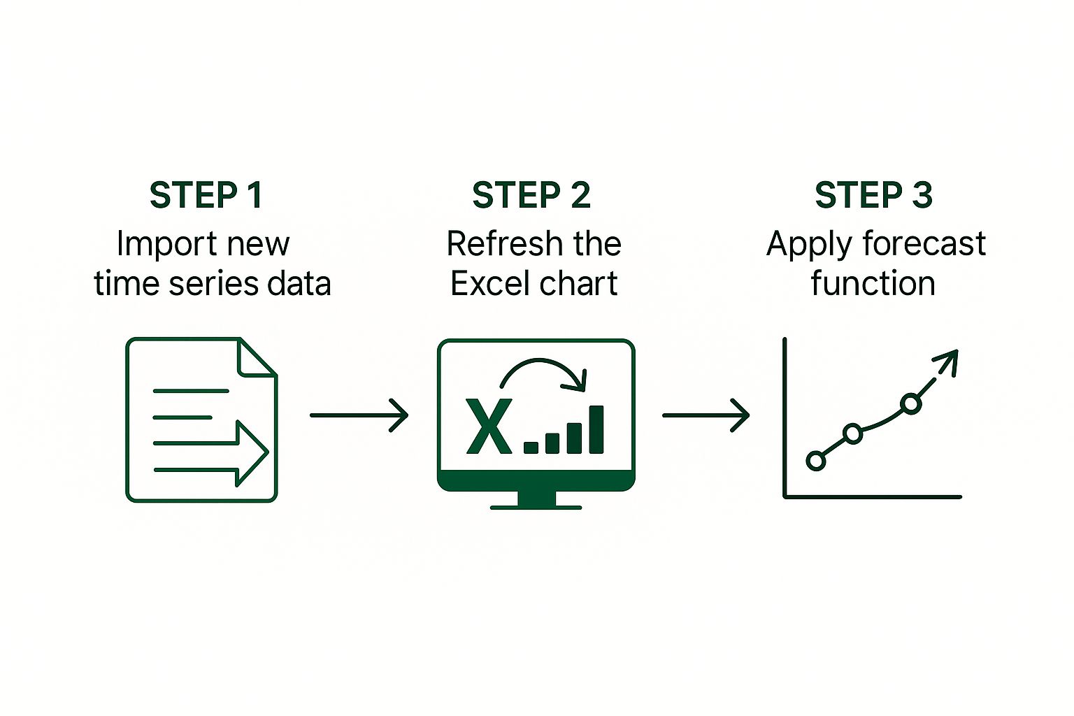
This infographic sums up the process: get new data, refresh the chart, and apply your forecast. See? Simple and effective. Now, instead of fiddling with charts, you're free to actually use the data to gain insights and make decisions.
This automation is a game-changer for data that changes frequently. I've seen firsthand how dynamic time series charts, particularly using named ranges and the FILTER function (especially helpful in Excel 365), have transformed how businesses handle large datasets. Think about tracking daily stock prices over six months. With 5,000+ rows of daily data, dynamic chart ranges that automatically adjust are a lifesaver. No more manual updates and far fewer errors. You can learn more about dynamic charts here.
Working With Dynamic Ranges
We'll concentrate on two powerful functions: OFFSET and FILTER. I'll show you how to use them to build charts that effortlessly handle growing datasets. Named ranges become essential here, automatically expanding as your data does. This kind of automation can significantly boost your efficiency, similar to how you might automate financial reporting.
Through real-world examples, we'll cover setting up these dynamic ranges, creating chart titles that update with the data, and making sure your visualizations stay accurate whether you're updating regularly or using live data feeds.
Advanced Tips and Tricks
I'll also share some of the more advanced techniques I've learned that make a real difference. These include gracefully handling missing data—because let's be honest, that happens—and ensuring your charts stay snappy and responsive even with huge amounts of data. These are the strategies that free you from constantly tweaking your charts, making your workflow much smoother.
Before we dive into the practical application, let's compare the different Excel functions we can use for creating dynamic time series charts. The following table provides a breakdown of their capabilities, complexity, and ideal scenarios.
Dynamic Chart Functions Comparison
| Function | Excel Version | Complexity Level | Best Use Case | Performance Impact |
|---|---|---|---|---|
| OFFSET | All Versions | Medium | Creating dynamic ranges based on a starting point and size | Can be slow with very large datasets |
| FILTER | Excel 365 & later | Beginner to Medium | Extracting specific data based on criteria | Generally efficient, especially for filtering large datasets |
| INDEX | All Versions | Beginner to Medium | Returning a value from a specific position in a range | Efficient for smaller to medium datasets |
| INDIRECT | All Versions | Advanced | Creating dynamic ranges from text strings | Can be error-prone and slow |
| CHOOSE | All Versions | Beginner | Selecting a value from a list based on an index number | Efficient for smaller datasets |
As you can see, the FILTER function offers a good balance of power and ease of use, especially in newer versions of Excel. However, OFFSET remains valuable for its flexibility in defining dynamic ranges. Consider the trade-offs between complexity and performance when making your choice.
These tips, combined with the right function choices, will help you create time series charts that are not only visually compelling but also truly informative and easy to maintain. No more constant manual adjustments – just clear, insightful data visualizations that work for you.
Solving Common Problems Before They Drive You Crazy
Let's face it, Excel can be tricky. Everyone, even seasoned users, runs into snags occasionally. But knowing how to troubleshoot those issues? That’s what separates the smooth operators from the spreadsheet screamers. So, let’s dive into some real-world Excel chart woes—the kind that make you want to throw your laptop out the window. I've definitely been there, and I'm here to help.
Taming the Date Axis Beast
Dates. They seem simple, right? But they can be a major source of frustration in Excel charts. Sometimes, Excel decides to display dates as plain numbers, squishes all your data points together, or just completely butchers the timescale. It's like it has a mind of its own. A quick fix? Right-click on that unruly axis, select "Format Axis," and double-check that the "Date" type is selected. Seriously, that often solves the problem instantly. You can also fine-tune the major and minor units to control how many date labels are displayed, which prevents overcrowding and makes your chart much easier to read.
Scaling Issues: Making Your Data Visible
Another common headache? Data that looks flatter than a pancake because the scale is all wrong. Imagine trying to showcase subtle changes in sales over a year, but your vertical axis spans from zero to a million. Those important fluctuations? Gone. Poof. Vanished. The solution is simple: adjust the minimum and maximum values of your vertical axis. Zoom in on the important part of the data, the part that actually tells a story. This seemingly small adjustment can make a world of difference in highlighting the trends you want to showcase.
Performance Problems and Large Datasets
Ever tried working with a massive dataset in Excel? It’s like trying to run a marathon in quicksand. Charts become sluggish, unresponsive, and generally painful to deal with. I’ve seen this countless times with large financial reports or scientific data. If your chart is moving at a glacial pace, try simplifying it. See if you can reduce the number of data points, or perhaps break the chart into smaller, bite-sized pieces. This not only improves performance but can also make your data easier to understand and analyze.
Handling Data Gaps and Excel Version Compatibility
Missing data? It’s like a pothole in the middle of your chart, and it can really throw off your analysis. One option is to fill those gaps using Excel's forecasting tools or by calculating an average from neighboring data points. Alternatively, you can leave the gaps but visually highlight them in the chart, acknowledging their presence and preventing misinterpretations.
Finally, let's talk about compatibility. Different Excel versions can sometimes interpret formatting in…interesting…ways. To avoid headaches, try to keep your formatting relatively simple. Avoid overly complex features that might not play nicely with older versions of Excel. If you absolutely must use advanced features, test your chart in different Excel versions before sharing it to avoid any nasty surprises down the line. Trust me, this can save you a lot of grief.
Ready to take your Excel skills to the next level? Check out AIForExcel. It's a great tool for efficiently analyzing data and making your time series charts even more impactful.