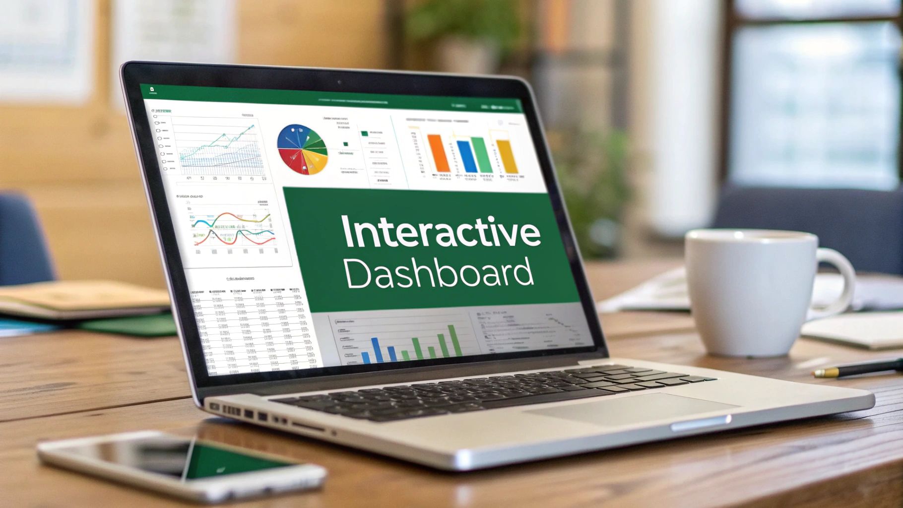
Let's face it, a giant spreadsheet full of raw numbers is more likely to cause a headache than an epiphany. It's static, dense, and frankly, a little intimidating for most people. This is where building interactive dashboards in Excel becomes a game-changer. You can transform that wall of data into a dynamic, visual story that lets you—and your team—filter, explore, and understand the numbers in real time.
This isn't about needing fancy, expensive software. It’s about mastering a skill that turns a good analyst into an indispensable data storyteller.
Why Interactive Dashboards Are an Excel Superpower
A static report is a dead end. It gives you a snapshot, but it doesn't let you ask "what if?" An interactive dashboard, on the other hand, is the start of a conversation with your data.
Think about it from a sales manager's perspective. You're looking at quarterly performance. Instead of emailing an analyst for five different regional reports, you just click a button labeled "North America" on your dashboard. Instantly, every chart—from sales trends to top-performing products—updates to show you exactly what happened in that region. Click another button, and you see Europe.
This kind of immediate feedback puts powerful insights into the hands of people who need them, without requiring them to be Excel gurus. It empowers your team to find their own answers, which frees up analysts from pulling routine reports to focus on much deeper, more strategic work.
The Key Ingredients for an Interactive Report
The real power of an interactive dashboard in Excel comes from how a few core features work together. Once you understand how they connect, you're well on your way.
Here's a quick look at the essential Excel tools we'll be using and how they contribute to a fully interactive dashboard.
Core Excel Features for Interactive Dashboards
| Feature | Primary Function | Benefit for Interactivity |
|---|---|---|
| PivotTables | Summarizes massive datasets into concise tables. | Acts as the "engine" that calculates metrics like totals, averages, and counts on the fly. |
| PivotCharts | Creates visual representations of PivotTable data. | Automatically updates as the PivotTable data changes, providing instant visual feedback. |
| Slicers | Provides user-friendly filter buttons. | Allows users to click and filter multiple PivotTables and PivotCharts simultaneously with a single action. |
Understanding these components is the first step, but the real magic happens when you start connecting them.
The goal is to link a single Slicer to multiple PivotCharts. This creates that seamless, unified experience where the entire report responds to one click. It’s how you build a dashboard that provides immediate answers to complex business questions, not just a collection of charts on a page.
This isn't some niche trick; it's a standard practice in modern business intelligence. Interactive dashboards in Excel have become incredibly popular because almost everyone has access to the software. In fact, some market analysis suggests that around 70% of companies that use dashboards rely on Excel for creating interactive reports, simply because it’s so accessible and flexible. You can dig deeper into these trends and their business impact with this data from Datapad.io.
By learning to combine these tools, you're not just building a report. You're building a decision-making machine.
Setting Up Your Data for Success

Before you even dream of building a single chart, let's talk about the absolute bedrock of your project: the data. The success of your interactive dashboard in Excel lives or dies by the quality of your source data. You simply can't build a powerful, insightful dashboard on a shaky foundation. Honestly, this initial prep work is the most crucial part, and doing it right now will save you a world of frustration later on.
Think about that raw data export you just downloaded. It’s probably a bit of a mess, right? I've seen it all—inconsistent date formats, random blank cells, and pesky duplicates that can throw off your entire analysis. Your first mission is to get that data into shape. I have a simple mantra: one clear header per column, one complete record per row, and absolutely no merged cells or blank rows cluttering the works.
The Power of "Format as Table"
Once everything is tidy, there’s one move that I consider non-negotiable for any dynamic dashboard: using the "Format as Table" feature. This isn't just about making your spreadsheet look pretty with alternating colors. It fundamentally changes a static range of cells into an intelligent, structured object that Excel can understand and work with seamlessly.
It's easy to do. Just click anywhere within your data, head to the "Home" tab, and choose "Format as Table."
My Favorite Pro Tip: When you use an official Excel Table, it automatically expands as you add new data. This means any PivotTable or chart you've built from it will instantly see the new information when you hit refresh. You'll never have to manually update source ranges again. It's a game-changer.
This simple dialog box is your gateway to making your data dynamic.
Notice how it smartly detects your data's boundaries and asks if your table has headers. By making this official, you unlock incredibly useful tools like structured references, which make your formulas far easier to read and much less likely to break.
Best Practices for Your Raw Data
Getting your data structure right from the beginning sidesteps the most common dashboard headaches. Here are a few core principles I always stick to:
- Keep it Consistent: Make sure every entry in a column is the same type. Dates should be formatted as dates, and numbers as numbers. Mixed formats, like having "N/A" in a sales column, will wreck your calculations.
- Handle Blanks with Intention: Empty cells can cause trouble. For columns with numbers, I almost always replace blanks with a 0. This prevents unexpected errors when you start pivoting the data.
- Nuke the Duplicates: Head over to the "Data" tab and use Excel’s built-in "Remove Duplicates" tool. You need to be sure every record is unique for your summaries and counts to be accurate.
Think about it: in a sales report, a single duplicate entry could falsely inflate your revenue by thousands of dollars. Spending a few minutes on these checks ensures every insight you pull from your interactive dashboard in Excel is built on truth. This clean, structured table is now your single, reliable source for everything that follows.
Building Your Dashboard's Analytical Engine
https://www.youtube.com/embed/m0wI61ahfLc
Alright, your data is now clean, organized, and properly formatted as an Excel Table. This is where the real magic begins. We're about to build the analytical engine that will drive your entire interactive dashboard in Excel. The heart of this engine is the PivotTable—it’s the true workhorse for any serious data analysis in Excel. PivotTables are what let you take thousands of rows of raw data and instantly distill them into meaningful summaries.
Now, a common mistake is to build one giant, overly complex PivotTable. The smarter, more professional approach is to create several smaller, dedicated ones. Think of each PivotTable as a specialized tool designed for a single job. One will track sales, another will break down performance by region, and so on. Each one tells a single, clear piece of the story.
Crafting Your First PivotTable
Let's get our hands dirty by creating a summary for monthly sales trends. Just click any cell inside your data table, head over to the Insert tab, and select PivotTable. Excel will automatically select your table as the source and offer to place the PivotTable on a new worksheet. This is exactly what we want. It's a best practice to keep all your PivotTables on a separate sheet—I usually name mine "Pivot Data" or "Calculations"—to keep your main dashboard sheet uncluttered.
Once you hit OK, the PivotTable Fields pane will pop up on the right. This is your control center. For our monthly sales report, we'll drag the 'Order Date' field into the 'Rows' area and the 'Sales' field into the 'Values' area. You'll see Excel intelligently group the dates by month and sum the sales for you. Just like that, you have an instant summary.
Be intentional with every PivotTable you create. The key is to resist the temptation to cram too much information into a single table. A clean, focused PivotTable is far easier to manage and much less likely to cause headaches when you start connecting interactive filters later.
From this one data table, you can now spin up several other PivotTables to answer different business questions. For example, you could quickly build:
- A Regional Performance Pivot: Drag 'Region' to Rows and 'Sales' to Values.
- A Top Products Pivot: Drag 'Product Name' to Rows and 'Sales' to Values, then sort the sales from highest to lowest.
- A Customer Segment Pivot: Drag 'Segment' to Rows and 'Profit' to Values.
Each of these tables acts as a separate analytical module for your dashboard. If you'd like a more in-depth look at this, our full guide on how to create a dynamic dashboard in Excel from scratch walks through this with more examples.
From Numbers to Narratives with PivotCharts
With the numbers crunched, it's time to visualize them. This is where PivotCharts come in. A PivotChart is directly linked to its PivotTable, which means it will automatically update whenever the source data changes or you filter it.
Creating one couldn't be simpler. Click anywhere inside your first PivotTable (the monthly sales one), go to the PivotTable Analyze tab on the ribbon, and click PivotChart.
Of course, choosing the right chart type is crucial for telling a clear story with your data.
| Data Story | Recommended Chart Type | Why It Works |
|---|---|---|
| Trends over Time | Line Chart | Perfectly illustrates the ups and downs of a metric like monthly sales. |
| Comparing Categories | Bar or Column Chart | The best choice for comparing performance across different regions or products. |
| Part-to-Whole | Pie or Donut Chart | Ideal for showing market share or how customer segments make up the total. |
For our monthly sales data, a line chart is the obvious and most effective choice. But your job isn't done once you select it. A big part of making a dashboard look professional is cleaning up the charts. Take a moment to remove visual clutter—things like field buttons, unnecessary gridlines, or legends that don't add any real value. A clean, focused chart is easier for anyone to understand at a glance.
Now, just repeat this process for each of your PivotTables, creating a unique and appropriate chart for each one. These charts are the visual building blocks you'll soon assemble into your final, cohesive dashboard.
Bringing Your Dashboard to Life with Slicers
Alright, you've done the heavy lifting with the data and set up your charts. Now for the fun part: making the whole thing interactive. This is where slicers come into play, and frankly, they're what separate a static report from a dynamic, living dashboard.
Slicers are basically fancy, user-friendly filter buttons. Forget clunky drop-down menus. With slicers, anyone can explore the data just by clicking. Imagine your boss wanting to see sales for "2024" or the "North America" region—they can do it with a single click instead of fumbling with filters. This is the core of what makes a great interactive dashboard in Excel.
To get started, just click inside any of your PivotTables. From there, head to the PivotTable Analyze tab and hit Insert Slicer. A box will pop up, letting you pick which fields you want to filter by—things like 'Year', 'Region', or 'Product' are common choices.
Excel has really leaned into these kinds of interactive features lately. Tools like PivotCharts and slicers are becoming standard because they make data exploration so much easier. You can see how these trends are shaping data visualization on platforms like YouTube and beyond.
The image above really drives the point home. A clean layout where slicers are logically placed next to the visuals they control is absolutely crucial for a dashboard that people will actually want to use.
Connecting Slicers to Multiple Charts
Adding a single slicer is a good start, but the real magic happens when one slicer controls your entire dashboard. This is how you create a truly unified and professional-looking tool. By default, a new slicer only talks to the PivotTable it was born from. We need to change that.
Right-click on your slicer and find the Report Connections option. This little command is the key to unlocking full interactivity.
You'll see a dialog box appear, showing a list of every PivotTable in your workbook. All you have to do is tick the checkbox for each PivotTable you want that slicer to influence. For a completely seamless experience, you'll want to connect that one slicer to all the relevant PivotTables on your dashboard. Now, one click updates everything in perfect sync.
Expert Tip: I make it a habit to test every single slicer right after connecting it. Click a few buttons and watch your charts. Does everything update as expected? Catching a missed connection now will save you a headache and prevent confusion for your users down the road.
Polishing Your Slicer Design
Functionality is king, but design is what makes people want to use your dashboard. The default slicers work, but let's be honest, they can look a bit clunky. With just a few tweaks, you can make your interactive dashboard in Excel look like it was professionally designed.
Here are a few adjustments I almost always make:
- Adjust Columns: Got a long list of items in your slicer, like years or months? A single, scrolling column eats up valuable screen space. Select the slicer, go to the Slicer tab on the ribbon, and bump up the Columns count. This creates a neat, compact grid of buttons.
- Apply Custom Colors: That default blue rarely matches a company's brand or a dashboard's color scheme. The Slicer tab has a whole gallery of styles to choose from, so you can find one that fits your design.
- Hide the Header: Sometimes the slicer's title is just redundant. For a cleaner, more minimalist look, right-click the slicer, select Slicer Settings, and uncheck the "Display header" box.
These small, intentional design choices really add up. They transform your dashboard from a simple report into an intuitive, custom-built application. To dive deeper into the whole process, take a look at our complete guide to creating an interactive dashboard in Excel.
Assembling a Polished and Professional Dashboard

You've done the heavy lifting—the data is prepped, the PivotTables are built, and your slicers are ready to go. Now comes the fun part: bringing it all together into a clean, professional report that’s as intuitive as it is powerful. This is more than just making things look pretty; a smart design guides your user’s eye and turns raw data into obvious insights.
The first move I always make is creating a dedicated home for the dashboard. Just add a new, blank worksheet and name it something simple like ‘Dashboard.’ This will be your stage, completely separate from the backstage mess of raw data and PivotTables. This separation is a non-negotiable for a pro-level setup. It keeps things tidy and prevents your users from accidentally wandering into the mechanics of it all.
Creating an Intuitive Layout
With your blank canvas ready, it’s time to start arranging your components. You'll need to cut your PivotCharts and slicers from their original sheets and paste them onto your new ‘Dashboard’ sheet. But don't just dump them anywhere. Think about the narrative. How do you want someone to read and interact with this information?
I’ve found that placing the main slicers—like ‘Year’ or ‘Country’—at the top or down the left side feels the most natural for users. It’s a familiar layout, much like a website or app. From there, I arrange the charts in a logical hierarchy:
- Top-Level Metrics: Your most critical numbers, like total revenue or key performance indicators (KPIs), should grab attention right at the top.
- Deeper Dives: Charts that break down the details, such as sales by product or monthly trends, can sit below the main summary charts.
- Logical Grouping: Keep related items together. If you have a ‘Product Category’ slicer, it makes sense to put it right beside the chart that visualizes product sales.
A well-designed dashboard doesn't just present data; it tells a story. The goal is to create a visual path where the most important information is obvious at a glance, and the finer details are there for anyone who wants to explore further. It should feel effortless.
Applying Professional Design Principles
This is the final 10% that makes all the difference. A few deliberate design tweaks are what separate a functional dashboard from a truly professional one.
First, kill the visual clutter. Head over to the 'View' tab and uncheck the 'Gridlines' box. This one simple click gives your dashboard a much cleaner, report-like background. Next, tidy up each individual chart. You can often remove redundant elements like field buttons or even the legend if the chart's title already explains what's being shown. If a chart is titled "Sales by Region," you probably don't need a legend that also says "Sales."
Consistency is your best friend here. Settle on a simple, clean color scheme and stick to it across all your visuals for a cohesive look. For more inspiration on this, our guide to building an Excel KPI dashboard has some great design tips.
Finally, a great finishing touch is a dynamic title that changes as the user interacts with the slicers. This provides instant context, clarifying exactly what data they're looking at and completing the truly interactive feel of your report.
Common Questions About Excel Dashboards
As you start putting all the pieces together, you'll inevitably run into a few common head-scratchers. It happens to everyone. Whether you're trying to figure out why your charts aren't updating or how to make the whole thing feel more connected, getting past these hurdles is key.
Let's walk through some of the most frequent questions I get asked when building interactive dashboards in Excel. Getting these right will make your life a whole lot easier.
How Do I Make My Dashboard Update When New Data Is Added?
This is the big one. If your dashboard doesn't update easily, it's not very useful. The magic here is something we did right at the start: formatting your source data as an official Excel Table. This simple step makes your data source dynamic.
Now, when you paste or type new rows of data at the bottom of your dataset, the table automatically expands to include them. All that's left for you to do is go to the Data tab and hit Refresh All. Just like that, every single PivotTable, PivotChart, and slicer connected to that data springs to life with the latest information.
Honestly, this is a non-negotiable best practice. It completely gets rid of the painful, error-prone task of manually adjusting the source range for every chart and table. Once you start doing this, you'll never go back.
Can One Slicer Control Multiple Charts?
Absolutely, and you definitely should do this. It's what makes a dashboard feel like a single, cohesive tool rather than a collection of separate charts.
By default, when you create a slicer, it only talks to the PivotTable it was born from. To change that, you need to tell it what else to control.
Just right-click the slicer and select Report Connections. A small window will pop up showing you a list of all the PivotTables in your workbook. Simply tick the box next to every PivotTable you want this slicer to filter. Now, one click on that slicer will update all your connected visuals in sync.
What Can I Do If My Dashboard Is Slow to Refresh?
A sluggish dashboard can be a real pain, especially when you're presenting data. If you notice a lag, there are a few usual suspects.
First, check your source data. Are you importing columns you don't even use in your charts? Every extra column adds processing weight. Get rid of anything you don't absolutely need.
Second, be mindful of your formulas. Using whole-column references like A:A is a huge performance killer because it forces Excel to scan over a million rows. Stick to structured references that come with Excel Tables (like Sales_Table[Revenue]), which are much more efficient. If your dataset is truly massive, it might be time to graduate to Power Pivot and build a Data Model, which is built from the ground up to handle large-scale data much better than standard PivotTables.
Ready to stop wrestling with complex formulas and start getting insights instantly? AIForExcel integrates a conversational AI assistant directly into your spreadsheet. Ask questions in plain English, get immediate analysis, and build reports faster than ever before. Learn more about AIForExcel.