Why Excel KPI Dashboards Still Rule Business Analytics
In today's data-driven business world, numerous analytics tools promise powerful insights. Yet, a familiar tool remains a staple: the Excel KPI dashboard. Why do businesses, even those with access to complex software, still rely on Excel for KPI tracking?
One key reason is accessibility and familiarity. Most professionals already possess Excel skills, avoiding the need for extensive training. This widespread knowledge simplifies collaboration, allowing teams to easily share and contribute to dashboard development. Excel also provides a low barrier to entry for smaller businesses lacking resources for expensive analytics platforms.
This ease of use doesn't sacrifice functionality. Excel boasts a robust feature set ideal for KPI dashboards. PivotTables enable dynamic data summarization, while customizable charts visualize data effectively. Conditional formatting automatically highlights important trends, instantly focusing attention on crucial areas. Excel's flexibility also allows for customization, tailoring dashboards to specific business needs.
Creating an Excel KPI dashboard is essential for efficient key performance indicator tracking and analysis. For example, a sales performance KPI dashboard helps sales managers monitor metrics like sales revenue, the total money generated from sales over a specific time. Comparing revenue month-over-month or year-over-year identifies growth trends, informing timely decisions. Learn more at Zapier's blog on creating KPI dashboards in Excel.
Key Advantages of Excel KPI Dashboards
Beyond core functionalities, Excel offers other advantages:
- Cost-effectiveness: Excel is often included in existing software packages, minimizing extra costs.
- Data Control: Businesses maintain complete control over their data, especially vital for sensitive information.
- Offline Access: Unlike cloud-based tools, Excel dashboards can be accessed and used offline.
This blend of accessibility, power, and control makes Excel KPI dashboards valuable for businesses of all sizes. While specialized platforms have their uses, Excel remains a reliable solution for turning data into actionable insights.
Building Your First Excel KPI Dashboard That Actually Works
Ready to turn your data into actionable insights? Creating a powerful Excel KPI dashboard might seem complicated, but with a clear process, it's surprisingly manageable. This guide will walk you through building a dashboard that not only looks professional but also informs key business decisions.
Structuring Your Data for Success
Before creating charts and graphs, organizing your data is essential. Structure your data in a table with clear column headers that represent your KPIs. This ensures your dashboard performs efficiently, even with large datasets. For example, if you're tracking sales, create dedicated columns for date, product, region, and sales amount.
This foundational step ensures that your dashboard remains responsive and insightful, regardless of the volume of data it handles.
Leveraging Excel's Powerhouse Features
Excel provides a range of features ideal for KPI dashboards. PivotTables enable dynamic data analysis, summarizing information by different criteria. For example, you can analyze sales by region or product. Charts visualize your data, highlighting trends and comparisons.
Conditional formatting automatically highlights important data points. This feature emphasizes critical areas, such as exceeding targets or falling short of goals, making it easy to identify areas for improvement or recognize successes.
Mastering KPI Calculations With Excel Functions
Excel functions are essential for calculating and displaying KPIs. SUM, AVERAGE, and COUNT handle basic calculations, while advanced functions like SUMIFS and COUNTIFS perform conditional calculations based on specific criteria. For instance, SUMIFS can calculate the total sales for a specific product within a defined date range. For a deeper dive into Excel's analytical capabilities, check out this resource: How to master data analysis in Excel.
As of 2025, there are comprehensive guides and templates available that simplify building effective Excel dashboards. These resources empower users to create dynamic dashboards that significantly improve financial reporting. For detailed statistics and insights, see: Livetecs Blog on Excel Dashboards.
Dynamic Elements for Seamless Updates
An effective dashboard automatically updates as new data is added. Excel allows you to connect your dashboard elements directly to your data source. This ensures charts and tables automatically refresh with each data update, eliminating manual updates and providing real-time insights. This automation saves time and ensures your dashboard always reflects the latest information.
Troubleshooting and Common Mistakes
Even with meticulous planning, challenges can occur. Avoid overcrowding your dashboard. Focus on displaying only the most critical KPIs. Choosing the wrong chart type is another common pitfall. Bar charts are great for comparisons, while line charts are ideal for illustrating trends over time. Interested in enhancing your Excel skills further? Explore the possibilities of AI integration: How to master AI in Excel.
By following these steps and utilizing Excel's features, you can create a KPI dashboard that empowers data-driven decisions and helps achieve your business objectives. A well-designed dashboard transforms raw data into a powerful tool for understanding performance and driving success.
Choosing KPIs That Drive Real Business Outcomes
Creating an effective excel kpi dashboard isn't just about presenting data visually; it's about selecting the right data to display. Many dashboards become cluttered with vanity metrics—data that looks impressive but doesn't inform actual decisions. This section focuses on identifying the KPIs that genuinely affect your bottom line.
Focusing on Impactful Indicators
Begin by considering your core business objectives. What are you ultimately trying to achieve? Your KPIs should directly reflect these goals. For example, if your objective is to increase sales, your dashboard should feature KPIs like sales conversion rate, average order value, and customer acquisition cost. These provide a clear view of your progress toward your main objective.
Additionally, consider the different levels within your organization. Executives need high-level financial KPIs, such as revenue growth and profit margin, to inform strategic decision-making. Operational teams, on the other hand, benefit from metrics that reflect daily efficiency, such as order fulfillment time or production output. This tiered approach makes sure each level has the pertinent data needed to inform their specific responsibilities.
Balancing Leading and Lagging Indicators
Effective dashboards balance leading indicators and lagging indicators. Leading indicators, like website traffic or lead generation, offer a glimpse into future performance. Lagging indicators, like revenue or customer churn, confirm past performance. For instance, tracking website traffic (leading) can suggest potential future sales (lagging).
This combination offers both predictive insights and the ability to confirm the effectiveness of current strategies. You might be interested in exploring additional resources on data analysis: Free data analysis tools.
Tailoring KPIs to Your Industry
KPIs are not a one-size-fits-all solution. Different industries require different metrics. A software company might prioritize customer lifetime value, while a manufacturing company focuses on equipment uptime and defect rates. For example, Excel KPI dashboards aren't limited to financial metrics; they can also be used to track marketing performance.
A marketing KPI dashboard template in Excel can track total leads generated and compare them to planned goals, providing valuable insights into the efficacy of marketing strategies. Delve deeper into this topic here.
Avoiding Metric Overload
While comprehensive data is essential, avoid overwhelming your dashboard with excessive KPIs. Focus on a select group of the most impactful metrics directly correlated with your business goals. This focused approach prevents metric overload, ensuring your dashboard remains clear, concise, and actionable. Too many KPIs can diffuse focus and make it challenging to pinpoint the real drivers of business success.

Choosing the right KPIs is the foundation of a successful excel kpi dashboard. By aligning your metrics with business objectives, balancing leading and lagging indicators, and customizing KPIs to your specific needs, you can create a robust tool that drives real business results.
Advanced Techniques For Interactive Excel Dashboards
Building a basic Excel KPI dashboard is a great starting point. However, transforming it into an interactive analytical powerhouse can significantly increase its business value. This involves incorporating dynamic elements that empower users to explore data on their own.
Implementing Interactive Controls
Interactive controls give users the ability to filter and customize the data displayed without altering the underlying spreadsheet. Some popular controls include dropdown menus, slicers, and dynamic date ranges. For example, a dropdown menu could allow users to select different product categories.
A dynamic date range would then let them analyze performance over specific periods. This kind of flexibility allows stakeholders to gain more granular insights based on their individual needs.
Automating Data Refresh Processes
Manual data updates can be time-consuming and prone to errors. Automating this process ensures your dashboard always contains the most current information. This is generally achieved by connecting your Excel dashboard to external data sources.
You can also set up automatic refresh intervals. Imagine a sales dashboard connected to a live sales database. Automation allows the dashboard to reflect the latest sales figures without manual intervention. This "set it and forget it" approach saves considerable time and improves data analysis reliability.
Advanced Charting and Data Visualization
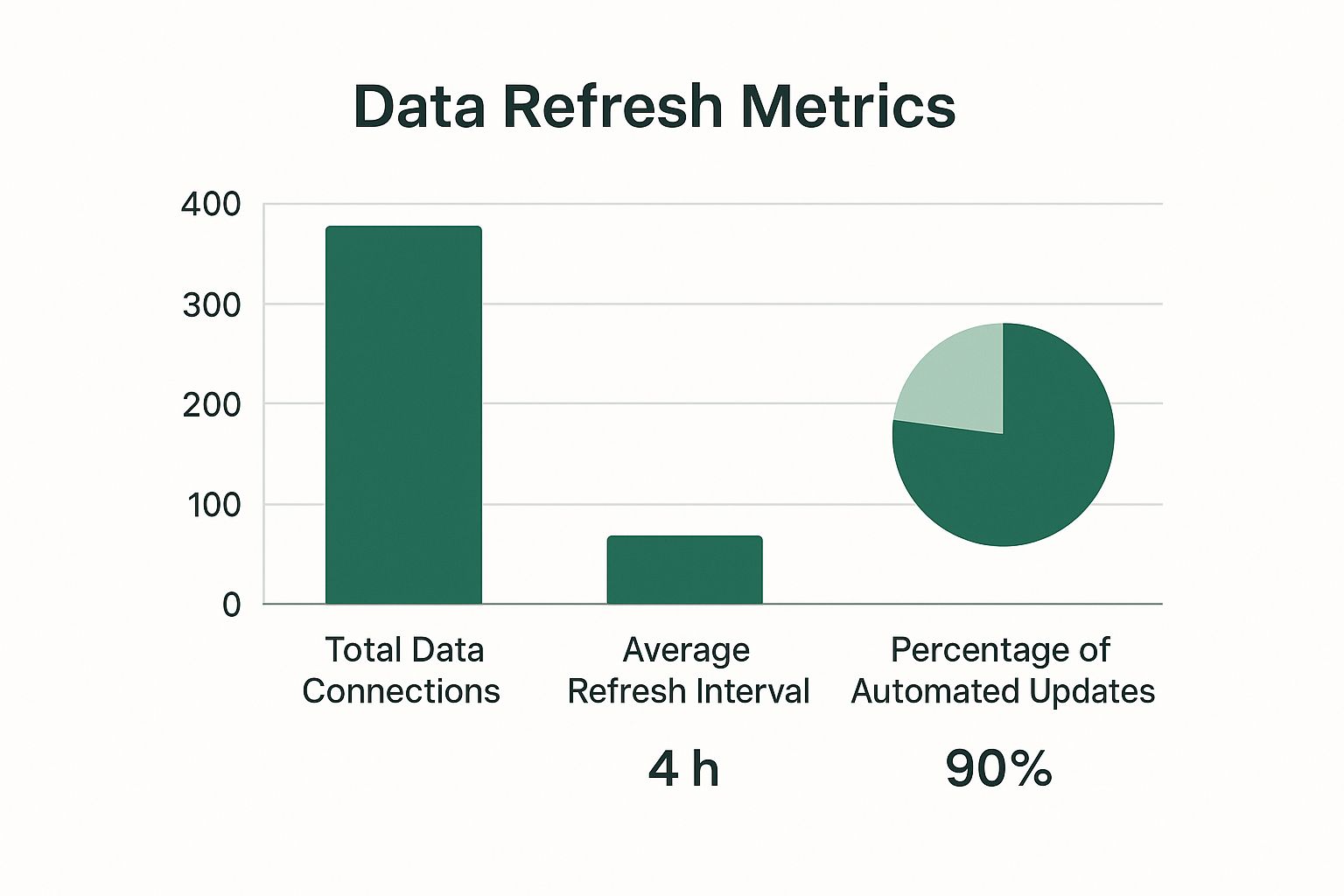
The infographic above visualizes key data about our Excel KPI dashboards. It shows total data connections, average refresh interval, and the percentage of automated updates. A significant portion of our dashboards are automated, leading to frequent data refreshes and numerous data connections. This highlights the importance of real-time data and the interconnectedness within our dashboards.
Beyond basic charts, explore combination charts and sparklines for more insightful analysis. Combination charts, as the name implies, combine different chart types (like bar and line charts). This allows you to represent multiple datasets on a single chart.
Sparklines, on the other hand, are miniature charts that fit within individual cells. They provide a quick visual summary of trends within a larger dataset. These advanced visualizations help users grasp complex relationships and patterns in a concise and easy-to-understand format. For a deeper dive into AI-powered Excel tools, see our guide on How to master AI in Excel.
Handling Large Datasets With Power Query
As the volume of your data increases, Excel's performance can sometimes suffer. Power Query, a powerful data connection and transformation tool within Excel, offers a solution. Power Query lets you import, clean, and transform data from various sources before it enters your spreadsheet.
This leads to significant performance improvements, especially when dealing with large datasets. By pre-processing data with Power Query, you reduce the load on your Excel workbook and make it more responsive.
To better understand the various features discussed, the following table offers a comparison between basic and advanced Excel dashboards:
Excel Dashboard Features Comparison
Comparison of basic vs advanced Excel dashboard features and their business impact
| Feature | Basic Level | Advanced Level | Business Impact |
|---|---|---|---|
| Interactivity | Limited, possibly using basic filtering | Dropdown menus, slicers, dynamic date ranges | Enhanced user exploration, customized insights |
| Data Refresh | Manual updates | Automated connections to external data sources, scheduled refreshes | Real-time data, reduced errors, time savings |
| Charting & Visualization | Basic charts (bar, line, pie) | Combination charts, sparklines | Deeper data insights, clearer presentation of complex relationships |
| Data Handling | Direct import into spreadsheet | Power Query for data transformation and cleaning | Improved performance with large datasets, optimized data structure |
This table summarizes the key differences between basic and advanced Excel dashboards. As shown, advanced techniques offer significant advantages in terms of user experience, data handling, and the depth of insights.
By implementing these advanced techniques, you can transform your Excel KPI dashboard from a static report into a dynamic and powerful business tool. This empowers data exploration and drives better decision-making, creating a more data-driven culture within your organization.
Design Principles That Make People Actually Use Your Dashboard

A technically brilliant Excel KPI dashboard can be a wasted effort if it's not user-friendly. This section explores design principles that transform complex spreadsheets into clear, compelling tools people want to use. We'll examine how visual design influences user behavior and what makes a dashboard effective.
The Psychology of Effective Data Visualization
Effective dashboards consider how people process information. Our brains quickly recognize patterns and anomalies. A well-designed dashboard leverages this by presenting data for quick comprehension. For example, using contrasting colors to highlight key performance indicators (KPIs) draws attention to critical information.
Visual hierarchy, arranging elements by importance, logically guides the user's attention. Placing the most critical KPIs at the top left, where users typically start scanning, improves information absorption. These subtle cues significantly impact user understanding.
Choosing the Right Chart for the Right Data
Different data requires different charts for effective visualization. A bar chart compares values across categories, while a line chart displays trends over time. Using the wrong chart can obscure insights and mislead users.
A pie chart effectively shows proportions, such as product categories contributing to total sales. But tracking those sales figures over time requires a line chart for a more effective visualization. The right chart ensures data clarity and accuracy.
Layout Strategies for Clear Communication
Your Excel KPI dashboard's layout significantly affects its usability. A cluttered layout overwhelms users, while an organized layout provides a clear path for understanding the data. Think of your dashboard as a story – the layout determines how that story unfolds.
Group related KPIs together visually, using clear headings and spacing to separate sections. This helps users quickly find information. For example, separate sales and marketing KPIs into distinct sections for easy navigation.
Balancing Detail and Simplicity
An effective dashboard balances comprehensive data and visual simplicity. Analysts need detailed information, while executives often need a quick overview of KPIs. This means providing different levels of detail within the dashboard.
Use summary charts at the top level for a high-level overview. Then, allow users to drill down for more details. This satisfies the need for quick insights and in-depth analysis. Prioritizing clear communication, with high-level summaries and granular details, makes your dashboard a valuable tool.
Avoiding Dashboard Disasters That Kill User Adoption

Building an Excel KPI dashboard requires more than just technical proficiency. A technically perfect dashboard can still fall flat if users find it difficult to understand or irrelevant to their needs. This section explores common pitfalls that hinder dashboard adoption and offers solutions to create a truly effective tool. The key is understanding your audience and their specific requirements.
Overcoming Information Overload
One of the biggest mistakes is information overload. Overcrowding a dashboard with too many KPIs creates visual clutter, making it challenging to extract valuable insights. Users quickly become overwhelmed and abandon the dashboard entirely.
This defeats the purpose of providing quick, actionable data. Instead, focus on the most critical KPIs. Consider creating separate, targeted dashboards for various departments or specific purposes. This approach leads to a more focused data presentation, improving user comprehension and engagement.
Choosing Appropriate Visualizations
Another frequent issue is using inappropriate visualizations. A pie chart effectively displays proportions but isn't suited for showing trends over time. Similarly, overly complex charts can obscure the very data they’re meant to illuminate.
Carefully consider the data and select the most effective chart type. This ensures data is displayed clearly and accurately. Consider using tools like AIForExcel to suggest optimal chart types based on the data and desired insights. This can significantly streamline the visualization process.
Addressing Data Accuracy and Performance Issues
Data accuracy is crucial. Inaccurate data undermines user trust and renders the entire Excel KPI dashboard useless. Implementing data validation processes and regular checks for inconsistencies are essential.
Dashboard performance also matters. Slow loading times can frustrate users. Optimizing your Excel workbook, particularly for large datasets, ensures a smooth user experience and encourages continued use.
Maintenance and User Feedback
Even well-designed dashboards require ongoing maintenance. Regularly review the relevance of your KPIs and update the dashboard to reflect evolving business needs.
Gathering user feedback is critical for continuous improvement. Actively solicit feedback and incorporate user suggestions. This promotes a sense of ownership and encourages long-term dashboard adoption.
Ready-To-Use Templates and Implementation Strategies
Building an effective Excel KPI dashboard involves more than just technical know-how. Practical application requires proven templates and implementation strategies. This section provides resources and frameworks to help you launch successful, widely-adopted dashboards in your organization.
Department-Specific Templates for Immediate Use
Different departments have different needs. Pre-built, function-specific templates can jumpstart your dashboard development. These templates offer a adaptable framework for your unique data and KPIs. For example, a sales performance tracker might include KPIs like conversion rate, average deal size, and sales cycle length. A marketing ROI analyzer would focus on website traffic, lead generation, and customer acquisition cost. This facilitates quicker implementation and faster dashboard adoption.
Sales Performance Trackers: Visualize key sales metrics to predict revenue.
Marketing ROI Analyzers: Use clear ROI data to guide budget decisions.
Operational Efficiency Monitors: Identify workflow bottlenecks and optimize processes.
These targeted templates provide a strong foundation for relevant data analysis within each department, ensuring dashboards deliver immediate value.
Industry-Specific Adaptations for Maximum Relevance
While department-specific templates are a good starting point, adapting them to your industry context is crucial. A retail business will have different KPIs than a software company. Understanding these nuances is key to creating truly relevant dashboards.
To illustrate how KPIs and dashboard functionalities vary across industries, let's look at the following table:
| Industry | Primary KPIs | Dashboard Focus | Update Frequency |
|---|---|---|---|
| Retail | Sales per square foot, Inventory turnover, Customer conversion rate | Store performance, Inventory management, Sales trends | Daily/Weekly |
| Software | Customer churn rate, Customer lifetime value, Monthly recurring revenue | Customer retention, Revenue growth, Product usage | Monthly/Quarterly |
| Manufacturing | Production output, Defect rate, Equipment uptime | Operational efficiency, Quality control, Production planning | Daily/Hourly |
As this table demonstrates, tailoring your dashboards to industry-specific needs ensures the data presented is both relevant and actionable.
Implementing Dashboards Across Teams
Successfully rolling out dashboards requires careful planning and execution. Effective training is vital for user adoption. Start with clear instructions and provide ongoing support to help users understand how to interpret and use the dashboard data.
Furthermore, establish clear data governance processes to maintain data quality. Define who is responsible for data input and updates, and implement validation rules to prevent errors. This ensures the data feeding your dashboards is accurate and reliable. A well-structured implementation process is essential for long-term success and maximizing the value of your dashboards.
Implementing Excel KPI dashboards strategically, by leveraging pre-built templates, adapting to industry needs, and focusing on user training and data governance, will transform your dashboards into essential tools for data-driven decisions.
Ready to transform your Excel reporting? AIForExcel helps you build dynamic, insightful dashboards in minutes. Learn more about AIForExcel and start your free trial.