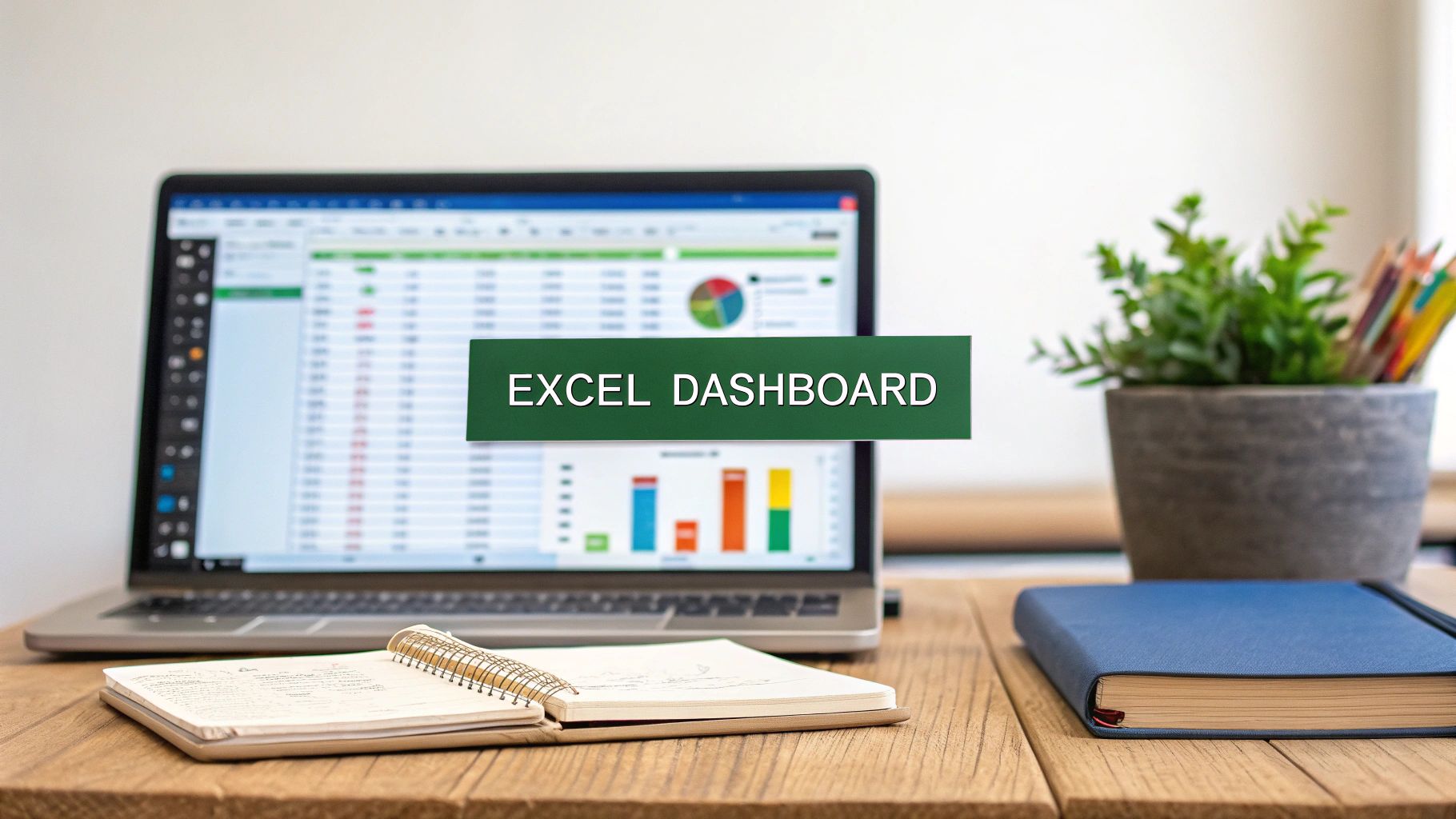
An interactive Excel dashboard is a single-screen report that pulls together charts, tables, and slicers to transform messy, raw data into something you can actually use: clear, actionable insights. What makes it "interactive" is the ability for anyone to filter and play with the data themselves, digging for answers without needing to ask for a new report. It’s the difference between a static photograph and a live video feed of your business.
Why Interactive Dashboards Are a Business Superpower
Before we jump into the nuts and bolts of building one, it's crucial to understand why this skill is so valuable. We're not just making pretty pictures with data; we're fundamentally changing how an organization sees and uses its information. A standard report gives you a snapshot. A dynamic dashboard, on the other hand, starts a conversation with your data.
This shift from just looking at data to actually exploring it gives teams a serious edge. Think about a sales director who, with a few clicks, can instantly see performance by region, by product line, and even by individual rep. Or a project manager who can monitor budgets and resource hours in real-time, catching potential overruns before they snowball into major problems.
The real magic of an interactive dashboard is its ability to answer the next question immediately. When a stakeholder asks "Why did sales dip in Q2?", they don't have to wait for a new analysis. They can click, filter, and find the answer themselves.
From Data Overload to Decisive Action
Let's be honest, most companies are drowning in spreadsheets. An interactive Excel dashboard is the lifeline. It cuts through the noise by putting your most important Key Performance Indicators (KPIs) front and center in a format that makes sense at a glance. The crucial metrics are right there, and the interactive slicers and charts are ready for anyone who wants to dig deeper.
This isn't just a "nice-to-have" skill anymore; it's what the market expects. The demand for clear, data-driven answers is exploding. In fact, the global dashboard software market is on track to hit $11.75 billion by 2029, a huge jump from its 2024 value. This isn't just a fad—it's a massive industry shift toward tools that make data useful for everyone, not just analysts. You can see the numbers for yourself in this detailed report on dashboard software growth.
Elevating Your Professional Value
When you learn to build an effective interactive dashboard in Excel, you become more than just "the spreadsheet person." You become a storyteller who can turn a list of numbers into a clear narrative that guides business decisions. This ability to bridge the gap between raw data and smart strategy is incredibly valuable, making you a key player on any team that wants to be driven by data, not just surrounded by it.
Building a Rock-Solid Data Foundation
Every truly impressive Excel dashboard I've ever built—or seen—shares a common secret: an impeccably clean, well-structured data foundation. This isn't just a preliminary step; it's the absolute bedrock of your entire project. Get this wrong, and even the most beautiful charts will crumble, spitting out confusing or downright incorrect information.
The quality of your final dashboard is a direct reflection of your source data. Think of it like building a house. You wouldn't pour concrete for the walls onto a shaky, uneven plot of land. In the same way, your data needs to be organized, clean, and properly formatted before you even dream of creating your first chart. This discipline is what separates a fragile, one-off report from a robust, scalable dashboard that you can rely on.
Before we dive into the fun part with charts and slicers, it's crucial to get your data into what I call a "dashboard-ready" state. This means structuring it in a way that Excel can easily understand and manipulate.
Here's a quick rundown of the core components that make up a dashboard-ready dataset. Getting these right from the start will save you countless headaches later on.
Core Components of a Dashboard-Ready Dataset
| Component | Description | Best Practice Example |
|---|---|---|
| Tabular Format | Your data must be organized in rows and columns, with each row being a single record and each column a specific attribute. | A sales dataset where each row is a unique transaction and columns are Date, Product, Region, Sales Amount. |
| Consistent Headers | Every column needs a unique, descriptive header in the very first row. Avoid merged cells or multiple header rows. | Instead of a vague "Amount," use a specific header like "Sales_USD" or "Units_Sold." |
| No Blank Rows/Columns | Your dataset should be a contiguous block of data. Blank rows or columns can break formulas and PivotTable functionality. | Run a quick sort or filter to identify and remove any entirely blank rows or columns within your data range. |
| Proper Data Types | Ensure each column contains the correct type of data. Dates should be formatted as dates, numbers as numbers, etc. | The 'Order Date' column should use Excel's Date format, not be stored as text like "Jan 5, 2024". |
Once your data adheres to these principles, you're ready to unlock its real power within Excel.
The Game-Changing Power of Excel Tables
One of the most common rookie mistakes I see is working with data in a simple range. The moment you add new data, all your formulas and chart references break, forcing you to manually update everything. The solution is remarkably simple yet incredibly powerful: convert your data into a formal Excel Table.
It’s easy. Just click anywhere inside your dataset and hit Ctrl + T. This one shortcut instantly transforms your static range into a dynamic powerhouse.
Here’s what that simple action does for you:
- Dynamic Range Management: The table automatically expands to include any new rows or columns you add. This means your charts and PivotTables update on their own, without you having to frantically redefine the source range. It’s a lifesaver.
- Structured Referencing: Your formulas become far more intuitive. Instead of a cryptic formula like
=SUM(C2:C100), you get something that reads like plain English:=SUM(Sales[Amount]). This makes your work so much easier to understand and debug. - Built-in Formatting: Tables come with slick, professional styling right out of the box, including alternating row colors that make your data much easier to read.
Making Ctrl + T a reflex is a foundational habit for anyone serious about building reliable, interactive dashboards in Excel.
Professional Workbook Organization
A messy workbook is a recipe for disaster. To keep your project manageable, especially when you need to hand it off to a colleague, you have to be organized. The best practice is to separate your project’s core components onto different worksheets.
A professional setup almost always looks like this:
- Data Sheet: This sheet holds one thing and one thing only: your raw data, formatted as an Excel Table. It is the single source of truth for your entire dashboard. No charts, no summaries, just data.
- Calculations Sheet: Think of this as your workshop. It’s where you’ll house all the PivotTables, complex formulas, and helper columns that crunch the numbers from your Data sheet. Keeping this "messy" work separate keeps your final dashboard clean.
- Dashboard Sheet: This is the star of the show—the final, user-facing presentation layer. It should only contain your charts, slicers, and key performance indicators (KPIs). This separation creates a polished, uncluttered, and intuitive interface for the end-user.
By separating your data, calculations, and presentation layers, you create a system that is not only organized but also incredibly easy to update and debug. When new data comes in, you only need to refresh one place, and the entire dashboard updates seamlessly.
This structured approach is no longer just a "nice-to-have." As businesses become more data-driven, the demand for clear, reliable insights is exploding. The global data analytics market, valued at USD 50.04 billion in 2024, is solid proof of this trend. By mastering these foundational principles, you are directly aligning your skills with a major business priority. You can dig deeper into these market growth projections and what they mean for data professionals to see just how valuable these skills are becoming.
Bringing Data to Life with PivotTables and Charts
Now that your data is clean and structured, we get to the fun part—making that data actually mean something. This is where you transform rows of numbers into a visual story that people can understand at a glance. We're moving from raw data to real insights, and our main tools for the job are Excel's powerhouse combo: PivotTables and PivotCharts.
If you're new to them, PivotTables are the engine of any serious Excel dashboard. They let you take a huge, intimidating dataset and slice, dice, and summarize it in seconds. No complex formulas needed. Got a year's worth of sales data? A PivotTable can instantly group it by region, product, or salesperson to answer your most pressing questions.
The setup is surprisingly straightforward. Once your data is in an Excel Table, you just insert a PivotTable onto your "Calculations" worksheet. From there, it’s a simple drag-and-drop interface. Want to see sales by region? Drag the Sales_Amount field to the Values area and the Region field to the Rows area. Boom—instant summary. If you want to really dig in, our guide on how to master the Excel Pivot Table is a fantastic resource.
From Summaries to Visuals with PivotCharts
PivotTables are incredible for analysis, but a dashboard needs visuals. That's where PivotCharts shine. A PivotChart is directly connected to a PivotTable, meaning any change you make to the data summary is instantly reflected in the chart. This is what creates that slick, interactive feel that makes a dashboard so effective.
To add one, just click anywhere inside your finished PivotTable and select "PivotChart" from the Analyze tab. This single action links your numbers to your visuals, ensuring they are always perfectly in sync.
Choosing the right chart is absolutely critical. The wrong visual can confuse people, while the right one provides immediate clarity.
- Bar or Column Charts: These are your go-to for comparing distinct categories. Think sales totals for each product or performance metrics for different teams.
- Line Charts: Nothing beats a line chart for showing a trend over time. Use it to track things like monthly revenue, website visits, or customer acquisition costs.
- Pie Charts: Be careful with these. They work well for showing parts of a whole, like the percentage of a budget spent by each department, but they become unreadable with more than a few slices. Use them wisely.
Expert Tip: A well-designed dashboard doesn't just show data; it answers questions. Before you choose a chart, ask yourself, "What specific question am I trying to answer with this visual?" That simple check will guide you to the most effective chart type every time.
A Quick, Practical Example
Let's put this into practice. Imagine you're building a dashboard to track project health.
On your "Calculations" sheet, you can create a PivotTable that counts your project tasks and groups them by their status: Not Started, In Progress, and Completed.
From that PivotTable, you can create a donut chart (a modern take on the pie chart) and place it on your main "Dashboard" sheet. This one chart gives anyone who sees it an immediate, high-level view of the project's progress. As tasks get updated in your data source, you just hit refresh, and the chart on your interactive Excel dashboard updates in real time. It’s this dynamic feedback that makes dashboards an essential tool for any manager.
Now for the fun part. You’ve got the data organized and the basic charts in place. It's time to inject the "secret sauce" that elevates a static report into a truly interactive Excel dashboard. This is where you empower your audience—your boss, a client, your team—to slice and dice the data themselves.
We'll do this with Slicers and Timelines, which are Excel's brilliant answer to clunky, old-school filter dropdowns.
Think of Slicers as stylish, clickable buttons for your PivotTables and PivotCharts. Let's say you're building a sales dashboard. Instead of making users fiddle with a tiny filter arrow, you can give them clean, obvious buttons for Region, Product Category, and Salesperson. One click on "North America," and every connected chart instantly pivots to show only that region's data. It’s clean, intuitive, and fast.
Making Slicers Work Together
The real power move is connecting a single slicer to multiple charts. This is what creates that seamless, unified experience where the entire dashboard feels like one cohesive tool. Imagine your manager clicking a "Q3" button and watching the sales trends, regional performance, and product breakdown charts all update in perfect sync. That's a professional dashboard.
Getting this set up is surprisingly straightforward.
- First, create the slicer. Just click on any of your PivotTables on your "Calculations" sheet. Then, head to the Insert tab and hit Slicer. A pop-up will ask you to choose a field to filter by—let's pick
Region. - Next, you need to tell that slicer which charts to control. Right-click on your new slicer and choose Report Connections.
- A dialog box will appear, listing all the PivotTables in your workbook. Simply check the box next to every PivotTable you want this slicer to boss around.
That’s it. This simple technique is the foundation of a dynamic, user-friendly dashboard.
A dashboard that responds uniformly to a single click feels intuitive and powerful. By linking one slicer to all relevant charts, you’re not just providing filters; you’re designing a guided analytical experience for your user.
If you're interested in diving deeper, our comprehensive post on how to create a dynamic dashboard in Excel from scratch explores this and other advanced tricks.
Designing Slicers That Look the Part
Functionality is king, but aesthetics matter. A default, bright blue slicer dropped into a dashboard with a specific color scheme just looks sloppy. Thankfully, Excel makes it easy to customize them.
Just click on a slicer, and a new Slicer tab will pop up in the ribbon. From here, you can change the color scheme to match your brand or dashboard theme, adjust the number of columns to make it more compact, and tweak button sizes for a custom fit. A well-designed slicer should feel like it belongs, not like an afterthought.
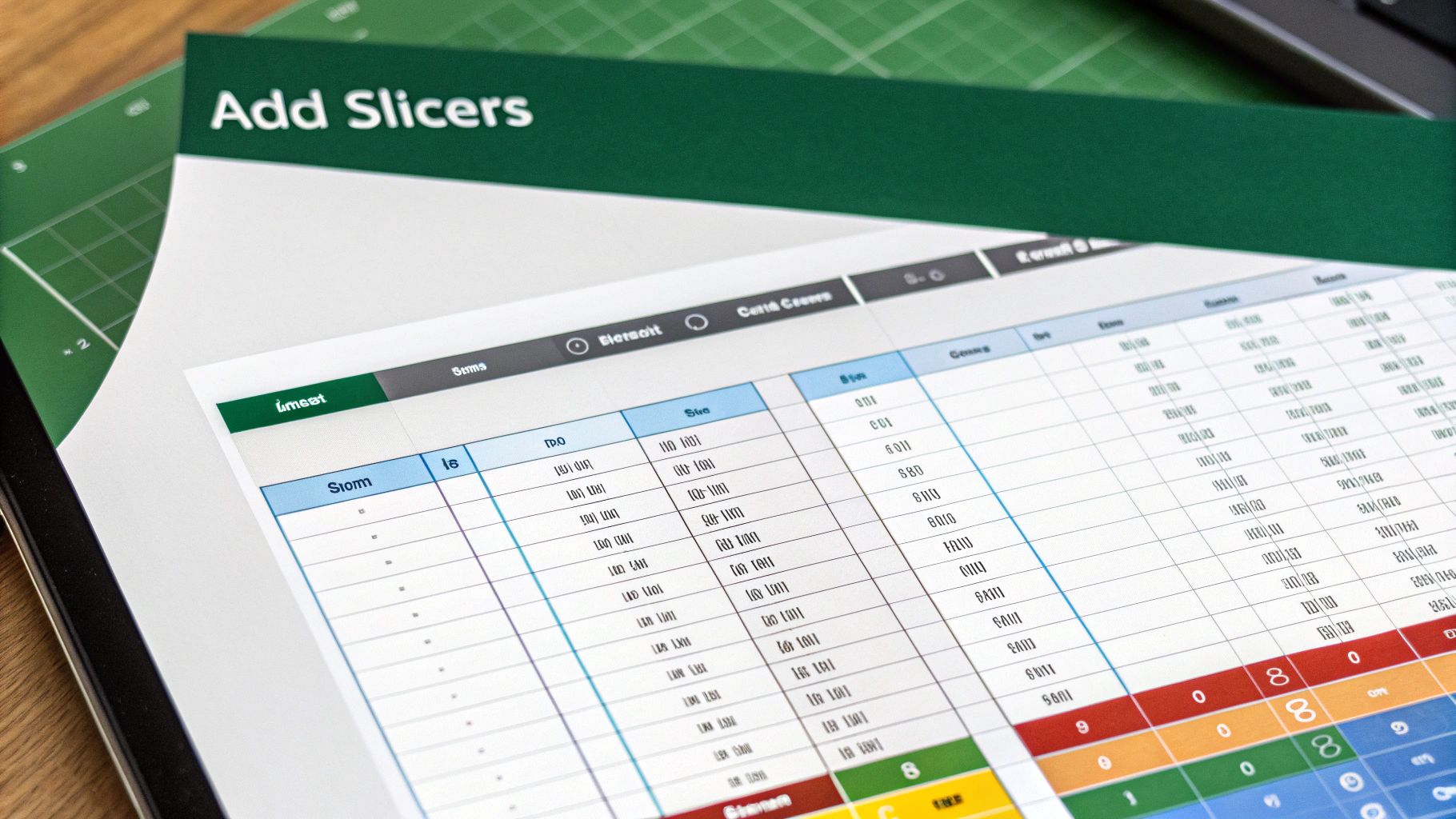
This image really breaks down the foundational workflow required before you can even think about adding interactivity.
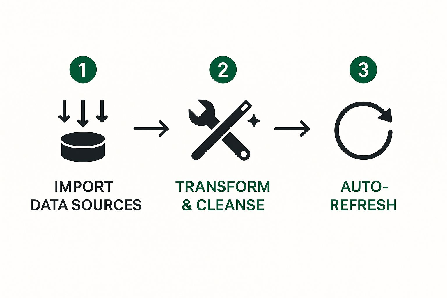
From getting the data in and cleaning it up to setting up auto-refresh, every step builds the platform for a dashboard that can handle live or frequently updated information. Excel's built-in tools, especially when paired with powerful add-ins, make this entire process far more manageable than it used to be.
Designing a Polished and Professional Interface
You’ve done the heavy lifting. The data is prepped, the PivotTables are working their magic, and your slicers are ready for action. Now comes the part that separates a good dashboard from a great one: the design. Function is king, but a sharp, professional interface is what gets your dashboard used, trusted, and valued.
Think of it this way: a cluttered or confusing layout can completely sabotage all your hard work. A well-designed dashboard, on the other hand, guides your audience straight to the insights that matter. It feels less like a spreadsheet and more like a purpose-built tool.
Crafting an Intuitive Layout
I’ve found that the best dashboards follow a natural reading pattern. You want to lead the viewer’s eye, not force them to hunt for information. The classic "F-pattern" from web design works wonders here.
Start by placing your most important Key Performance Indicators (KPIs) right at the top. These are your big-ticket numbers—total sales, customer acquisition cost, or overall profit margin. They should be impossible to miss, giving anyone a 30-second summary of the current situation.
From that top-level summary, the rest of the dashboard should tell a progressively deeper story. I like to arrange my charts to flow from left to right and top to bottom, moving from broad trends to more granular details. For instance, below the main KPIs, you could show a sales trend chart for the year, and next to that, a bar chart breaking down sales by product category.
Achieving a Clean, App-Like Feel
Want to instantly make your dashboard look more professional? Get rid of the default Excel clutter. That sea of gridlines and extra toolbars can make even the best charts look like they're still in the workshop.
Here are a few quick formatting tricks I use on every dashboard I build:
- Ditch the Gridlines: Head over to the View tab and simply uncheck the Gridlines box. This one change creates a clean canvas that makes your visuals stand out.
- Hide the Extras: For that true "dashboard" feel, you can also hide the Sheet Tabs and Formula Bar from the same View menu. This locks the user's focus purely on the data story you're telling.
- Pick a Smart Color Palette: Step away from the default Excel colors. Instead, choose a limited, cohesive color scheme. Often, using your company's brand colors is a great starting point. Consistency across all your charts creates a sense of unity and professionalism. For more ideas on this, checking out some data visualization best practices can be a huge help.
By removing visual noise and creating a clear information flow, you turn a spreadsheet into a focused decision-making tool. The ultimate goal? The user forgets they're even in Excel.
Protecting Your Hard Work
After spending hours perfecting your layout, the last thing you need is someone accidentally dragging a chart out of place. This is where worksheet protection becomes your best friend.
You can lock the dashboard down while keeping the interactive elements, like slicers, fully functional. To do this, just right-click each slicer, go to Size & Properties, and uncheck the "Locked" option under the Properties section. Once that's done, you can protect the rest of the sheet.
This final step ensures your dashboard is both robust and user-friendly, ready to be shared with confidence.
Your Top Excel Dashboard Questions, Answered
Even after following a guide, it’s completely normal to have a few questions. Building a truly interactive Excel dashboard is a bit of an art, and hitting a roadblock is part of the process. I get asked about this all the time, so let's tackle some of the most common sticking points.
Is Excel Actually Good Enough for Dashboards?
It absolutely is, especially when you're working on small to medium-sized projects or just need to get a dashboard up and running quickly. The biggest advantage? Almost everyone in the business world already has Excel and knows their way around it. It's the perfect starting point for creating some seriously powerful reports without needing to buy or learn a specialized BI tool.
Now, it's not without its limits. If you're dealing with massive datasets—I'm talking hundreds of thousands of rows—Excel can start to feel sluggish. Real-time collaboration also isn't as seamless as you'd find in a cloud-based platform, and setting up automatic data refreshes takes a little work with Power Query.
Can My Dashboard Refresh Its Own Data?
Yes, and you absolutely should set this up! This is what separates a static, one-time report from a living, breathing dashboard. The trick is to stop copying and pasting data and instead connect your Excel file directly to the source.
Here’s the basic workflow I use:
- First, head to the Data tab and use the Get Data feature. This is where you'll link to your source, whether it's another Excel file, a CSV, or a database.
- Once you've pulled the data in, make sure it’s formatted as an official Excel Table (the shortcut is
Ctrl + T). All your PivotTables and charts should be built from this table. - To update your data, you can always go to the Data tab and hit Refresh All. For true automation, right-click your query in the "Queries & Connections" pane, choose Properties, and set it to refresh every X minutes or each time the workbook is opened.
Honestly, setting up an automated data refresh is the single most important thing you can do. It ensures your decisions are always based on the latest information, saving you from the mind-numbing task of manual updates.
Can I Just Get ChatGPT or AI to Build the Whole Thing?
Not quite. At least not yet. An AI like ChatGPT can't just open up Excel and build a dashboard for you from a blank slate. What it can do, however, is act as an amazing co-pilot to help you build it faster and better.
I use it all the time to speed up the tedious parts. For example, you can ask it to:
- Write tricky formulas: "Give me an
XLOOKUPformula that finds the total sales for a product ID in one table and returns it to another." - Brainstorm chart ideas: "What's the best way to visualize the relationship between my marketing spend and the number of leads we generated last quarter?"
- Generate VBA code: "Write me a VBA macro that automatically formats all new charts in my company's brand colors."
This approach lets the AI handle the technical heavy lifting. You're still in the driver's seat, focusing on strategy and the story your interactive Excel dashboard needs to tell. It’s all about working smarter.
Ready to stop wrestling with formulas and let AI handle the heavy lifting? AIForExcel integrates directly into your spreadsheet, allowing you to clean data, generate insights, and build reports using simple, natural language. Take the first step toward faster, smarter analysis by exploring what you can build with AIForExcel.