Before you even think about picking a chart type, we need to talk about the bedrock of your entire project: your data. I can't stress this enough—a truly powerful dashboard in Excel is built on clean, well-organized data. Skipping this step is a surefire way to end up with a dashboard that’s not just frustrating to use, but flat-out wrong.
Build a Rock-Solid Data Foundation First
Every great dashboard I've ever built started not with a fancy visual, but with a simple, pristine table of data. This is easily the most important part of the process, yet it's the one people are most tempted to rush. Getting your data structure right from the beginning will save you countless headaches down the road.
Think of it like building a house. You wouldn't start putting up walls without a solid concrete foundation, right? The exact same principle applies here. Your data is that foundation.
This groundwork is absolutely critical, especially when you consider just how many businesses depend on this tool. Microsoft Excel is a powerhouse in the business world, with over 123,000 companies using it for everything from project management to, you guessed it, building dynamic dashboards. Its incredible versatility is why mastering its core functions is so valuable.
Embrace Raw, Transactional Data
So, what does a "good" data foundation look like? The secret ingredient is raw, transactional data. This means your source data should be a simple, unsummarized list of individual events or records.
For example, if you're building a sales dashboard, each row in your table should represent a single sale. It shouldn't be a summary of sales for a specific day or month.
Why is this so critical? Raw data gives you ultimate flexibility. You can slice, dice, and pivot it in any way you can imagine. If you start with pre-summarized data (like "Total January Sales"), you've lost the ability to dig deeper. You can't find out which products sold best that month or who your top salesperson was, because that detail is already gone.
The golden rule I live by when creating dashboards is simple: always start with the most granular data you can get. You can always summarize data up, but you can never drill down into details that don't exist in your source file.
Cleaning and Structuring Your Data for Analysis
Let’s be honest—data is rarely perfect right out of the gate. Before it's ready for your dashboard, it almost always needs some tidying up. Messy data is the number one reason dashboards fail. Your goal is to create a simple, flat table without any weird formatting or structural quirks.
To help you see what to aim for, here’s a look at a common "before and after" scenario.
Good vs Bad Data Structure For Dashboards
Many people are used to seeing data formatted like a report, with merged cells and subtotals. While this might look nice for printing, it's terrible for analysis. For a dashboard, you need a "raw data" format. This table breaks down the key differences.
| Characteristic | Poor Structure (Report Format) | Good Structure (Raw Data Format) |
|---|---|---|
| Header | Multi-row headers, merged cells for titles. | A single header row with a unique name for each column. |
| Data Layout | Grouped data with subtotals and blank rows for separation. | A continuous block of data with no blank rows or columns. |
| Cell Formatting | Merged cells are common for grouping categories (e.g., regions). | No merged cells. Each row and column has its own distinct cell. |
| Data Repetition | Values are often not repeated (e.g., a date is listed once). | Every cell is filled. Data is repeated on each row where it applies. |
| Totals | Contains subtotal and grand total rows within the data. | Contains only raw, transactional data. No summary rows. |
Getting your data from the "poor" column to the "good" column is the most important prep work you'll do.
Here are the key cleanup tasks I always perform:
- Kill the Merged Cells: Merged cells are a nightmare for sorting, filtering, and analysis. Go through and unmerge every single one.
- Delete Blank Rows & Columns: Your data needs to be a single, solid block. Delete any completely empty rows or columns breaking up the dataset.
- Fill in All the Gaps: Look for reports where a category (like a region or date) is listed once at the top of a section and then left blank for the rows below it. You need to copy that value down so every single row has an entry for that column.
- Standardize Your Formats: Consistency is key. Make sure all your dates are actually formatted as dates, numbers are numbers, and so on. Mixed data types will throw errors in your formulas and PivotTables.
The payoff for this cleanup is huge. Shifting from manual reporting to an automated dashboard can fundamentally change how you spend your workweek.
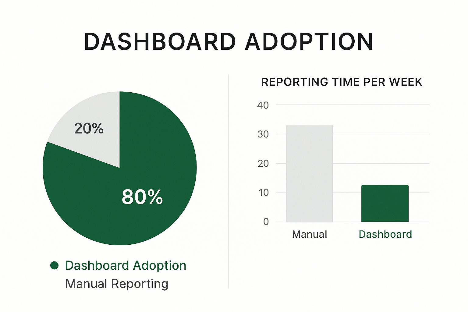
As you can see, a well-built dashboard in Excel can automate the vast majority of reporting tasks, freeing you up for more valuable, strategic work.
The Magic of "Format as Table"
Once your data is squeaky clean, there's one final, game-changing step: format it as an official Excel Table. This is not the same as just adding borders and colors!
Select any cell inside your data block and press Ctrl+T (or go to Home > Format as Table).
This single action converts your static range of cells into a dynamic, intelligent object. This unlocks several massive advantages:
- It Grows With Your Data: When you paste new rows of data at the bottom, the Table expands automatically. Your charts and PivotTables will instantly include the new data after a quick refresh. No more manually updating formula ranges!
- It Makes Formulas Readable: Tables use something called structured referencing. This means your formulas will use clear, readable names like
Sales[Amount]instead of cryptic cell references like$A$2:$A$5000. - It Boosts Performance: Excel is optimized to work with official Tables. Filtering, sorting, and calculating are often faster and more responsive, which makes a big difference in a large dashboard.
Summarize Your Data with PivotTables and Charts

Alright, your data is now clean, structured, and sitting pretty in a proper Excel Table. This is where the magic really starts to happen. We're about to turn that raw information into something you can actually use.
The engine behind almost every great dashboard in Excel? The humble, yet incredibly powerful, PivotTable.
Forget wrestling with complex SUMIFS or COUNTIFS formulas. A PivotTable lets you digest thousands of rows of data in seconds, all with a few simple drag-and-drop moves. It’s the quickest path from a daunting wall of numbers to clear, actionable insights.
To get started, just click anywhere inside your Excel Table. Then, head to the Insert tab on the ribbon and click PivotTable. Excel is smart enough to select your entire table as the data source automatically. Simply click OK, and Excel will place the new PivotTable on a fresh worksheet. This is a best practice—it keeps your dashboard elements neatly separated from your source data.
Building Your First Summaries
With your blank PivotTable ready, you’ll see the PivotTable Fields pane pop up on the right. This is your command center. It lists all the column headers from your data table, which are now the building blocks for your analysis.
Let's say you're working with a sales dataset. You can answer critical business questions in just a few clicks:
- What are our total sales by region? Drag the 'Region' field into the Rows area and the 'Sales Amount' field into the Values area. Boom. You have an instant summary.
- Which product categories bring in the most revenue? Just swap out 'Region' for 'Product Category' in the Rows area. Now you're looking at sales broken down by category.
- How many orders did we get each month? Drag 'Order Date' to Rows and 'Order ID' to Values. Excel will probably try to sum the Order IDs, which is meaningless. No problem. Right-click the sum in the Values area, choose Value Field Settings, and switch the calculation to Count.
This flexibility is what makes PivotTables so crucial for a dynamic dashboard. You can play around, experiment with different combinations, and slice your data until you uncover the key performance indicators (KPIs) that truly matter.
The genius of a PivotTable isn't just in summarizing data. It’s in its ability to pivot—to rapidly restructure the report and view your information from completely different angles, all without touching the original data.
If you really want to master this skill, our detailed guide on how to use an Excel Pivot Table is the perfect next step. It covers more advanced tricks like calculated fields and grouping.
From Numbers to Narratives with PivotCharts
A table full of numbers is great for analysis, but a chart is what tells a compelling story. A PivotChart is tied directly to a PivotTable, meaning when the table's data changes or you apply a filter, the chart updates on the fly. This automatic connection is the secret sauce that will make our dashboard interactive.
Creating one is simple. Click inside your finished PivotTable, go to the PivotTable Analyze tab, and click PivotChart.
Excel will offer a suggested chart type, but don't just accept the default. It's vital to pick a visualization that accurately represents your data and the specific point you're trying to make.
Choosing the Right Chart Type
Selecting the right chart is half the battle. A poor choice can confuse your audience or, worse, mislead them. Here's a quick cheat sheet for the most common scenarios:
| Use This Chart... | When You Want To... | Example Scenario |
|---|---|---|
| Column or Bar Chart | Compare distinct categories. | "Total sales per salesperson." |
| Line Chart | Show a trend over a continuous period. | "Website traffic by month over the last year." |
| Pie Chart | Show parts of a whole (use with 6 or fewer categories). | "Market share breakdown by product." |
| Area Chart | Show the magnitude of change over time. | "Contribution of different revenue streams over quarters." |
| Scatter Plot | Show the relationship between two numbers. | "Correlation between advertising spend and sales." |
Clarity should always be your top priority. A simple, easy-to-read bar chart is far more effective than a dazzling, complex one that nobody understands.
For now, your goal is to create several individual PivotTables and their matching PivotCharts, each on its own worksheet. Think of these as your analytical "Lego blocks," with each one answering a specific business question. In the next steps, we'll bring all these blocks together into one cohesive dashboard.
Design an Intuitive and User-Friendly Layout
So, you've crunched the numbers and your charts are ready. It's really tempting to just copy-paste everything onto a blank sheet and call it a day. But honestly, this is the moment that separates a good dashboard from a great one. An effective dashboard in Excel is much more than a jumble of visuals; it’s a thoughtfully designed interface that tells a clear story and guides the user's eye.
First things first, give your dashboard a proper home. I always start by adding a fresh, new worksheet and naming it something obvious like "Dashboard" or "Sales Overview." Think of this as your canvas. It keeps your final presentation completely separate from the "back-end" sheets where your PivotTables and raw data live, which immediately makes the whole thing feel cleaner and more professional.
Establish a Clean and Organized Structure
Clutter is the absolute enemy of clarity. When a dashboard is a mess, it’s hard to read and even harder to understand. The simplest trick I’ve found for creating a polished, organized look is to build a grid system.
Before I place a single chart, I select the entire dashboard sheet and shrink all the columns to a uniform, narrow width—maybe 3 or 4. This simple action gives me incredible control over aligning every single element perfectly.
Now you can start arranging your key visuals. Think like a newspaper editor: your most critical, high-level number (like total revenue or your main KPI) should go in the top-left corner. That’s where our eyes naturally start. From there, you can let the supporting charts and more detailed breakdowns flow from top to bottom and left to right, in order of importance.
A well-designed dashboard should just feel right. The user shouldn't have to hunt for information. The layout itself should guide them through the data, starting with a high-level summary and then inviting them to explore the details.
This structured approach is a cornerstone of effective visual communication. If you want to go deeper on this, exploring some established data visualization best practices will give you a solid foundation for building charts that don't just show data, but actually persuade.
Leverage Shapes for a Polished Look
Let's be real, standard Excel charts can look a bit... plain. A fantastic and simple way to elevate your design is by using basic shapes and text boxes. You can create a professional-looking header for your dashboard just by adding a colored rectangle across the top and placing a bold, clear title inside a text box.
This technique is also perfect for creating distinct sections. For instance, you could group all your sales-related charts under a "Sales Performance" header and all your marketing metrics under "Campaign ROI." This visual separation breaks up the information, making the entire dashboard much easier to scan and digest.
A few tips I've learned for using shapes effectively:
- Stick to a Palette: Don't go crazy with colors. Use your company's brand colors or pick a simple, clean palette of 2-3 complementary colors and stick with it.
- Embrace Whitespace: Resist the urge to cram every inch of the sheet with charts. Leaving empty space around your elements gives them room to breathe. It reduces the cognitive load and makes the dashboard feel far less overwhelming.
- Keep Fonts Consistent: Use one or two standard, easy-to-read fonts (like Calibri, Arial, or Segoe UI) for everything—titles, labels, and notes.
A Pro-Tip: The Excel Camera Tool
One of the most frustrating things about arranging a dashboard is how clunky charts can be. They're hard to resize and place with any real precision. I'm going to let you in on a game-changing tool that most Excel users have never even heard of: the Camera tool.
This little hidden gem lets you take a live, linked "picture" of any range of cells—including a chart—and paste it anywhere you want. The best part? This picture isn't static. It automatically updates whenever the original data or chart changes.
So why is this so powerful?
- Total Placement Freedom: You can resize and place the linked picture anywhere on your grid with pixel-perfect precision, without messing up the original chart's formatting.
- A Cleaner Workspace: It lets you keep your actual charts neatly organized on separate sheets (maybe next to their PivotTables), while only the clean "pictures" appear on the main dashboard.
To get it, you'll need to add it to your Quick Access Toolbar. Just right-click the toolbar, choose "Customize," change the "Choose commands from" dropdown to "All Commands," then find "Camera" and add it. Now, you can select a chart, click the Camera icon, and then click on your dashboard sheet to paste the linked image. It’s a simple trick that gives you a massive boost in design flexibility.
Bring Your Dashboard to Life with Slicers

Right now, your dashboard looks great. The charts are clean and the layout makes sense. But it's static—it’s just a picture of the data. Now for the fun part: making it interactive. This is where we introduce Slicers, the feature that transforms a simple report into a truly dynamic dashboard in Excel.
Think of Slicers as stylish, user-friendly filter buttons. They let anyone, regardless of their Excel experience, filter your charts and data with a single click. Instead of asking someone to navigate a clunky dropdown menu on a PivotTable, you're giving them intuitive buttons that are far more engaging to use.
Adding Your First Slicer
Getting your first slicer on the page is surprisingly simple. Just click on any of your PivotCharts. You'll see the "PivotChart Analyze" tab pop up in the ribbon at the top. From there, click Insert Slicer.
A small window will appear, listing all the fields from your source data. Put yourself in your audience's shoes—what's the first thing they'll want to filter by? It's usually things like:
- Product Category
- Region or Country
- Salesperson
- Team Name
For this example, let's check the box for 'Region' and click OK. And just like that, a new slicer object appears on your dashboard. You can drag it into position, resize it, and even use the Slicer tab to change its color scheme to match your dashboard's design.
Go ahead, try it. Click a region on your new slicer. The chart you started with instantly filters. It's a massive and immediate upgrade to the user experience.
The Real Magic: Connecting Slicers to Multiple Charts
Having a slicer control one chart is cool, but the real power move is making one slicer control your entire dashboard. This is what creates a truly unified, professional-grade tool. Imagine clicking "North America" and watching every single chart—sales trends, product performance, and team metrics—update in unison.
This is all done with a feature called Report Connections.
Select the slicer you just made. The Slicer tab will appear in the ribbon again. Find and click on Report Connections. This brings up a dialog box listing every PivotTable in your workbook.
You'll notice only the PivotTable tied to your original chart is checked. The magic happens when you check the boxes for all the other PivotTables that feed your dashboard charts. Once you click OK, that single slicer controls everything. Repeat this for any other slicers you add.
This is the defining step that elevates a collection of charts into a cohesive dashboard. When a user can filter the entire canvas with one click, they feel empowered to explore the data and uncover their own insights.
Filtering by Dates with Timelines
Slicers are brilliant for categories like products or regions, but what about dates? Filtering by specific date ranges can be a pain. For this, we use a special tool called a Timeline. A Timeline is essentially a slicer built specifically for handling date fields.
The process is almost identical. Click on a PivotChart, head back to the "PivotChart Analyze" tab, and this time choose Insert Timeline. Excel is smart enough to only show you fields formatted as dates. Select your date field and click OK.
A sleek, interactive timeline appears. It gives users a much better way to analyze time-based data. They can:
- Easily switch between viewing data by Years, Quarters, Months, or Days.
- Simply click and drag to select a custom date range, like from March 15th to May 10th.
And just like with the regular slicers, you have to connect the timeline to all your charts. Select it, go to the Timeline tab, and use Report Connections to link it to all relevant PivotTables. This is what ensures that when a user selects "Q2," every chart on the dashboard updates to show only Q2 data.
This functionality is especially critical when building a financial dashboard. In fact, advanced dashboard design often involves complex ratio and trend analyses, which you can learn more about in resources like the guide to strategic financial modelling on Scribd.com.
With both Slicers and Timelines connected and working together, your dashboard in Excel is no longer a static report. It's an exploratory tool that invites people to play with the data and makes analysis accessible to everyone.
Automate Updates and Share Your Final Dashboard

You’ve built an interactive, well-designed dashboard. That's a huge accomplishment. But a dashboard's true power lies in its ability to stay current and get in front of the right people. This last leg of the journey is all about making your hard work sustainable and shareable.
The real magic of building a dynamic dashboard in Excel this way is how simple it is to update. Say goodbye to the tedious monthly task of rebuilding charts from scratch. Since everything—your charts, your slicers—is connected to PivotTables fed by a central data Table, updates are a breeze.
When you get new data, like the latest month of sales figures, you just paste it into the empty rows at the bottom of your source data Table.
That’s it. Then, head to the Data tab on the ribbon and hit Refresh All. In a single click, Excel updates every PivotTable, which in turn refreshes every chart. Your entire dashboard reflects the latest information in seconds.
Protect Your Hard Work
Before you send your masterpiece out into the world, it’s smart to protect it from accidental edits. I’ve seen it happen too many times: someone means well, but they click the wrong thing, move a chart, or delete a crucial formula. A few simple protective measures can save you a world of headaches later.
Here's my go-to strategy for locking things down:
- Hide the “Back End”: Your audience doesn't need to see the messy kitchen. The sheets with your raw data and individual PivotTables can be confusing. Just right-click on those sheet tabs and select Hide. This keeps the focus squarely on the finished dashboard and stops people from getting lost or breaking something behind the scenes.
- Lock Down the Dashboard Sheet: You want people to use the slicers, but you probably don’t want them rearranging the charts or editing titles. Excel's sheet protection is perfect for this. You can lock the entire dashboard sheet while leaving the slicers and chart elements unlocked and fully interactive.
The point of protection isn't to be restrictive; it's to create a foolproof, guided experience. A well-protected dashboard makes it obvious what users can do (filter with slicers) and prevents them from accidentally doing what they shouldn't (like deleting a key visual).
If you want to take this to the next level, you can explore ways to fully automate Excel reports, which can streamline this process even more.
Choose the Right Sharing Method
With your dashboard finalized and protected, it's time to get it into the right hands. How you share it really comes down to your audience and what you want them to be able to do.
There’s no single "best" way; the right choice is all about your specific goal. Each method has its own pros and cons.
| Sharing Method | Best For | Pros | Cons |
|---|---|---|---|
| Sending a static snapshot for a presentation or a high-level email update. | Universal format, looks professional, and the file size is small. | Completely non-interactive. Users can't filter or explore the data. | |
| Excel File | Sharing with colleagues who need to explore the data and use the slicers themselves. | Fully interactive, allowing users to drill down and find their own insights. | Recipients must have Excel, and the file size can be large. |
| Cloud-Based Sharing | Real-time collaboration with a team using OneDrive or SharePoint. | Everyone always sees the latest version; enables co-authoring. | Requires a shared cloud environment and careful permissions setup. |
Even with a sea of powerful competitors, Excel remains a cornerstone for countless organizations. In the broader document management software market, G Suite has a massive 72.69% share. Yet Microsoft Excel holds a respectable 1.85% on its own against more than 260 other tools, as noted by 6sense.com's market analysis. This highlights its enduring relevance for managing and visualizing data in many business workflows.
Choosing the right sharing format ensures your audience gets exactly what they need from the powerful dashboard in Excel you've just created.
Common Questions About Excel Dashboards
Even with the best guide, you’re bound to hit a few snags when you start building your own dashboards. It’s just part of the process. Think of this section as a conversation with an experienced colleague, tackling the common frustrations and questions that pop up along the way.
Let’s walk through some of the most frequent challenges I see people face and get you the clear, practical answers you need to keep moving forward.
Why Is My Excel Dashboard Running So Slow?
There’s nothing worse than putting the finishing touches on a dashboard, only to find it lags and stutters with every click. When a dashboard feels sluggish, it's almost always due to a handful of common issues lurking beneath the surface.
More often than not, the culprit is a large dataset that hasn't been properly structured. If your source data is just a standard range of cells, you're making Excel work way harder than it needs to. The single most effective fix is to convert that data into an official Excel Table (Ctrl+T). This one move fundamentally changes how Excel stores and accesses the information, often resulting in a massive speed improvement.
Another major performance hog is the overuse of complex formulas, especially "volatile" functions like OFFSET, INDIRECT, or TODAY() that force constant recalculations. Whenever possible, shift the heavy lifting away from the spreadsheet grid and into your PivotTables by using calculated fields.
Performance is often a game of a thousand tiny cuts. Slowness rarely comes from one single issue but from the combined weight of many small inefficiencies. Optimizing your data structure and centralizing calculations are the most impactful changes you can make.
How Do I Make One Slicer Control Multiple PivotTables?
Ah, this is the trick that really brings a dashboard to life! It’s what transforms a collection of separate charts into a single, interactive tool. And the best part? It’s incredibly simple to set up.
By default, when you add a slicer, it only talks to the one PivotTable you had selected. To make it the master controller for your entire dashboard, you just need to link it up using Report Connections.
- First, click on the slicer you want to use as a master control. This makes the Slicer tab appear up in the ribbon.
- In that Slicer tab, look for the Report Connections button and click it.
- A small window will pop up, showing you a list of every single PivotTable in your workbook.
- Just go down the list and check the box next to each PivotTable you want this slicer to filter.
That's it! Now when you select an option on that slicer, all the connected PivotTables and their charts will update instantly. Just repeat this process for every slicer on your dashboard to create a truly seamless experience.
Can I Build a Dashboard Without Using PivotTables?
You absolutely can, but be warned: you're heading into more advanced territory. For the vast majority of projects, PivotTables strike the perfect balance between power and ease of use. They handle all the complex data aggregation for you without needing a single formula.
However, if you're an experienced user who craves total design freedom, you can build an amazing dashboard in Excel using dynamic array formulas. This approach is much more modern and flexible.
You'll be relying heavily on functions like:
- FILTER: To pull specific rows from your source data based on user selections.
- UNIQUE: To automatically generate lists for your dropdown menus.
- SORT: To arrange the results exactly as you want them displayed.
- SUMIFS / COUNTIFS: To perform the actual math on your filtered data.
With this method, you'd point your charts to the results of these dynamic formulas instead of a PivotTable. The biggest advantage is having 100% control over your layout. The trade-off is that it demands a much stronger grasp of Excel's formula engine and can be trickier to debug if something goes wrong.
What’s the Best Way to Handle Changing Data Ranges?
This is a classic headache. You build the perfect dashboard, but when next month's sales figures arrive, you have to go through and manually update the source data range for every single PivotTable. There's a much smarter way.
As I mentioned earlier, the key is to format your raw data as an official Excel Table before you do anything else. When you build a PivotTable from a proper Table, you're not pointing it to a fixed range like A1:G5000. You're pointing it to the Table object itself.
This is a game-changer. When you paste new rows of data at the bottom, the Table expands automatically to include them. The only thing you have to do is go to the Data tab and click Refresh All. Every single PivotTable and chart will instantly update with the new information. You'll never have to manually edit a data source again.
Feeling like you're spending more time fighting with formulas than finding insights? What if you could just ask your data questions in plain English? With AIForExcel, you can. Stop Googling formulas and start getting answers in seconds. Discover how AIForExcel can revolutionize your workflow and build your next dashboard in minutes, not hours.