Let's be real—3D charts in Excel often get a bad rap. Some data pros argue they're all flash and no substance. And sometimes, they're right. But if you dismiss them completely, you're missing a trick. When used thoughtfully, a 3D chart can bring a whole new dimension (literally) to your data storytelling, especially when you're trying to show how three different variables work together.
When Does a 3D Chart Actually Make Sense?
The main criticism against 3D charts is valid: perspective can mess with how we see the data. A bar in the foreground can easily look bigger than an identical one tucked away in the back, which can lead to misinterpretation. That's a genuine risk.
But the trick is knowing when to use them. It's not about making a standard bar chart look cooler. The real power of a 3D chart is its ability to add a Z-axis, a third layer of information that a flat, 2D chart just can't handle. This is your go-to tool when the relationship between multiple moving parts is the core message you need to get across.
Finding the Right Business Use Cases
So, when is it worth adding that third dimension? It’s all about situations where a simple two-way comparison just won't cut it.
Here are a couple of classic scenarios I’ve run into:
Analyzing Sales Data Across Multiple Fronts: Let's say you're looking at quarterly sales. A 2D chart is great for showing sales by region (X-axis) and revenue (Y-axis). But what if you also want to see which product lines are driving those numbers? A 3D column chart lets you add the product category as your third dimension (Z-axis). Suddenly, you can see how each product performed in every single region, all in one cohesive visual.
Visualizing Complex Financial Scenarios: A 3D surface chart is a lifesaver for modeling. For instance, you could plot how changes in marketing spend and product price impact overall profit. The chart would show peaks and valleys, helping you pinpoint the sweet spot for maximizing returns—an insight that’s tough to spot in a spreadsheet.
The capability to create a 3d chart excel has come a long way. Early versions were pretty basic, but Microsoft eventually brought in 3D column, pie, and surface charts, giving us better ways to map out data across three dimensions. It's interesting to look back at the brief history of how 3D charts in Excel developed over time.
My Two Cents: Never choose a 3D chart just for looks. Pick it when your story genuinely has three parts and their interaction is what truly matters. Used with purpose, a 3D chart tells a far more compelling story than a 2D chart ever could.
Creating Your First 3D Chart in Excel
Diving into your first 3D chart in Excel can feel a bit intimidating, but it's really quite simple once you get the hang of it. The biggest mistake I see people make isn't with the chart tools themselves—it's with the data they start with. A clean, well-organized data table is the absolute foundation for any 3D visual that's actually useful.
Let’s say you're a sales manager getting ready to present quarterly performance for different regions. Your spreadsheet probably has columns like "Region," "Quarter," and "Sales Revenue." This kind of simple, logical layout is exactly what you need. The whole point is to see how these three pieces of information relate, which is where a 3D chart really shines.
Prepping and Selecting Your Data
Before you even glance at the "Insert" tab, take a minute to look at your data. Is it clean? Get rid of any blank rows or columns right in the middle of your dataset, and make sure your headers are clear. For that sales report scenario, you might have your regions listed down the side, the quarters running across the top, and the sales numbers in the middle.
Once your table is set, the first hands-on step is to select everything you want to plot. Just click the top-left cell of your data (probably A1) and drag down to the bottom-right corner. Make sure you grab the row and column headers along with all the numbers. This tells Excel exactly what information to build the chart from.
Generating the Basic Chart
With your data selected, head over to the Insert tab in the Excel ribbon. You'll see a "Charts" section full of different icons. Find the icon for Column or Bar charts and give it a click. A menu will pop up, and you should see a section for "3D Column" or "3D Bar" charts.
For now, just pick the first option—a basic 3D Clustered Column chart. Excel will immediately drop a default version of the chart right onto your worksheet. It won't be pretty, but that's okay. This is just our starting point.
My Two Cents: The success of your 3D chart is decided long before you click "Insert." A logical data structure with clear categories, series, and values is the difference between a chart that delivers "aha!" moments and one that just creates confusion.
This basic process is the core of creating any 3D chart in Excel. The infographic below lays out these essential steps visually.
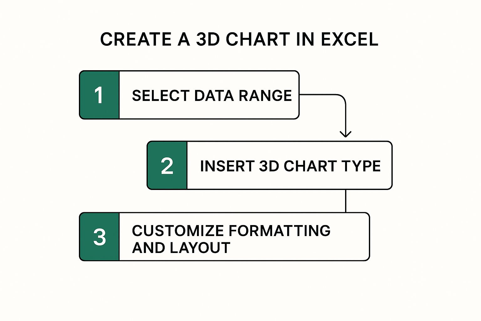
As you can see, getting the chart on the page is just the beginning. The real magic happens when you start customizing it to tell a clear story, which we'll get into next.
Making Your 3D Chart Clear and Impactful
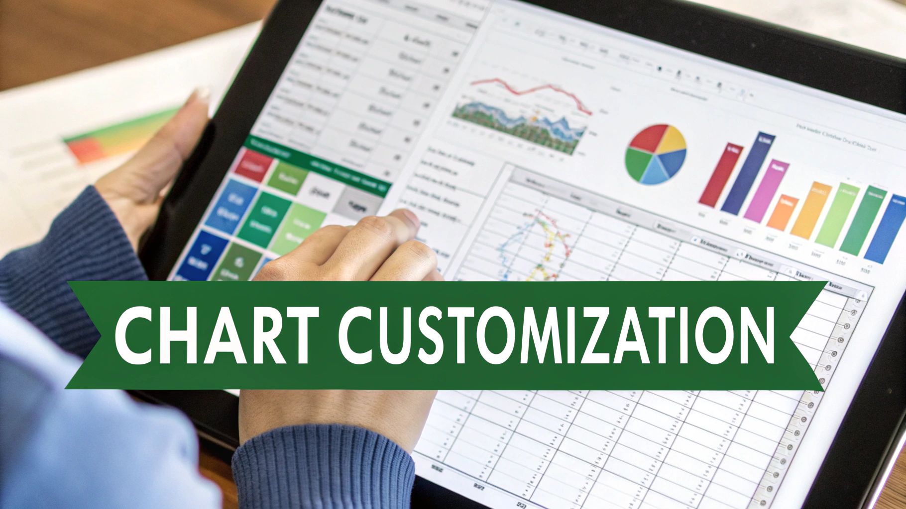
Think of Excel's default chart as a rough draft. It’s functional, but the real magic happens when you start customizing it. This is where you transform a basic visual into a communication tool that tells a clear and compelling story. To do this, you’ll want to get very familiar with the Format Chart Area options.
One of the biggest headaches with a 3d chart excel often creates is when taller bars in the front completely block shorter ones in the back. This isn't just messy; it actively hides data and can mislead your audience. The fix? Getting comfortable with 3D rotation and perspective.
Using 3D Rotation to Uncover Hidden Data
When your chart looks like a cluttered mess, just right-click on it and choose 3D Rotation. This brings up a panel where you can adjust the chart's viewpoint. Don't be shy about playing with these settings.
- X Rotation: This spins the chart horizontally. Sometimes, a tiny tweak is all it takes to reveal a data series that was completely hidden.
- Y Rotation: This tilts the chart forward or backward, giving you a better top-down or angled view. I find this especially useful for getting the right perspective.
- Perspective: This setting can either exaggerate the depth or flatten it out. I often dial the perspective back a bit to reduce distortion, which makes it much easier to compare bars of similar heights.
The goal isn't to create some wild, dramatic angle. You're simply trying to find a viewpoint where every single data point is visible and easy to grasp. A few small adjustments here can make a world of difference.
Pro Tip: I always start with small, incremental changes to the rotation values. You’d be surprised how much a five-degree adjustment can change the view. If you go too far, you can just create new visibility issues. It’s all about finding that sweet spot where every piece of data is present and accounted for.
Adding Polish with Color and Formatting
Smart color choices do more than just make a chart look nice—they guide your viewer's eye. Ditch Excel's default palette and pick colors that actually support your message. For example, you could use different shades of the same color to show a trend, or use a bold, contrasting color to make one particular data series pop. These decisions are central to good visual communication, which we cover in more detail in our data visualization best practices guide.
Beyond color, a few other formatting touches can add a professional finish without becoming a distraction.
- Data Labels: Adding labels directly onto your data points is a game-changer. It saves your audience from having to trace lines back to an axis, which makes your chart quicker to understand and less prone to misinterpretation.
- Lighting and Bevel: You can find these effects under 3D Format. Use them with a light touch. A soft bevel can make your columns look more tangible and defined, but harsh lighting can create glare that hides details. Remember, the goal is a subtle polish, not a Hollywood special effect.
By thoughtfully applying these customizations, your 3d chart excel creation will not only look sharp but will also deliver its message with precision and clarity.
Telling Complex Data Stories with Advanced Charts
Sometimes, a standard 3D column chart just won't cut it. When your data has more than two layers, you need a visual that can handle that complexity without becoming a mess. This is where a more advanced 3D chart in Excel, like a 3D bubble chart, can really shine, helping you tell a sophisticated story in a single, powerful graphic.
Let's imagine you're a product manager analyzing your company's portfolio. You're juggling three crucial metrics for each product: total sales, profit margin, and market share. Instead of spreading this across multiple charts, a 3D bubble chart lets you map all three variables at once. You could set it up like this:
- X-axis: Total Sales
- Y-axis: Profit Margin
- Bubble Size: Market Share
Suddenly, you can see the whole picture. High-performing "star" products jump out, and you can instantly spot underachievers needing attention. It transforms a potentially cluttered dashboard into one clear, insightful visual.
Building Out Sophisticated Visuals
While Excel is an incredible tool, it doesn't have a ready-made option for every advanced chart you can dream up. For something like a 3D bubble chart, you'd typically have to get creative with a 3D scatter plot or turn to a specialized add-in. Thankfully, you don't always have to start from zero.
A powerful visualization does more than just show numbers; it reveals the story hidden within them. A 3D bubble chart, for example, can immediately show you which products are both high-margin and high-volume—an insight that might take much longer to find in a raw data table.
The business world's demand for better data storytelling has led to a rise in tutorials and add-ins that fill these gaps. A popular tool like ChartExpo, for example, simplifies creating complex charts directly in Excel, letting you build things like 3D bubble charts without the manual headache. You can see how these tools simplify complex chart creation on YouTube.
Using an add-in brings a bigger business intelligence toolkit right into your familiar Excel workspace. They do the heavy lifting on the backend, which frees you up to focus on what really matters: the insights your data is trying to show you. If you feel like you're spending more time fighting with chart settings than analyzing results, it might be a good time to improve your approach to data analysis in Excel.
Avoiding the Common Pitfalls of 3D Charts

With great visual power comes great responsibility. A poorly designed 3D chart in Excel can do more harm than good, confusing your audience or, even worse, actively misleading them. The biggest trap by far is perspective distortion—an optical illusion where the chart's angle makes some data points look bigger or smaller than they really are.
This one issue can completely tank the credibility of your report. Think about a 3D pie chart where the slice closest to you looks massive compared to one in the back, even if their values are nearly the same. It's a classic case of style getting in the way of substance. Always remember to put data accuracy before flashy visuals.
While market research suggests 15-20% of Excel charts get the 3D treatment, their use is often limited for this very reason. To dig deeper into this, you can learn more about how chart selection impacts data reporting and the psychology behind it.
Keeping Your Data Honest
Avoiding these common mistakes just takes a bit of intention. It's all about finding that sweet spot where your chart is both visually engaging and easy to understand.
- Watch Out for Hidden Data: This problem, known as occlusion, is when taller columns in the front completely hide shorter ones behind them. The fix is in your 3D Rotation settings. Tweak the X and Y axes until every single data point is clearly visible from one angle.
- Label Everything: Don't make people squint or guess. Add data labels directly onto your columns, bars, or pie slices. This gives them the exact numbers, instantly clearing up any confusion caused by the 3D perspective.
- Skip the Exploding Pie: Exploding the slices of a 3D pie chart might look cool, but it just makes the distortion worse. For an honest comparison of parts to a whole, keep all the slices together.
The best 3D charts are the ones where the third dimension adds real context, not just visual noise. If you find yourself endlessly rotating a chart just to find a "good-looking" angle, it's a sign you might be headed in the wrong direction.
Ultimately, the most valuable skill is knowing when to just say no. If your 3D chart in Excel hides data or needs a five-minute explanation, a simple 2D chart is almost always the better, more professional choice. Clarity should be your guide.
And if you find yourself spending too much time on these formatting tweaks, you might be interested in how an AI for Excel assistant can handle chart creation and styling for you, all from a simple text prompt.
Got Questions About 3D Charts in Excel?
Creating a 3D chart in Excel is usually straightforward, but a few common frustrations can pop up along the way. If you've hit a snag, you're not alone. Here are some quick solutions to the most frequent issues I see people run into.
What Do I Do When My Data Is Hidden in a 3D Chart?
This is probably the most common headache with 3D charts. You've got taller columns or bars in the front completely hiding the shorter ones in the back. It’s a classic issue called occlusion.
The fix is surprisingly simple. Just right-click on your chart and select 3D Rotation. From there, you can play with the X and Y Rotation values. Honestly, a small nudge of just a few degrees is often all it takes to bring that hidden data back into view.
For another quick fix, you can also lower the Perspective value in that same menu. This will slightly flatten the chart's appearance, which can make it much easier to see all the data points at once without making things look too distorted.
Can I Put a 2D and 3D Chart Together?
I get this question a lot. Unfortunately, Excel doesn't let you mix 2D and 3D chart types within the same chart object. They are fundamentally different formats.
The best workaround is to create two separate charts—one 2D and one 3D—and then just place them next to each other on your worksheet. This is a great way to build a mini-dashboard that lets you compare the two perspectives directly.
My Pro Tip: The vast majority of 3D chart problems, like hidden data or weird angles, are solved in the 3D Rotation and Format Data Labels menus. Getting comfortable with these two tools will save you a ton of time and frustration.
Why Does My 3D Pie Chart Look So Warped?
Ah, the infamous distorted 3D pie chart. They are notorious for making the slice closest to the viewer look much bigger than it actually is, which can be seriously misleading. It's a natural side effect of adding perspective.
To combat this, you have a couple of solid options:
- Adjust the rotation. Nudge the chart's angle to give your audience a more top-down, "flatter" view. This immediately reduces the perspective effect.
- Always add data labels. This is non-negotiable for 3D pie charts. By displaying the actual percentages directly on the slices, you ensure no one misinterprets the proportions, no matter the angle.
Tired of manually tweaking chart settings? What if you could just ask for the visual you need and have it appear? AIForExcel is a conversational AI assistant that builds charts, generates formulas, and analyzes your data on command. Simply describe what you need in plain English and let the AI handle the heavy lifting in seconds.