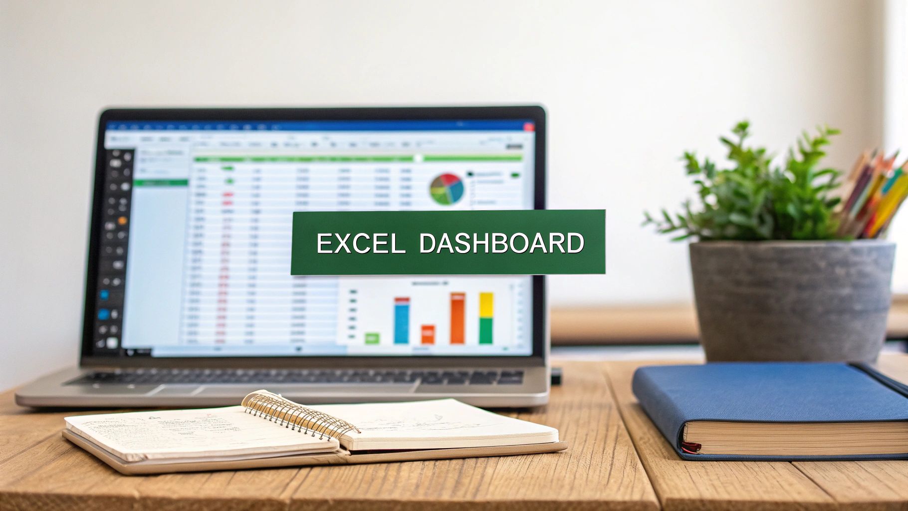
Taming Your Data Before You Analyze
Before you even dream of building those impressive pivot tables or eye-catching charts, there’s a crucial, unglamorous reality we need to confront: raw data is almost always a mess. Diving straight into analysis with messy data is like trying to build a house on a shaky foundation—it’s destined to crumble. This initial cleanup phase is where the real work begins, and frankly, it’s what separates reliable insights from dangerously misleading conclusions.
This isn’t just about deleting a few extra rows. Think about a typical sales report. You might have customer names entered inconsistently ("John Smith" vs. "smith, john"), dates formatted as text, and mysterious blank cells where sales figures should be. These aren't minor typos; they are errors that can completely throw off your calculations. Learning how to analyze data in Excel properly starts with learning how to clean it.
Spotting and Fixing Sneaky Data Issues
The first part of any analysis is to become a data detective. Your mission is to hunt down the inconsistencies that will sabotage your work later. Instead of manually scanning thousands of rows, which is both tedious and prone to error, you can use a few smart Excel tools to make this job much easier.
Here are some common culprits I always look for in my datasets:
- Duplicate Records: In a customer database, a duplicate entry could mean you’re undercounting unique customers or overstating their purchase frequency. Excel’s Remove Duplicates tool (found in the Data tab) is perfect for quickly eliminating these.
- Inconsistent Formatting: A classic example is having dates stored as text. This prevents you from sorting chronologically or calculating time-based metrics. The Text to Columns feature can be a lifesaver here, allowing you to convert entire columns to the correct format.
- Hidden Spaces and Characters: Sometimes, cells contain leading or trailing spaces that aren’t visible but can cause VLOOKUPs to fail. The TRIM function is your best friend for getting rid of these pesky extra spaces.
Before we dive deeper, here's a quick look at some common data problems you'll encounter and the best Excel tools to tackle them.
| Data Issue | Excel Solution | Time Investment | Impact on Analysis |
|---|---|---|---|
| Duplicate Entries | Data > Remove Duplicates tool |
Low (seconds to minutes) | High: Skews counts, averages, and unique customer metrics. |
| Inconsistent Text (e.g., "NY" vs. "New York") | Find and Replace, Flash Fill, or IF formulas |
Medium (minutes to an hour) | High: Prevents accurate grouping and filtering. |
| Mixed Data Types (e.g., dates as text) | Text to Columns feature or VALUE function |
Medium (minutes) | High: Makes chronological sorting and date calculations impossible. |
| Extra Spaces (leading/trailing) | TRIM function |
Low (seconds) | Medium: Causes lookup formulas (like VLOOKUP) to fail. |
| Blank Cells or Zeros | Go To Special > Blanks, then fill or delete |
Low (seconds) | Medium: Can lead to errors in calculations and charting. |
| Incorrect Capitalization | PROPER, UPPER, LOWER functions |
Low (seconds) | Low: Primarily an aesthetic issue but can affect lookups if case-sensitive. |
As the table shows, a small investment of time in cleaning can prevent major headaches and flawed conclusions down the line.
Spending time on these tasks isn’t just about being neat; it’s about ensuring the integrity of your work. Its accessibility and flexibility are why, even with specialized platforms available, Excel remains a dominant force for data tasks. The trust your boss places in your final report is built right here, in the cleanup phase.
Excel Formulas That Actually Move the Needle

Once your data is clean, you can start asking it questions. Formulas are your main way to get those answers. Sure, everyone knows SUM and AVERAGE, but the functions that really make a difference are the ones that can look up, combine, and calculate information on the fly. These are the formulas that save you from hours of manual work and prevent costly mistakes. For anyone serious about how to analyze data in Excel, getting good at a few key formulas is a must.
Picture this: you have a sales report with transaction IDs, but a separate table has all the customer details. Your boss wants to see sales performance by customer name, not just some random ID. This is a classic business problem that's perfect for a lookup formula.
The Modern Alternative to VLOOKUP
For years, VLOOKUP was the standard tool for this job, but it has its frustrations—it can only look for data in columns to the right, and it can be pretty inflexible. That's where XLOOKUP comes in. It's the more powerful and intuitive successor that's much easier to work with. XLOOKUP can look in any direction, lets you set a custom message for errors, and is just more reliable overall.
Let's go back to our sales scenario. To pull the customer's name into your sales report, your XLOOKUP formula would look something like this:
=XLOOKUP([@[Attendee ID]], Customer_Table[ID_Column], Customer_Table[Name_Column], "Name Not Found")
Here's what that formula is doing:
- It's looking up the Attendee ID from your main table.
- It searches for that ID in the ID_Column of the
Customer_Table. - It grabs the matching value from the Name_Column.
- If it can't find a match, it displays "Name Not Found" instead of a confusing
#N/Aerror.
This single function makes merging datasets incredibly simple and helps you avoid errors.
Combining Data and Calculating Metrics
Beyond just looking up data, you often need to create new information. Let's say you have separate columns for "Join Time" and "Leave Time" and need to figure out how long someone was in a meeting. A simple subtraction formula like =[@[Leave Time]]-[@[Join Time]] gives you that duration instantly. Now you can analyze meeting engagement or employee work hours.
The real magic happens when you start combining these functions. You can use IF statements to categorize data, COUNTIFS to tally records based on multiple criteria (like sales for a specific product in a specific region), and SUMIFS to add up values under complex conditions. By getting comfortable with a handful of these formulas, you turn Excel from a simple spreadsheet into a dynamic analysis tool.
If you want to explore more advanced techniques, you might find our guide on data analysis in Excel helpful. The key is to always think about the business question first, then find the formula that gets you the answer.
Pivot Tables That Actually Answer Your Questions
Once you've cleaned up your data and plugged in some useful formulas, it's time to fire up the real engine of data exploration in Excel: the Pivot Table. A lot of people just drag a few fields to get basic sums or counts, but that’s like using a sports car for a quick trip to the corner store. Pivot Tables are built for deep, interactive analysis, letting you slice, dice, and rearrange your data in seconds to find patterns you'd otherwise miss. For anyone learning how to analyze data in Excel, getting comfortable with Pivot Tables is a game-changer.
Think about it: you have a full year of sales data. A simple total doesn't tell you much. With a Pivot Table, though, you can instantly group those sales by quarter and then by region to see when and where sales are spiking. With another click and drag, you can shift your view to see the same data broken down by salesperson, identifying your top performers for each product line. This ability to instantly shift your perspective is what makes them so essential. You're not just answering a single question; you're ready to tackle the dozen follow-up questions that your team will definitely ask.
Going Beyond Basic Summaries
To get real answers, you need to build your Pivot Table with a clear question in mind. Don't just randomly toss fields into the boxes and hope for the best. Think about the story you're trying to uncover.
- Calculated Fields: What if you need to analyze profit margins, but your original data only has "Sales" and "Cost" columns? Instead of messing with your raw data, you can create a Calculated Field right inside the Pivot Table. This keeps your analysis clean and calculates the metric dynamically as you adjust the table.
- Grouping Data: Pivot Tables are fantastic at grouping. You can easily bundle dates into months, quarters, and years to spot trends over time. For numbers like customer age or purchase amount, you can create custom ranges (like 20-29, 30-39) to build a clear frequency distribution.
The Bigger Picture of Data Analysis
Knowing your way around tools like Pivot Tables is becoming more and more valuable. The global data analytics market, where Excel is a cornerstone for foundational data work, was valued at around USD 48.53 billion in 2024. Projections show it rocketing to over USD 329 billion by 2033. To see the details behind this trend, you can explore the full findings on the data analytics market. This massive growth highlights just how critical it is to turn raw numbers into smart business decisions.
When you move past simple summaries, your Pivot Table becomes less of a static report and more of an interactive dashboard. This is the heart of effective data analysis—not just showing numbers, but making them explorable and insightful. For a more detailed walkthrough, take a look at our guide on how to use Excel Pivot Tables.
Charts That Tell Stories (Not Just Show Numbers)
 After all the hard work sorting data and building pivot tables, the final step is often the most important: showing people what you found. A great chart can make your entire analysis "click" for your audience. On the flip side, a confusing one can make all that effort feel wasted. The real goal is to create visuals that tell a compelling story, not just throw a jumble of numbers on a screen. For anyone learning how to analyze data in Excel, this is the skill that gets your hard work noticed.
It's time to think beyond the standard pie or bar chart. While they have their place, more advanced charts can uncover deeper insights. For instance, instead of showing sales and profit margins on two separate charts, a combination chart can display both metrics on a single graph. This immediately shows their relationship—you might discover that your highest-selling products aren't actually your most profitable. That kind of visual connection is powerful and way more convincing than making your boss flip between two slides.
Choosing the Right Chart for Your Story
The kind of chart you select should directly back up the point you're making. Don't just go for the one with the most colors. Think about the narrative you want to build with your data.
Here are a few common scenarios and the charts that best tell their stories:
- Showing a Trend Over Time: A line chart is perfect for tracking things like monthly revenue or website traffic. It clearly shows the peaks and valleys, making it easy to spot seasonal trends or the effect of a recent marketing push.
- Comparing Categories: When you're comparing separate groups, like sales figures across different regions, a bar chart is still your best friend. A simple but effective tip is to sort it from largest to smallest (or vice versa) to instantly highlight top and bottom performers.
- Visualizing Proportions: If you need to show how different parts make up a whole, like the breakdown of a marketing budget, a treemap can be a great alternative to a pie chart, especially when you have a lot of categories.
Making Your Charts Dynamic and Clear
A chart should do more than just present data; it should look professional and be easy to understand at a glance. Always use clear, direct titles that state the main takeaway (e.g., "Q3 Sales Growth Driven by New Product Launch" is much better than "Q3 Sales"). You can also use conditional formatting within your charts to make key data points pop, like coloring bars that go above a certain target.
Here’s another pro tip: build your charts from the data in a Pivot Table. When you do this, your charts update automatically whenever you refresh your raw data. This saves you from having to manually remake them and ensures your presentations are always based on the latest information.
Advanced Techniques for Serious Business Intelligence
 Once you've gotten the hang of basic summaries, you can unlock a world of professional business intelligence right inside Excel. This is the point where you shift from just reporting on what happened to predicting what will happen next. These techniques are what really separate an Excel power user from the crowd, turning spreadsheets from static reports into dynamic tools for strategic planning.
For instance, instead of only tracking past sales, you could use regression analysis to forecast future revenue based on variables like your marketing spend or seasonal trends. This changes the conversation from being reactive to proactive, helping you put your resources where they’ll count the most. These skills are becoming essential in the job market; the U.S. Bureau of Labor Statistics projects a 23% increase in data analyst jobs by 2032, driven by companies needing people who can translate data into forward-looking insights. You can read more about the growing demand for data analysts and see why mastering these skills is a smart career move.
Modeling Business Outcomes
Beyond simple forecasting, advanced analysis lets you model potential futures. This is where you can test out business strategies without any real-world risk.
- Scenario Analysis: With Excel’s Scenario Manager, you can build different versions of your financial models. Think of it as creating an "optimistic case," a "pessimistic case," and a "most likely case" to see how your bottom line might change under various conditions.
- Sensitivity Testing: This technique helps you pinpoint which variables have the biggest impact on your outcomes. You might find that a small 5% change in material costs affects your profit more than a 10% change in sales volume.
- What-If Analysis: Tools like Goal Seek let you work backward. If you have a target profit in mind, you can ask Excel to figure out the exact number of units you need to sell to hit that goal.
To help you decide which tool fits your needs, the table below compares some of Excel's most powerful analysis features.
Advanced Excel Analysis Features Comparison
Overview of Excel's advanced analysis capabilities and when to use each technique
| Analysis Type | Excel Tools | Best Use Cases | Skill Level Required |
|---|---|---|---|
| Forecasting | FORECAST.ETS, Regression Analysis (Data Analysis ToolPak) |
Predicting future sales, inventory needs, or website traffic based on historical data. | Intermediate |
| Scenario Modeling | Scenario Manager, What-If Analysis |
Evaluating how different economic conditions (e.g., inflation, market growth) could impact a budget. | Intermediate |
| Risk Assessment | Monte Carlo Simulation (requires add-ins), Data Tables |
Quantifying risk in project timelines or assessing potential returns on investment portfolios. | Advanced |
| Optimization | Solver Add-in |
Finding the ideal product mix to maximize profit with limited resources, like staff or materials. | Advanced |
These comparisons show that for every complex business question, Excel likely has a specialized tool to help find the answer.
Getting comfortable with these methods is key to learning how to analyze data in Excel at a professional level. It empowers you to deliver the kind of high-impact intelligence that truly guides major business decisions.
Leveraging AI Features for Faster Insights
Beyond the usual formulas and pivot tables, Excel now comes with built-in AI features that can seriously speed up your analysis. Think of these tools as an intelligent assistant, ready to spot patterns and handle the boring tasks that once ate up hours of your day. This lets you worry less about writing the perfect formula and more on what the data is actually trying to tell you, which is a key part of learning how to analyze data in Excel.
Let’s say you’re dealing with a messy dataset where dates are mixed in with text, like "October 26, 2024 10:00 AM". Instead of wrestling with complicated DATEVALUE and TIMEVALUE formulas, you can let an AI assistant sort it out. Another great example is Flash Fill, which cleverly recognizes patterns as you work. If you start manually reformatting a column—say, changing "smith, john" to "John Smith"—Flash Fill will catch on and offer to finish the entire column for you in a single click.
From Manual Work to Automated Insights
These AI capabilities go way beyond just cleaning up data. Modern Excel, especially when combined with other tools, can understand plain English prompts to pull out insights. Instead of spending time manually filtering for negative customer reviews, you could just ask something like, "Summarize the feedback for all ratings under 3 and identify the main themes."
This completely changes how you approach your work:
- Automatic Pattern Recognition: A feature like Ideas (now called Analyze Data) on the Home tab scans your entire dataset and automatically suggests useful Pivot Tables and charts. It often highlights trends you might have otherwise missed.
- AI-Powered Formula Suggestions: Rather than searching online for the right syntax, you can describe what you need. The AI can then build the right formula, whether it's an
XLOOKUPto combine tables or a simple subtraction to calculate the time between two dates. - Integration with Other Tools: The real magic happens when you connect Excel to specialized AI. For a deeper look at how these connections function, you can explore our guide on AI for Excel, which details how these tools can help with everything from customer segmentation to tracking performance.
By getting comfortable with these features, you turn Excel from a simple calculator into a proactive partner in your analysis. This shift not only makes you faster and more accurate but also helps uncover insights that traditional methods might miss, giving you a real edge.
Your Complete Excel Analysis Workflow
Now that you're comfortable with the individual tools, let's put them together into a repeatable process. The secret to learning how to analyze data in Excel isn't just knowing the functions; it's about creating a consistent workflow that takes you from raw numbers to a polished presentation. This isn't about following a strict set of rules, but rather a flexible guide to make sure you don’t skip important steps, like double-checking your figures before they go public. It’s all about building confidence in your results, every time.
A reliable workflow is built on good habits. For instance, I always use a standard naming system for my files, like Report_Sales_Q3_v1.0. This simple practice has saved me from confusing versions and sending the wrong report more times than I can count. Another great time-saver is creating analysis templates for tasks you do regularly, such as monthly performance reports. You set up the complex formulas and chart designs just once, and then you can simply drop in the new data each month.
From Initial Import to Final Insights
The journey from a messy CSV file to a clear, actionable dashboard usually follows the same path. It starts with importing and cleaning your data—that crucial first step we talked about. Then, you move into the exploration phase. This is where you use Pivot Tables to look at the data from different angles and formulas to calculate important business metrics. It's your chance to test ideas and find the first clues hidden in the numbers.
Finally, you create visuals for your most important discoveries and build the story you want to tell. For analyses you perform often, you can even have macros do some of the work for you. The simple flow below shows how you can automate exporting results from a specific data range.
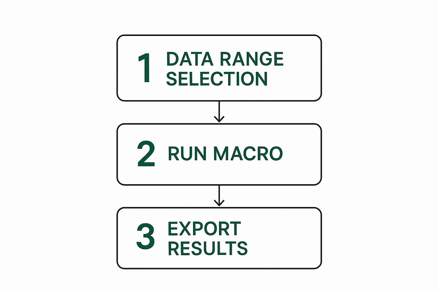
This process shows that once your analysis logic is in place, automation can take care of the repetitive export tasks. The key is to document everything, from where you got your data to the reasoning behind your calculations. This makes your work transparent and easy for others (and your future self) to understand and trust. Adopting this systematic approach turns Excel from a basic spreadsheet program into a powerful engine for business intelligence.
Tired of wrestling with complex formulas and spending hours on manual tasks? AIForExcel connects directly to your spreadsheet, letting you analyze data using simple, conversational language. Get instant insights, automate your reporting, and make smarter decisions faster. Try AIForExcel today and see the difference.