Getting Your Data Foundation Right From Day One

Data analysis in Microsoft Excel isn't simply about plugging in formulas and creating charts. It's about establishing a solid data foundation from the outset. Think of it as building a house: a shaky foundation will lead to instability and potential collapse. Likewise, poorly structured data in Excel will hinder your analysis and could lead to unreliable conclusions. This section will explore the essentials of building that crucial foundation for successful data analysis in Excel.
Essential Data Formatting Practices
First, we'll examine data formatting. Consistent formatting is much more than making your spreadsheet look neat; it's crucial for accurate data analysis. For example, inconsistent number formats can cause calculation errors, while extra spaces or inconsistent capitalization can disrupt sorting and filtering. Imagine trying to add a column where some numbers are formatted as text; Excel won't recognize them as numerical data, resulting in a wrong sum.
Here are some key data formatting practices to follow:
- Use consistent number formats: Make sure all numerical data in a single column shares the same format (e.g., currency, percentage, general number).
- Remove leading/trailing spaces: Eliminate extra spaces that might interfere with your data analysis.
- Standardize text case: Maintain consistent capitalization (e.g., all uppercase, all lowercase, or title case) within text fields to prevent sorting issues.
- Validate data types: Double-check that each column contains only the intended type of data (e.g., numbers in number columns, dates in date columns).
These practices help to ensure your data is clean and ready for analysis. For a deeper dive into data preparation, you can explore additional techniques in our data cleaning guide. Check out our guide on how to master data cleaning.
Data Quality: Spotting and Fixing Issues
Next, let's discuss data quality. Even with meticulous formatting, underlying data quality problems can significantly impact your analysis. Missing values, duplicate entries, and inaccurate data points can skew results and lead to flawed insights. Analyzing sales data with numerous missing entries, for instance, could artificially lower your average sales figures.
Here are some common data quality checks to implement:
- Identify missing values: Utilize Excel's built-in features or visually scan your data for empty cells or placeholder values.
- Remove duplicates: Use Excel's "Remove Duplicates" feature to efficiently eliminate redundant data entries.
- Validate data accuracy: Cross-check your data against other reliable sources or conduct logical checks to uncover and correct inaccuracies.
Microsoft Excel holds a substantial 7.95% market share in the productivity software market, competing with over 113 other tools for data analysis and management. Find more detailed statistics here. Its popularity stems in part from its flexible functionality and user-friendly interface. Mastering Excel data analysis provides you with valuable skills applicable across a wide range of professional contexts. By establishing a strong foundation in data formatting and quality from the start, you pave the way for accurate and insightful data analysis.
Unlocking Pivot Table Power Beyond The Basics
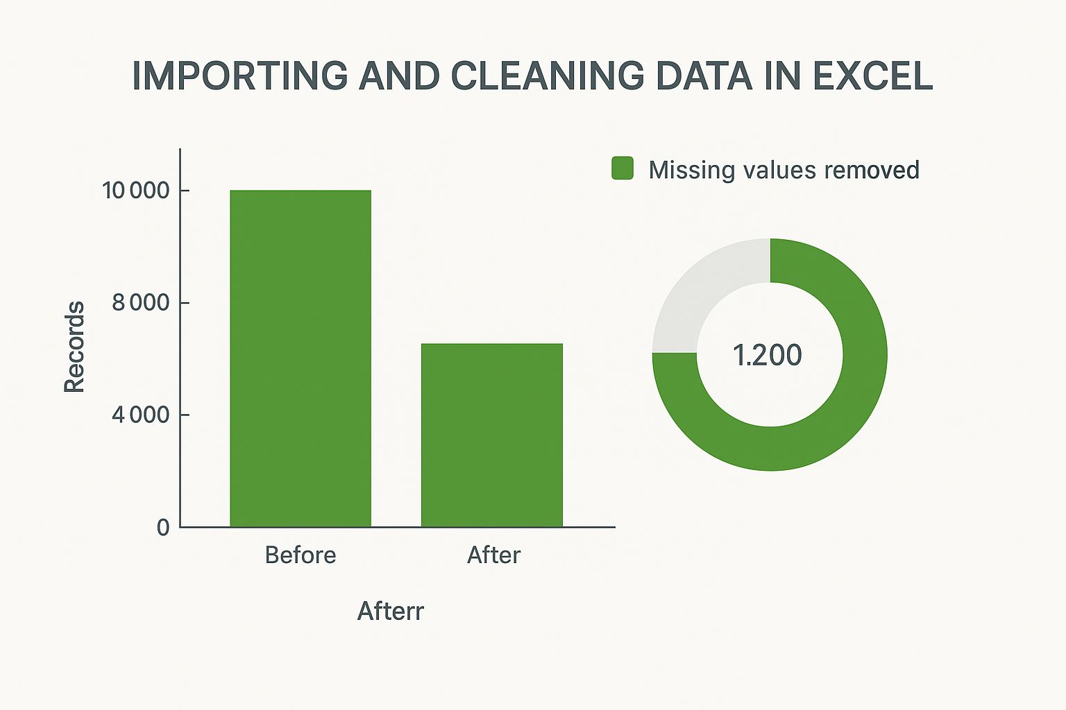
The infographic above visualizes the impact of data cleaning on a dataset in Excel. It shows the total records before and after cleaning, as well as the proportion of missing values removed. Proper data cleaning removed a significant number of missing values, resulting in a final dataset of 8,800 records from an initial 10,000, a reduction of 1,200 records. This highlights the importance of accurate data preparation before conducting any analysis. Building on this foundation, we’ll explore the true potential of pivot tables, a cornerstone of data analysis in Excel.
Pivot tables provide a robust framework for multi-dimensional analysis. They allow you to examine your data from multiple perspectives simultaneously. For instance, you can analyze sales data by region, product category, and time period all within a single pivot table. Excel empowers users to understand their data through high-level visual summaries, identifying trends and patterns. This powerful functionality makes pivot tables an indispensable tool for anyone working with data.
Calculated Fields: Unveiling Hidden Patterns
Standard pivot table aggregations like sum, count, and average offer valuable insights. However, calculated fields take your analysis to the next level. These fields let you create custom formulas within your pivot table, revealing hidden patterns and relationships. For example, you can calculate profit margins directly within your sales data pivot table, eliminating the need for separate formulas in your spreadsheet.
Dynamic Grouping: Adapting to Changing Data
Data is constantly evolving, and your analysis needs to keep pace. Dynamic grouping allows you to adjust pivot table categories dynamically. Instead of manually regrouping items, you can define rules based on your data's properties. This is especially useful when dealing with frequently changing data, like monthly sales figures. This adaptability keeps your pivot tables relevant and insightful as your data changes. For those interested in integrating more advanced techniques, you might find resources on AI in Excel helpful.
Filtering for Precision Insights: Drilling Down to What Matters
Filtering is essential for extracting meaningful insights from your pivot tables. Going beyond basic filters, explore advanced tools like slicers and timelines. These features provide intuitive, interactive filtering, enabling stakeholders to explore data and answer specific questions independently. Imagine a dashboard where users can filter sales data by region using an interactive map – the possibilities are extensive.
To help illustrate the various functions available within pivot tables, let's examine the following comparison:
Pivot Table Functions Comparison
A comparison of different pivot table aggregation functions and their best use cases
| Function | Purpose | Best Used For | Example Scenario |
|---|---|---|---|
| SUM | Calculates the total of selected values | Determining overall sales, total expenses, or any cumulative figure | Total revenue generated in a specific quarter |
| COUNT | Counts the number of items in a selected range | Determining the number of customers, transactions, or data entries | Number of orders processed in a month |
| AVERAGE | Calculates the average of selected values | Finding the average order value, average customer spend, or average performance metrics | Average monthly website traffic |
| MAX | Identifies the largest value in a selected range | Finding the highest sales figure, the largest expense, or the peak performance metric | Maximum temperature recorded in a year |
| MIN | Identifies the smallest value in a selected range | Finding the lowest sales figure, the smallest expense, or the bottom performance metric | Minimum stock level reached for a product |
This table provides a quick overview of some common pivot table functions and how they can be applied. Choosing the right function is crucial for accurate and meaningful data analysis.
Overcoming Common Challenges: Troubleshooting Your Pivot Tables
Pivot tables can sometimes present challenges, such as refresh issues or formatting difficulties. Understanding common problems and their solutions ensures a smooth and efficient analysis process. These troubleshooting skills enable you to confidently handle complex datasets. This involves not just fixing errors, but understanding why they occur, further strengthening your understanding of pivot table functionality. By being proactive, you can minimize disruptions to your workflow and enhance your proficiency with Excel.
Statistical Functions That Actually Make Sense

Building upon a solid data foundation and powerful pivot table techniques, we now explore the core of data analysis: statistical functions. This isn't about memorizing complex formulas; it's about understanding the story your data tells. Experienced analysts leverage tools like Microsoft Excel to uncover meaningful patterns and make informed decisions, and this section will equip you with the same powerful skills.
Measures of Central Tendency: Beyond the Average
While the average (or mean) is frequently used, it can sometimes be misleading. For instance, a dataset with a few exceptionally high values can inflate the average, giving an inaccurate representation of the typical value.
This is where the median comes in. The median represents the middle value in a sorted dataset, providing a more reliable measure of central tendency when outliers are present. The mode, the most frequent value, offers additional insights into common occurrences within your data.
Understanding these different measures—mean, median, and mode—is essential for effective data analysis. Imagine analyzing customer purchase amounts. A few large purchases might skew the average upwards, while the median provides a more accurate representation of typical customer spending. This distinction can significantly impact business decisions, particularly those related to pricing and marketing strategies.
Spotting Outliers: Identifying the Data Points That Matter
Outliers, data points significantly different from the norm, can be valuable insights or indicators of data errors. Excel provides tools like standard deviation (STDEV) to measure data spread and identify potential outliers.
A high standard deviation suggests widely dispersed data, while a low standard deviation indicates data clustered around the mean. However, identification is just the first step. Understanding the context of outliers is crucial. A single high sale could be an anomaly, or it could represent a new and exciting sales opportunity. Market analysis often utilizes Excel for data visualization and statistical analysis. Understanding mean, median, mode, and standard deviation is key to revealing trends, and techniques like conditional formatting can highlight critical thresholds. Learn more about using Excel for market analysis.
Correlation and Relationships: Uncovering Connections in Your Data
The CORREL function reveals relationships between variables. A correlation coefficient close to 1 or -1 indicates a strong relationship, while a value near 0 suggests a weak or nonexistent relationship. This is invaluable for understanding connections, such as the relationship between advertising spend and sales revenue.
The LINEST function performs linear regression, allowing you to model the relationship between variables and make predictions. For example, you could model the relationship between website traffic and conversions to forecast future sales based on projected website visits. This predictive capability empowers data-driven decision-making, transforming raw data into actionable intelligence and enabling you to not only understand the past but also anticipate the future.
Creating Charts That Actually Tell Your Story
Data analysis in Microsoft Excel is more than just numbers and formulas; it’s about clearly communicating insights. This means transforming your data into compelling visuals that tell a story. This section explores how data professionals use Excel to create charts that not only present information but also enhance understanding and inform crucial decisions.
Choosing the Right Chart Type: Matching Visuals to Your Data Story
The foundation of a compelling visual is selecting the right chart type. Each chart serves a unique purpose. A bar chart is ideal for comparing different categories, while a line chart effectively illustrates trends over time. Scatter plots help uncover correlations between variables, and pie charts show the composition of a whole. Think about the message you want to convey and select the chart type that best emphasizes it.
Avoiding Visualization Pitfalls: Common Mistakes That Undermine Your Credibility
Even with the right chart type, visualization mistakes can obscure your message and damage your credibility. Unnecessary 3D charts can distort data perception, and overcrowding a chart with excessive information can confuse your audience. Inconsistent scales or misleading labels can also lead to misinterpretations. Simplicity, clarity, and accuracy are paramount in your visuals.
Here are some best practices to ensure your charts effectively communicate your insights:
- Keep it simple: Avoid unnecessary embellishments or complex designs that distract from the data.
- Use clear labels: Ensure axes, data series, and titles are clearly labeled and easy to understand.
- Choose appropriate scales: Select scales that accurately represent data without exaggerating or minimizing differences.
- Be consistent: Maintain consistent formatting and labeling across all charts for a cohesive presentation.
Advanced Charting Techniques: Taking Your Visualizations to the Next Level
Once you've grasped the fundamentals, explore advanced techniques in Excel to create more impactful charts. Combination charts, such as overlaying a line chart and a bar chart, display multiple data dimensions simultaneously. Dynamic charts, which update automatically as your data changes, save time and ensure your visualizations are always current. You can also create dashboard-style visualizations that consolidate multiple charts and key metrics into a single, comprehensive view.
Design Principles for Effective Communication: The Art of Visual Storytelling
Effective data visualization involves design as much as data. Consider elements like color choice for accessibility and visual appeal. Strategic use of white space improves readability and highlights important information. Font selection and sizing also influence how your audience perceives your charts. Using contrasting colors can draw attention to specific data points, while consistent font styles create a professional and unified look.
From Amateur to Pro: Presentation Strategies That Get Results
Finally, how you present your charts significantly impacts their effectiveness. Seamlessly integrating them into your presentations or reports enhances their impact. Using interactive elements like drop-down menus or filters allows stakeholders to explore the data themselves. Providing context and narrative around your charts helps your audience understand the "why" behind the "what." The goal isn't just to show data, but to tell a compelling story that resonates with your audience and drives action. Mastering these techniques transforms your Excel charts from simple data displays into powerful communication and decision-making tools.
Advanced Filtering Strategies That Find Hidden Insights

While basic filtering in Microsoft Excel helps organize data, advanced techniques truly unlock its analytical power. These strategies go beyond simple sorting, allowing you to uncover hidden patterns and answer complex business questions. This section explores these powerful tools, taking your Excel skills to the next level.
Complex Criteria Ranges: Filtering for Sophisticated Questions
Advanced filtering uses multiple criteria to pinpoint specific data subsets. Instead of filtering sales for just one region, you can filter sales of a particular product across multiple regions within a specific timeframe. This precise targeting allows for in-depth analysis and more insightful results. You can achieve this by creating criteria ranges, separate tables that define your filtering parameters.
These criteria ranges act as a blueprint for your filter, specifying the exact conditions that data must meet for inclusion in your results. This granular control empowers you to ask more complex questions of your data, revealing insights that would be missed with basic filtering.
SUMIFS and COUNTIFS: Multi-Dimensional Analysis Made Easy
Excel functions like SUMIFS and COUNTIFS simplify multi-dimensional analysis. Imagine needing the total sales for a specific product category within a particular region—SUMIFS handles this with ease. Similarly, COUNTIFS counts occurrences meeting multiple criteria at once. This eliminates the need for complex nested formulas, making your analysis more efficient and less error-prone. You could analyze customer demographics by counting customers within specific age brackets and income levels, for example.
These functions act as powerful shortcuts for complex calculations, streamlining your workflow and providing accurate results. They allow you to quickly summarize and analyze data across multiple dimensions, providing a comprehensive view of your data.
To further delve into the capabilities of Excel for conditional analysis, let's explore some key functions in more detail:
The table below provides a comprehensive overview of Excel's conditional functions, including syntax and practical use cases, along with performance tips to optimize your spreadsheet's efficiency.
| Function | Syntax | Use Case | Performance Tips |
|---|---|---|---|
| SUMIFS | SUMIFS(sum_range, criteria_range1, criteria1, [criteria_range2, criteria2], ...) |
Calculate the sum of sales for Product A in Region B. | Avoid using entire columns as ranges; define specific ranges for better performance. |
| COUNTIFS | COUNTIFS(criteria_range1, criteria1, [criteria_range2, criteria2], ...) |
Count the number of customers aged between 25 and 35 with an income above $50,000. | Use wildcard characters (*, ?) carefully as they can impact performance. |
| AVERAGEIFS | AVERAGEIFS(average_range, criteria_range1, criteria1, [criteria_range2, criteria2], ...) |
Calculate the average order value for customers who made a purchase in the last month. | For large datasets, consider using helper columns to pre-calculate criteria results. |
| IF | IF(logical_test, value_if_true, value_if_false) |
Assign a "Pass" or "Fail" status based on a student's score. | Use nested IF statements sparingly; consider using lookup functions for complex logic. |
| AND | AND(logical1, [logical2], ...) |
Check if a customer meets multiple criteria (e.g., age > 25 AND income > $50,000). | Combine AND/OR functions strategically to simplify complex criteria. |
| OR | OR(logical1, [logical2], ...) |
Check if a customer meets at least one criterion (e.g., Region = "North" OR Region = "South"). | Avoid redundant criteria within OR functions. |
By understanding and utilizing these functions, you can leverage the full potential of Excel for conducting complex conditional analysis.
Conditional Formatting: Highlighting What Matters Most
Conditional formatting dynamically alters cell formatting based on predefined rules. This allows you to instantly visualize important data points. For instance, you can automatically highlight sales exceeding a specific target or flag data entry errors with distinct formatting. This visual approach makes identifying key information quick and intuitive, saving time and improving decision-making. This can be particularly useful for spotting trends, outliers, or anomalies within your data. Conditional formatting transforms your spreadsheets into interactive dashboards, providing at-a-glance insights.
Scenario Analysis: Modeling Different Business Conditions
Excel lets you explore "what-if" scenarios by altering input values and observing the impact on calculated results. This helps you model various business conditions, assess potential risks, and make better strategic decisions. You could model the effects of different pricing strategies on profit margins or forecast sales based on various market growth rates. This predictive capability enables data-driven decisions. Scenario analysis empowers you to anticipate potential outcomes and prepare for different market conditions.
Automated Alerts: Staying Informed When Your Data Changes
Excel can be configured to provide automated alerts when data undergoes significant changes. This keeps you informed about important developments without constant manual checks. You could set up an alert when inventory drops below a certain level or when sales reach a new milestone. This real-time awareness allows for proactive responses and greater business agility. Combining these advanced techniques transforms your spreadsheets from static data stores into dynamic decision-making tools. Automated alerts ensure you're always on top of critical changes in your data.
Building Dashboards That Drive Real Decisions
Transforming your Excel data analysis skills into impactful business intelligence tools starts with building effective dashboards. These dashboards shouldn't just display data; they should actively guide decision-making. This section will show you how to create dynamic, insightful, and user-friendly dashboards directly within Excel, eliminating the need for costly BI software.
Design Principles for Intuitive Dashboards: Clarity and Focus
Effective dashboard design begins with clarity. Avoid overwhelming your audience with too much data or overly complex visuals. Instead, concentrate on the Key Performance Indicators (KPIs) that truly matter to your stakeholders. Think of it like the dashboard of a car: it presents the essential information needed to drive, not every technical detail about the engine.
- Prioritize Key Metrics: Select the most important KPIs directly related to your business objectives.
- Visual Hierarchy: Organize information logically, drawing the viewer's attention to the most critical data first.
- Consistent Formatting: Use a uniform look and feel throughout the dashboard with a consistent color scheme and font.
These design principles will ensure your dashboard communicates insights effectively, preventing information overload and highlighting the most impactful data points.
Interactive Elements: Empowering Users to Explore Data
Static dashboards can be restrictive. Interactive elements, such as drop-down menus, slicers, and buttons, empower users to explore the data independently. This allows stakeholders to dig deeper into areas of interest and uncover valuable insights. Imagine a sales dashboard where users can filter by region, product, or time period – enabling them to answer their own specific questions. For further information on Excel reporting, you might find this resource useful: How to master financial reporting in Excel.
- Drop-down Menus: Enable users to select specific categories for analysis, filtering data accordingly.
- Slicers: Provide visual filtering, letting users interactively select data subsets for a customized perspective.
- Buttons: Trigger actions within the dashboard, like switching between views or running macros to update calculations.
These interactive features transform your dashboards into dynamic tools that encourage data exploration and personalized insight generation.
Linking Multiple Data Sources: Integrating Your Data Ecosystem
Valuable data often resides across multiple sources. Excel's data connectivity features allow you to seamlessly integrate data from various locations into your dashboards. This creates a centralized view of your business information, enriching your analysis. This integration can include connections to other Excel workbooks, databases, or even live online data feeds, offering a more comprehensive understanding of your business performance.
Advanced Dashboard Techniques: Delivering Deeper Insights
For more in-depth analysis, consider incorporating advanced techniques such as drill-down functionality. This allows users to begin with a high-level summary and then explore more granular details as needed. This layered approach unveils hidden patterns and facilitates more informed decision-making.
- Executive Summary Views: Offer high-level overviews for stakeholders primarily interested in key performance indicators.
- Drill-down Capabilities: Implement interactive features that allow users to click through summary data to reveal more detailed underlying information.
- Automated Refresh Systems: Keep your dashboards up-to-date by setting up automatic data refreshes from the linked sources.
These techniques elevate your Excel dashboards into powerful BI tools, providing rich insights and empowering data-driven decisions. Through thoughtful design, interactive elements, and robust data integration, you can create dashboards that are both visually engaging and highly informative. Such well-designed dashboards don’t merely present data; they empower users to explore, analyze, and ultimately make informed decisions that drive business success.
Solving Problems Before They Break Your Analysis
Data analysis in Excel can be incredibly powerful, but it's also susceptible to errors and inefficiencies. This section explores common challenges analysts face and offers practical solutions to maintain data integrity and keep your spreadsheets running smoothly. Proactive problem-solving is the key to confident analysis, enabling you to navigate complexities and deliver reliable insights.
Taming Performance Issues With Large Datasets
Large datasets can bog down Excel, leading to frustrating delays and even crashes. Optimizing your spreadsheet structure is crucial. Instead of using entire columns in formulas, use defined ranges. This seemingly small change can dramatically improve calculation speed, particularly with complex functions like SUMIFS or COUNTIFS. Also, consider using helper columns for intermediate calculations instead of embedding them within complex formulas. This simplifies your formulas, enhances readability, and further boosts performance.
Troubleshooting Formula Errors: Decoding the Cryptic Messages
Formula errors, from #VALUE! to #REF!, can halt your analysis in its tracks. While Excel’s error messages can be cryptic, they do offer clues. A #VALUE! error usually indicates a data type mismatch, such as trying to add text to a number. #REF! appears when a referenced cell has been deleted or is no longer available. Excel’s Formula Evaluation tool (found under the Formulas tab) allows you to step through your formula and pinpoint the source of the error. This step-by-step approach simplifies debugging, even with nested functions.
Data Cleaning Strategies for Real-World Data: Handling the Mess
Real-world data is rarely clean. Missing values, inconsistencies, and formatting issues can skew your analysis. Excel's built-in data cleaning features are invaluable. Find & Replace helps eliminate extra spaces or standardize text case. Text to Columns separates data stuck in single cells, making it ready for analysis. For more advanced cleaning, consider Power Query, a powerful tool within Excel for transforming and cleaning data from various sources. Power Query allows you to automate cleaning steps, ensuring data consistency across your analyses.
Maintaining Data Integrity: Validating and Protecting Your Insights
Data integrity is paramount for reliable results. Implement validation rules to prevent incorrect data entry, ensuring accuracy from the start. The Data Validation feature (under the Data tab) allows you to set criteria for cell entries, such as restricting numerical values to a specific range or enforcing data type consistency. Protected Worksheets (under the Review tab) prevent accidental changes or deletions, especially crucial for shared spreadsheets. This protects data accuracy and the validity of your analysis.
Optimizing Your Spreadsheets: Keeping Excel Running Smoothly
Beyond addressing individual errors, optimizing your overall spreadsheet structure is essential for performance. Avoid volatile functions (like NOW() and TODAY()) whenever possible, as they recalculate with every spreadsheet change, impacting speed. Use named ranges to improve formula readability and simplify updating references. Regularly saving your work and keeping file sizes manageable contributes to a more stable and efficient Excel experience.
Knowing When to Move Beyond Excel: Recognizing Its Limits
While Excel is a powerful tool, it does have limitations. Extremely large datasets, complex statistical modeling, or the need for collaborative, real-time analysis might require more specialized tools. Alternatives like Python, R, or business intelligence platforms like Power BI offer enhanced capabilities for specific needs. Recognizing when to transition to more advanced tools is a mark of a truly adaptable analyst.