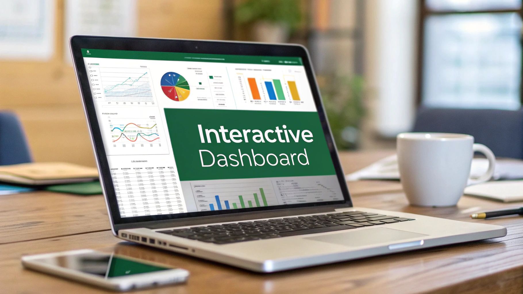
Ever felt like you're drowning in a sea of numbers in a static spreadsheet? An interactive dashboard in Excel is your lifeline. It completely transforms your data from a flat, lifeless report into a dynamic tool you can actually use for exploration. By connecting features like slicers and charts to pivot tables, you can instantly filter, drill down, and play with your data to see what’s really going on. This makes spotting trends and making smart decisions a whole lot easier.
Why Interactive Dashboards Are a Game Changer
If you've ever been frustrated by a report that's already out of date by the time you get it, you know the pain of static data. Traditional reports are just a snapshot in time; they're great for telling you what happened, but they can't answer your immediate follow-up questions.
An interactive dashboard flips that script entirely. It turns a passive document into an active analytical playground, empowering anyone on your team to dig in and find answers for themselves. This isn’t just a technical upgrade—it’s a mindset shift that puts powerful analysis into the hands of the people who actually need the insights.
Excel remains one of the most popular platforms for building these dashboards simply because almost everyone has it. Its power and familiarity make it the perfect starting point. You can get a sense of how businesses apply these concepts by checking out some great visual data storytelling techniques on YouTube.
From Raw Data to Actionable Insights
Let's get practical. Imagine you're on a marketing team trying to figure out the return on investment (ROI) from your latest campaigns. A basic report might give you a single, overall ROI number. An interactive dashboard, however, lets you slice and dice that data with a few clicks.
- Filter by Channel: How did social media really stack up against email?
- Analyze by Date: Did we get more traction at the start of the month or the end?
- Segment by Creative: Which ad copy actually got people to click?
Instead of sending an email to an analyst and waiting for a new report, the team gets answers on the spot. That speed is everything. It dramatically shortens the gap between seeing the data and doing something about it, allowing for nimble changes to strategy and budgets.
The real magic of an interactive dashboard isn't just in showing data; it's about sparking curiosity. When people can explore information without barriers, they start asking smarter questions—the kind that lead to real business breakthroughs.
Becoming a More Valuable Asset
Let's be honest, building an interactive dashboard in Excel is a skill that makes you incredibly valuable. This isn't just for data scientists with advanced degrees; it's a practical skill for managers, analysts, and coordinators who need to tell a clearer story with their numbers.
When you can transform a messy dataset into a clean, intuitive, and dynamic tool, you’re doing more than just crunching numbers. You're bridging the gap between raw data and smart decisions. That ability shows a higher level of thinking and makes you the person your team and leaders turn to for real answers.
Setting Up Your Data for Dashboard Success
Even the most dazzling interactive dashboard will fall flat if the data behind it is a mess. I can't stress this enough: before you even dream of building charts or adding slicers, you must dedicate time to structuring your source data. Get this step right, and you’ll sidestep a world of frustration and errors down the road.
This initial work is more than just fixing a few typos. The real game-changer is formatting your raw data as a formal Excel Table. This isn't just about aesthetics; it's about giving your data a smart, defined structure that Excel can work with in powerful ways.
This infographic lays out the big-picture planning process that should happen before you touch a single cell.
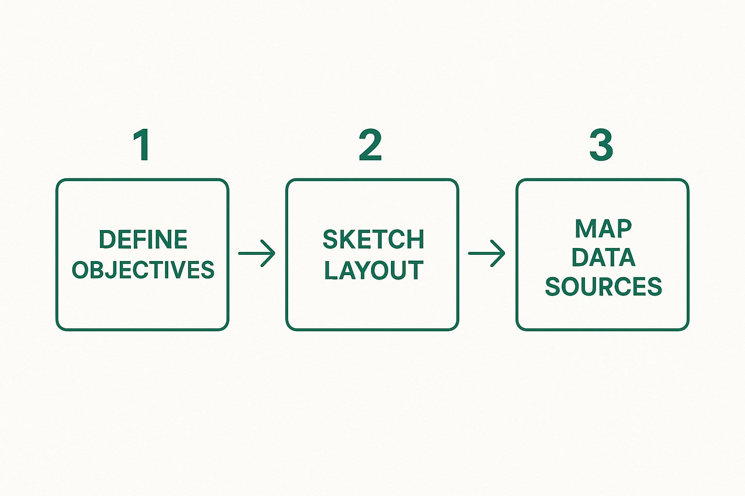
As you can see, mapping your data sources is the final prep step. This really drives home why having clean, well-structured data is so critical before you start building.
The Power of Using an Excel Table
Turning a regular block of data into an official Table is incredibly simple. Just click anywhere inside your dataset and hit Ctrl+T. That one keyboard shortcut unlocks a suite of features that are absolutely essential for a reliable dashboard.
Once your data is a Table, it becomes dynamic. When you add a new row of sales data, for instance, the Table automatically expands to include it. This means any PivotTable or chart connected to that Table will instantly pick up the new information on the next refresh. You'll never have to manually adjust cell ranges again.
The real magic of an Excel Table is its dynamic nature. It future-proofs your dashboard, allowing it to grow with your data instead of breaking every time you add new information.
Another massive win is structured referencing. Instead of wrestling with confusing formulas like A2:A500, you can write them with clear, readable names like SalesData[Revenue]. This makes your formulas infinitely easier to build, understand, and troubleshoot.
Preparing Your Dataset for Analysis
Let’s say you’re working with a typical sales dataset. You've got columns for Order Date, Region, Product, Sales Rep, and Revenue. Before you hit Ctrl+T, you need to make sure your data follows a few simple, non-negotiable rules.
Before creating any PivotTables, it’s crucial to ensure your raw data is formatted correctly. A few minutes of prep here saves hours of headaches later. This checklist covers the essentials for a clean, analysis-ready dataset.
Data Structuring Checklist for Excel Dashboards
| Data Rule | Why It's Important | Example |
|---|---|---|
| Unique, Single-Row Headers | PivotTables use headers to create fields. Merged cells or duplicate names will cause errors. | A single row with headers like "OrderDate", "Region", "Revenue". |
| No Blank Rows or Columns | Blank rows/columns can make Excel think your dataset has ended, excluding data from analysis. | Your data should be a solid, contiguous block without empty rows or columns inside. |
| Consistent Data in Each Column | Mixing data types (e.g., text in a number column) leads to incorrect calculations and grouping. | The 'Revenue' column should contain only numbers; 'OrderDate' only valid dates. |
| No Totals or Subtotals | Summary rows within your raw data will be double-counted by PivotTables, skewing your results. | Remove any "Grand Total" or "Subtotal" rows from the bottom of your dataset. |
Following these guidelines ensures your PivotTables will function exactly as you expect.
For a more in-depth guide on cleaning up particularly messy files, you can check out some advanced data cleaning techniques for Excel that have saved me countless hours of manual work over the years. This initial cleanup is the key to accurate PivotTable calculations.
Once your data is prepped and you convert it to a Table (don't forget to give it a sensible name like "SalesData"), you’ve built a solid foundation. From this point on, the rest of the dashboard creation process becomes remarkably smoother and more reliable.
Using PivotTables as Your Dashboard Engine

Alright, your data is now perfectly prepped and sitting in a named Excel Table. That was the foundational work. Now it's time to build the real analytical powerhouse of your dashboard: the PivotTables.
Don't think of these as the final report. Instead, picture them as the hidden engines doing all the heavy lifting—the summarizing, calculating, and organizing—completely behind the scenes.
Every single chart or key performance indicator (KPI) on your dashboard will be powered by its own dedicated PivotTable. This is the secret sauce for building a flexible and lightning-fast dashboard. Instead of wrestling with one gigantic, clunky PivotTable, we'll create a series of smaller, specialized ones. This approach is not only cleaner but makes troubleshooting a thousand times easier. If a chart looks off, you know exactly which "engine" to pop the hood on.
Building Your First PivotTable
Let's start by creating a PivotTable to break down revenue by region—a cornerstone of almost any sales dashboard.
First, click anywhere inside your named Table (the one we called "SalesData"). Head up to the Insert tab on the ribbon and click PivotTable. A dialog box will pop up, but you'll notice Excel has already filled in the Table/Range field with your Table's name. This is a huge time-saver and one of the best perks of using named Tables. No more manually selecting hundreds of rows!
Excel will then ask where you want to put this new PivotTable. This is a critical step.
Pro Tip: Always place each PivotTable on a new, dedicated worksheet. Resist the urge to cram them all onto one sheet to "save space." Separating them is the single best thing you can do for your sanity and the long-term health of your workbook.
Choose "New Worksheet" and hit OK. Excel will create a fresh sheet with a PivotTable placeholder on the left and the "PivotTable Fields" pane on the right. This pane is your control center.
Arranging Fields for Specific Insights
Now for the fun part: telling Excel how to organize the data. The "PivotTable Fields" pane shows all the columns from your source data. Your job is to drag these fields into the four boxes at the bottom:
- Filters: Used for high-level filtering (though we'll soon replace this with more elegant Slicers).
- Columns: Creates the column headers in your summary table.
- Rows: Creates the row labels.
- Values: This is for the numbers you want to calculate, like sums or averages.
For our revenue-by-region analysis, it's dead simple. Drag the Region field into the Rows area. Next, pull the Revenue field into the Values area. Just like that, Excel crunches the numbers and gives you a clean summary of total revenue for each region.
The Importance of Focused PivotTables
You've just built one engine. To answer other business questions, you'll repeat this process—creating separate, focused engines for each one. Don't just modify your first PivotTable. Go back to your "SalesData" sheet, click inside, and insert another brand new PivotTable on another new sheet.
For instance, you'll likely need to see:
- Product Performance: Drag "Product" to Rows and "Revenue" to Values.
- Sales Trends Over Time: Drag "OrderDate" to Rows and "Revenue" to Values. Excel is smart enough to automatically group the dates into months and years, which is an incredibly handy feature.
This method of creating distinct summaries is fundamental to modern business analysis. It's a process that begins with a clear goal for the dashboard, followed by organizing raw data into tables and then transforming it into the PivotTables that serve as the backbone for dynamic charts. If you're curious about different applications, you can see more examples of how businesses leverage dashboards on ClickUp's blog.
By now, you probably have a few new worksheets piling up. This is where a little bit of good housekeeping goes a long way.
Formatting and Organizing Your Engines
A raw PivotTable gets the job done, but it's not pretty. Before we connect these to charts, a couple of quick formatting tweaks will make a world of difference.
Formatting the Numbers Right now, your revenue figures are just plain numbers. Let's fix that. Right-click any number in the "Sum of Revenue" column, go to Value Field Settings, and then click the Number Format button. Choose "Currency" or "Accounting" and click OK. This instantly formats the entire column, making it much easier to read.
Naming Your Worksheets Default names like "Sheet4" and "Sheet5" are a recipe for confusion. Double-click each new sheet's tab and give it a sensible name. I have a habit of using a prefix like "PT_" to make it obvious what the sheet is for.
- "Sheet4" becomes PT_RevenueByRegion
- "Sheet5" becomes PT_ProductPerformance
- "Sheet6" becomes PT_SalesByMonth
This simple organizational habit is often what separates an amateur workbook from a professional one. It makes navigating and debugging your file infinitely easier. For a deeper look at the mechanics, feel free to check out our detailed guide on the essentials of creating an Excel Pivot Table.
With your collection of clean, focused, and well-organized PivotTables, you've officially built the powerful engines that will drive your entire dashboard. The heavy lifting is done. Now you're ready for the best part: bringing your data to life with charts and controls.
Bringing Your Data to Life with Charts and Slicers
Alright, the heavy lifting is done. You’ve put in the work to build a solid foundation with your PivotTables. Now comes the fun part: turning those data engines into a clean, intuitive, and visually compelling dashboard.
This is the step where your dashboard really comes alive. We're moving from a spreadsheet full of numbers to a cohesive visual story that answers questions at a glance.
Choosing the Right Chart for the Job
The first thing we'll do is create a PivotChart for each PivotTable. These aren't just regular charts; they're special because they stay linked to their source PivotTable. When the data in the table changes, the chart updates automatically. It’s a huge time-saver.
To get started, click anywhere inside one of your PivotTables (like PT_RevenueByRegion), head to the Insert tab, and pick a chart. Excel will even recommend a few good options. The trick is to pick the right chart for the story your data is telling.
- Bar or Column Charts: These are my go-to for comparing things directly. Use them for your revenue by region or sales by product. They make it instantly obvious which category is leading the pack.
- Line Charts: If you need to show a trend over time, a line chart is your best friend. Your
PT_SalesByMonthPivotTable is a perfect candidate, as it will clearly map out the sales journey throughout the year. - Pie or Donut Charts: Use these with caution. They work well for showing parts of a whole, like the percentage breakdown of sales by product category. Just remember the golden rule: keep the slices to a minimum. Anything more than a few categories and they become a cluttered mess.
If you want to go deeper into the "why" behind chart selection, our guide on mastering data visualization best practices is a great resource. Picking the right visual is half the battle in building an effective interactive dashboard in Excel.
Professional Chart Styling and Cleanup
A default Excel chart comes with a lot of baggage—field buttons, extra legends, and redundant labels that just create visual noise. A truly professional dashboard is defined by its clean, uncluttered design.
Click on your new chart, and you'll see the PivotChart Analyze tab pop up in the ribbon. The quickest win here is to click on Field Buttons and select Hide All. That single click instantly makes your chart look less like a raw spreadsheet object and more like a polished visual.
My personal rule is to remove anything from a chart that doesn't directly add to its comprehension. If an axis, gridline, or label doesn't help the user understand the data faster, it's just noise. Get rid of it.
Take a moment to clean up each chart. Do you really need the legend if there's only one data series? Probably not. Would data labels directly on the bars be clearer than y-axis gridlines? Often, the answer is yes. These small, deliberate tweaks add up to a much cleaner and more professional experience for your user.
Introducing Slicers for True Interactivity
This is where the magic really starts. Slicers are essentially stylish, user-friendly filter buttons. They let anyone—even non-Excel users—slice and dice the dashboard data with a simple click. They're a massive upgrade from clunky filter drop-downs and are the key to making your dashboard truly interactive.
To add one, just click inside any of your PivotTables, go to the Insert tab, and click Slicer. A new window will pop up showing all the fields from your data. Let's say we want to filter by Sales Rep and Product. Just check the boxes next to those two fields and hit OK.
This simple dialog box lets you add slicers for any field in your dataset.
Instantly, Excel will create two slicer panels that you can move and resize. But there’s a catch: right now, they're only connected to the one PivotTable you started with.
Connecting a Single Slicer to Multiple Charts
The final, crucial step is to make a single slicer control all of your charts at once. This is what creates a seamless experience, where one click updates the entire dashboard in perfect sync.
Right-click on your new "Sales Rep" slicer and choose Report Connections. This opens a dialog box listing every single PivotTable in your workbook. You'll notice only one is checked—the one you used to create the slicer.
Your job is to go down that list and check the box for every PivotTable that powers your dashboard (PT_RevenueByRegion, PT_ProductPerformance, PT_SalesByMonth, etc.). Do the same thing for your "Product" slicer.
And that's it! Now, when you click on a sales rep's name, every single chart will instantly filter to show data just for that person. This unified, responsive behavior is what transforms a simple collection of charts into a powerful and seamless analytical tool.
Designing a Polished and Professional Dashboard Layout

You’ve done the heavy lifting. The PivotTables are built, the charts are visualizing the data, and the slicers are ready for action. Now for the fun part: bringing it all together into a clean, professional dashboard that people will actually want to use. This is where we move from a functional spreadsheet to a powerful, decision-making tool.
The first thing we need is a dedicated canvas. So, let's create a new, blank worksheet and name it something intuitive, like "Dashboard." This keeps our final report completely separate from the behind-the-scenes data and PivotTable mechanics.
To immediately give it a more polished, report-like feel, we need to get rid of the standard Excel grid.
- Head over to the View tab.
- Just uncheck the boxes for Gridlines and Headings.
That simple two-click trick instantly transforms the sheet from a busy grid into a clean slate. It signals to anyone using it that this is a presentation layer, focusing their attention squarely on the insights you're about to show them.
Arranging Your Dashboard Elements
With our clean canvas ready, it’s time to move everything into place. Go to each of your PivotChart sheets, select a chart, and simply cut it (Ctrl+X). Then, flip back to your "Dashboard" sheet and paste it in (Ctrl+V). Do this for all your charts and slicers until everything is on the main stage.
Don't sweat the perfect placement just yet; the goal here is to get all the pieces on the board. Once everything is on the dashboard sheet, we can start arranging them in a way that makes sense.
A well-designed dashboard guides the user's eye naturally. Always place your most important, high-level information—like headline KPIs or summary charts—in the top-left corner. This is where most people look first, following a natural Z-shaped reading pattern.
I find it works best to group all your slicers together, usually along the top or left side. This creates a clear "control panel" and makes it obvious how to filter the report. Then, position your charts to tell a story. Maybe you have overview charts at the top, with more granular, detailed charts below them.
Aligning Elements for a Clean Look
Nothing screams "amateur" faster than a dashboard with misaligned charts. A messy layout looks unprofessional and distracts from the data. Thankfully, Excel’s alignment tools make this easy to fix.
You can select multiple objects at once by holding the Ctrl key while you click on each chart or slicer. Once you have a few selected, a Shape Format tab will appear in the ribbon. Look for the Align tool.
- Align Top/Middle/Bottom: Perfect for lining up objects horizontally.
- Align Left/Center/Right: Use this for vertical alignment.
- Distribute Horizontally/Vertically: This is a fantastic feature for creating equal spacing between three or more objects. It's a real time-saver.
Taking a minute to perfectly align everything is a small effort that pays huge dividends in how professional your dashboard feels. It shows you’ve been thoughtful and intentional in building your interactive dashboard in Excel.
Creating a Consistent Visual Theme
Consistency is what ties everything together. This means using consistent colors, fonts, and a general style across the board. The simplest way to do this is to pick a color palette and stick with it. You can manually set the colors for each chart series or apply a pre-built theme from the Chart Design tab.
To take it a step further, I like to use shapes to add structure and a sense of hierarchy. A simple rectangle can make a fantastic header for your report.
- Go to Insert > Shapes and grab a rectangle.
- Draw it across the top of your dashboard.
- Format its color to match your theme, then add a text box with a clear title like "Quarterly Sales Performance Dashboard."
This single addition provides a strong visual anchor and instantly makes your dashboard feel less like a collection of charts and more like a cohesive report. You can also use smaller shapes to create "cards" for your most important numbers (KPIs), giving them the spotlight they deserve. This is how you transform a standard Excel spreadsheet into a custom, polished, and incredibly effective analytical tool.
Frequently Asked Questions About Excel Dashboards
As you start building your own interactive dashboard in Excel, you're bound to hit a few snags. That’s perfectly normal—it's all part of the process. Let's walk through some of the most common questions and roadblocks I see people encounter so you can keep your project moving forward.
One of the first puzzles people run into is with slicers. You might ask, "Why aren't my slicers connected to all my charts?" This is a classic, and the fix is pretty simple once you know where to look.
When you first create a slicer, Excel only hooks it up to the specific PivotTable you had selected at that moment. To get it working across your whole dashboard, you have to tell it which other visuals to control. Just right-click the slicer, select Report Connections, and a dialog box will pop up. From there, simply check the box for every PivotTable that needs to be filtered by that slicer.
What to Do When Your Dashboard Slows Down
Another frequent pain point is performance. You've built this beautiful dashboard, but now it feels sluggish, especially when you refresh the data. What gives? More often than not, the culprit is the way your PivotTables are configured. A file packed with a huge dataset and lots of complex PivotTables can definitely start to lag.
To keep your dashboard snappy, here are a few tricks I've learned over the years:
- Separate Your Data: It’s a best practice to keep your raw source data on its own dedicated worksheet. Your dashboard and PivotTables should live on other sheets. This simple organization helps Excel work more efficiently.
- Control the Refresh: By default, PivotTables often try to refresh every time you open the file. You can turn this off. Go into the PivotTable Options and uncheck "Refresh data when opening the file." This puts you in control, preventing those long, unexpected load times.
- Slim Down Your Source Data: Before you even pull data into a PivotTable, make sure it’s clean and lean. If you have columns you know you'll never use for your analysis, get rid of them. A smaller dataset means faster calculations.
The best dashboards are often defined by what you choose to leave out. Every extra column of data or unnecessary chart element adds a bit of clutter and can bog down your file's performance.
Making Your Dashboard Truly Dynamic
"How do I get my dashboard to update automatically when I add new data?" This is the holy grail for most dashboard creators. The secret sauce here is formatting your source data as an official Excel Table. You can do this in a second with the shortcut Ctrl+T.
When you convert your data range into a Table, it becomes dynamic. That means whenever you paste new rows of data at the bottom, the Table automatically expands to include it.
The next time you go to the Data tab and hit Refresh All, every single one of your PivotTables and charts will instantly update with the new information. You'll never have to manually mess with cell ranges again. This is what transforms your report from a static picture into a living, breathing interactive dashboard in Excel—a tool that provides continuous insight without constant manual effort.
Are you spending more time fighting with formulas than finding insights? AIForExcel plugs right into your spreadsheet, allowing you to clean data, build reports, and get answers just by asking in plain English. Join over 4,800 professionals who use it to turn data into decisions faster. Start your free trial at AIForExcel today.