Why Pivot Tables Are Your Secret Weapon for Data Mastery
Working with large datasets in spreadsheets can be a real headache. Trying to extract useful information from endless rows and columns often feels like an impossible task. But what if you could transform this overwhelming data into clear, actionable insights in minutes? You can, with pivot tables.
Pivot tables have become a vital tool for professionals across various fields. Sales managers use them to track team performance, financial analysts leverage them for concise reporting, and even small business owners utilize them to monitor inventory. This widespread adoption speaks volumes about the power and efficiency pivot tables offer. Companies are saving significant time, sometimes hundreds of hours per month, by transitioning from manual data sorting to the automated summaries this tool provides.
This increased efficiency isn't surprising. Pivot tables have significantly changed data analysis since their introduction in Microsoft Excel back in 1993. Over the past three decades, they've become essential for businesses and analysts worldwide. According to Microsoft, Excel is currently used by over 750 million people globally, many of whom rely on pivot tables for data summarization. In fact, analysts report spending up to 40% less time on data aggregation and reporting when using pivot tables compared to traditional methods. To learn more, check out this resource: Introduction to Excel Pivot Tables
Overcoming Pivot Table Hesitation
Despite their clear benefits, some people are hesitant to use pivot tables. This often comes down to the initial perception of complexity. The interface might seem intimidating at first, leading some to stick with familiar, but less efficient, methods. This is like avoiding learning to drive because it seems too difficult—while walking works for short distances, driving opens up a world of new possibilities.
The Power of Pivot Tables: Unveiling Insights
So, how do pivot tables work? They allow you to "pivot" or rotate your data, viewing it from different angles without changing the underlying information. Imagine rearranging furniture in a room. You're not altering the furniture itself, but you're creating a new arrangement that better suits your needs. This dynamic exploration allows you to:
- Summarize data effortlessly: Quickly calculate sums, averages, counts, and other important metrics.
- Identify trends and patterns: Discover hidden relationships in your data that might otherwise be missed.
- Create interactive reports: Utilize filters and slicers to explore specific data subsets and different scenarios.
- Save time and increase efficiency: Automate time-consuming data tasks, freeing up your time for more strategic activities.
These capabilities make pivot tables invaluable for anyone working with data, from students analyzing research to executives making critical business decisions. In the following sections, we'll explore the practical steps involved in creating and using pivot tables, empowering you to unlock the full potential of this powerful tool and master data analysis.
Setting Up Your Data For Pivot Table Success
A well-structured dataset is essential for creating effective Excel pivot tables. This initial step is often where users encounter problems, leading to frustration and errors. This section provides a guide to essential data preparation techniques, highlighting the difference between proficient pivot table users and those who struggle. Think of your data as the ingredients for a recipe: if not prepared correctly, the final dish (your pivot table) won't be what you expect.
The Golden Rules of Data Structure
For a seamless Excel pivot table experience, follow these key principles:
Consistent Headers: Each column needs a clear, concise header accurately reflecting its data. These headers will become the fields used to build your pivot table. Avoid merged cells or blank rows in the header row, which can confuse Excel. For example, instead of "Sales Q1," use a descriptive header like "Sales Revenue Q1 2024."
No Blank Rows or Columns: Blank rows and columns within your dataset disrupt data interpretation for the pivot table. Excel might treat blanks as data points, affecting your analysis. Think of blank rows like cracks in a foundation: they weaken the entire structure. Always delete entirely empty rows or columns before creating your pivot table.
Consistent Data Formats: Maintain consistent data formatting within each column. Mixing formats (e.g., currency, percentage, general) in the same column can cause inaccurate calculations. If a column contains both currency and text, the pivot table might not sum the currency values correctly.
Data Cleanup and Organization
Real-world datasets are often messy. This section offers practical solutions for common issues like duplicate entries and inconsistent formatting:
Handling Duplicate Entries: Duplicates can inflate counts and sums, resulting in inaccuracies. Use Excel's "Remove Duplicates" feature to eliminate these extra rows. This is similar to refining raw materials: removing impurities for a pure result.
Converting Data Ranges to Excel Tables: Convert your data range into a dynamic Excel table (using Ctrl+T or Cmd+T). This allows your pivot table to automatically update with new data, saving time and ensuring current analysis. Dynamic tables are like a living organism, constantly adapting to new information.
Practical Solutions for Messy Data
Imagine data with inconsistent date formats: some as "mm/dd/yyyy," others as "dd/mm/yyyy." This can create confusion and errors. The solution? Use Excel's text-to-columns feature or formulas to standardize the date format.
Another common issue is inconsistent capitalization. "Product A" and "product a" should be the same. Functions like LOWER, UPPER, or PROPER can standardize text, avoiding separate categories for the same data in your pivot table.
By mastering these preparation techniques, you build a solid base for accurate and powerful pivot tables, ensuring reliable analysis for meaningful insights and informed decisions. Now that your data is ready, you can move on to learning the Excel pivot table process, covered in the next section.
Building Your First Pivot Table Step by Step
Time to unlock the potential hidden within your data! This section offers a clear, step-by-step guide to constructing your first pivot table in Microsoft Excel. We'll cover every stage, from selecting your data source to organizing the pivot table fields, empowering you to confidently tackle any pivot table task.
This process can be visualized in three simple steps: 1) Selecting the relevant data range, 2) Dragging the desired fields to the rows and columns of the pivot table interface, and 3) Generating the summary table which will provide valuable insights. The following infographic illustrates this process:
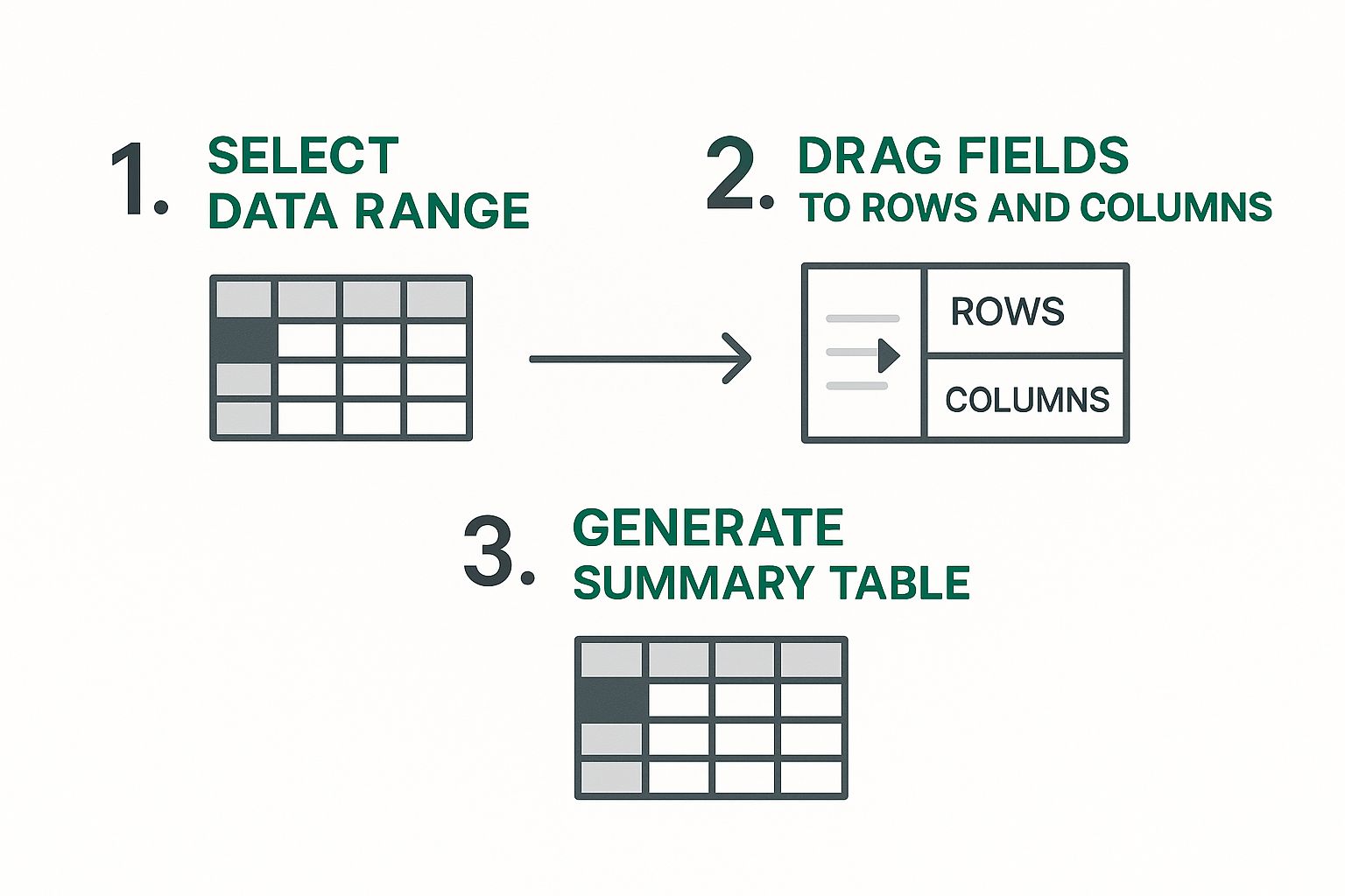
As shown, building an Excel pivot table involves a straightforward process of selecting, dragging, and generating. These simple actions transform raw data into actionable intelligence. Let's dive into the detailed steps involved.
Selecting Your Data Range
The first step in creating an Excel pivot table is selecting the data you want to analyze. This involves highlighting the entire range of cells that contain the pertinent information, including the header row. Ensure your data follows best practices, such as consistent formatting and no blank rows or columns within the dataset. This selection forms the foundation of your pivot table.
Inserting the Pivot Table
With your data highlighted, go to the "Insert" tab on the Excel ribbon and click the "PivotTable" button. A dialog box will appear, prompting you to choose the location for your new pivot table. You can choose to place it on a new worksheet or an existing one. For beginners, starting with a new worksheet is generally recommended for a cleaner, more organized view. This also isolates your pivot table from the source data, preventing accidental changes to the original dataset.
Arranging the Pivot Table Fields
After clicking "OK" in the dialog box, a new worksheet will open, displaying a blank pivot table structure and the PivotTable Field List. This list contains all the headers from your original data, which become your pivot table fields. This is where the real power of pivot tables comes into play. You can drag and drop these fields into four key areas: Rows, Columns, Values, and Filters.
To help you understand the different methods for creating pivot tables and when each is most effective, let's look at the following comparison:
Pivot Table Creation Methods Comparison
| Creation Method | Best Use Case | Time Investment | Complexity Level |
|---|---|---|---|
| Using the "PivotTable" button on the "Insert" tab | Standard pivot table creation | Low | Beginner |
| Using the "Recommended PivotTables" option | Quick exploration of common data summaries | Very Low | Beginner |
| Creating a pivot table from an external data source | Analyzing data from databases or other files | Medium | Intermediate |
| Using Power Pivot for complex data models | Handling large datasets and intricate relationships | High | Advanced |
This table summarizes the various approaches, ranging from the simple "PivotTable" button method to more advanced techniques involving external data sources and Power Pivot. Choosing the right method depends on your data and analysis needs.
- Rows: Fields placed here define the rows of your table, providing the categories for your data.
- Columns: Fields dragged here form the columns of your table, offering additional categorization.
- Values: Fields placed in this area represent the data you want to analyze, such as sales figures or quantities. Excel automatically summarizes these values.
- Filters: Fields added here allow you to filter your data based on specific criteria.
For instance, to analyze sales by region and product, you would drag "Region" to Rows, "Product" to Columns, and "Sales Amount" to Values. Experimenting with different field arrangements allows you to answer specific questions about your data. This drag-and-drop functionality makes pivot tables incredibly versatile and powerful, allowing you to view your data from multiple angles and uncover hidden patterns and trends.
Making Your Pivot Tables Look Professional
Raw pivot tables are effective for data analysis, but professionally formatted ones truly impress and communicate insights with greater impact. This section will show you how to transform a basic pivot table in Excel into a polished report ready for presentations and decision-making. Think of it like this: a plain brick house is functional, but adding paint, landscaping, and decor elevates it to a beautiful home.
Formatting For Readability
One of the first steps to a professional pivot table is enhancing readability through number formatting. Instead of displaying long strings of numbers, use formatting options like currency, percentages, or decimals to clarify the data's meaning. For example, apply currency formatting to sales figures or percentage formatting to profit margins.
Conditional formatting can also add visual cues, highlighting key data points with color scales or icon sets. This allows viewers to quickly identify trends or outliers, like exceptional sales performance or underperforming products. This makes the data more digestible and impactful.
Additionally, applying pre-designed styles can instantly improve the visual appeal of your pivot table. Excel offers various built-in styles that control fonts, colors, and borders, giving your table a consistent and professional look. Experiment with different styles to find one that suits your report's overall design.
Layout and Structure
The layout of your pivot table significantly impacts its readability. Excel offers different layout options:
- Compact Form: Best for simple pivot tables with a few fields.
- Outline Form: Offers a more detailed view, showing subtotals and grand totals prominently.
- Tabular Form: Resembles a traditional table, with each row and column clearly labeled.
Choosing the right layout depends on the complexity of your data and the specific insights you want to highlight. For a sales report by region, a compact form might suffice. However, analyzing sales by region, product, and salesperson might require the tabular form for clarity.
Mastering Field Settings
Beyond layout, field settings unlock deeper insights. You can move beyond basic sums to calculate averages, percentages, running totals, and other custom metrics. For example, instead of just showing total sales, you might calculate the average sales per customer or the percentage change in sales year-over-year.
These calculations reveal more nuanced information, leading to better-informed decisions. You might be interested in How to master Excel KPI dashboards for a deeper dive into presenting your data effectively.

Practical Application For Professional Impact
By applying formatting, layout options, and advanced field settings, your pivot tables transform from basic data summaries into compelling reports that enhance decision-making and build credibility. Practice these techniques with your own data and explore different combinations of formatting and layout to find what best communicates your insights.
Remember, a well-designed pivot table not only showcases your analytical skills but also makes your data easier to understand and act upon.
Real-World Pivot Table Applications That Drive Results
Understanding how to create a pivot table in Excel is just the beginning. The real power lies in applying this knowledge to solve actual business challenges. This section explores how pivot tables transform raw data into actionable business intelligence. We'll examine real-world scenarios using datasets mirroring those you'd find in sales, demographics, and business operations.
Analyzing Sales Performance
Imagine you're a sales manager with thousands of sales records. A pivot table can quickly summarize sales by region, product, and salesperson. You can instantly see which regions are performing well, which products are top sellers, and identify any underperforming team members.
This insight allows for targeted interventions, such as additional training or focused marketing campaigns. Additionally, you can track sales trends over time, identifying seasonal patterns or the impact of specific marketing initiatives. This empowers you to make data-driven decisions about inventory management, sales targets, and resource allocation.
Understanding Your Customers
For businesses, understanding customers is paramount. Pivot tables can analyze customer data based on demographics, purchase history, and preferences.
For example, you could segment customers by age group and location to see which products are popular in different demographics. This targeted analysis informs marketing strategies, product development, and customer service efforts. Discovering a specific product is popular with a certain demographic could lead to targeted advertising campaigns.
Streamlining Operational Reporting
Beyond sales and marketing, pivot tables excel in operational reporting. Let's say you manage a warehouse. A pivot table can track inventory levels, order fulfillment times, and shipping costs.
By summarizing data across different time periods, you can identify bottlenecks in your operations, optimize inventory levels, and negotiate better shipping rates. This granular level of control improves efficiency and reduces operational costs. For a deeper dive into data analysis using Excel, check out our guide on data analysis in Excel.
Census and Population Reporting
A prominent example of pivot table usage is in statistical analysis, particularly for census and population reporting. Consider the 2022 United States Census data: a pivot table effortlessly summarizes population estimates for each state and county.
A tutorial using Excel and the 2022 US Census data demonstrates how a dataset with over 3,000 counties and 50 states can be aggregated to show the total population for each region instantaneously. This saves analysts days of manual calculations. Learn more about using Excel with US Census data.
Advanced Techniques for Deeper Insights
Mastering "excel pivot table how to" also involves understanding advanced features. Date grouping allows you to analyze data over different time periods (days, months, quarters, years), revealing seasonal trends or long-term growth patterns. Calculated fields empower you to create custom metrics, such as profit margin or customer lifetime value, directly within the pivot table.
Multi-level summaries provide a hierarchical view of your data, breaking down complex information into manageable chunks. For example, you can summarize sales by region, then drill down further to see sales by city within each region. You might be interested in: How to master data analysis in Excel.
By combining these techniques, you gain a deep understanding of your data, allowing you to identify opportunities, solve problems, and make strategic decisions that drive results. This hands-on approach to "excel pivot table how to" empowers you to confidently tackle any data analysis challenge.
Advanced Techniques That Set You Apart
Having established a solid foundation in creating and using pivot tables in Microsoft Excel, let's explore advanced techniques that can truly distinguish your analytical abilities. These features can transform you from a proficient analyst into a sought-after data expert.
Interactive Filtering With Slicers and Timelines
While standard filters are helpful, slicers and timelines offer a more dynamic and interactive approach to data exploration. Slicers provide a visual filtering method, allowing you to select or deselect data with simple clicks. Imagine a pivot table displaying sales by product category. A slicer would enable you to instantly filter for "Electronics" or "Clothing" with a single click.
Timelines, conversely, offer a visual interface specifically for filtering by date. If your data covers several years, a timeline allows you to easily select a specific month, quarter, or year for analysis, simplifying the process of manual date range selection. This interactivity makes your pivot table reports more engaging and accessible to a wider audience.
Dynamic Pivot Charts: Visual Storytelling With Data
Pivot tables efficiently present data, but pivot charts enhance understanding by visualizing it. Dynamically linked to your pivot table, a pivot chart updates automatically whenever you adjust filters, rows, or columns. This visual representation improves data comprehension and makes it easier to identify trends and patterns. For instance, a bar chart could quickly highlight the top-selling product category, while a line chart can illustrate sales trends over time.
Calculated Fields: Custom Business Metrics
Calculated fields extend the capabilities of pivot tables beyond standard summaries. They enable the creation of custom metrics tailored to your business needs, directly within your pivot table. For example, with sales and cost data in your pivot table, you could create a calculated field for "Profit Margin" by subtracting cost from sales and dividing the result by sales. This flexibility makes pivot tables a versatile tool for business intelligence and reporting.
You might be interested in learning more about how AI can enhance your work with Excel: How to master AI for Excel. This knowledge can significantly improve your data analysis capabilities.
To give you a better understanding of how these advanced features can be used, let's look at the following table:
Advanced Pivot Table Features Overview
Comprehensive guide to advanced pivot table capabilities and their practical business applications.
| Advanced Feature | Primary Purpose | Learning Difficulty | Business Applications |
|---|---|---|---|
| Slicers | Interactive Filtering | Easy | Sales Reporting, Customer Analysis |
| Timelines | Date-based Filtering | Easy | Trend Analysis, Performance Tracking |
| Calculated Fields | Custom Metrics | Medium | Profitability Analysis, Inventory Management |
| Data Consolidation | Combining Data from Multiple Sources | Medium | Financial Reporting, Project Management |
| External Data Connections | Linking to Databases or Other Files | Medium | Large-Scale Data Analysis, Business Intelligence |
This table summarizes the key advanced features, their purposes, how easy they are to learn, and how they can be applied in different business contexts. Using these features can significantly enhance your data analysis and reporting efficiency.
Automating Updates and Shortcuts
Creating pivot tables that update automatically when your source data changes is crucial for efficient reporting. Converting your source data into a dynamic Excel table allows your pivot table to refresh automatically whenever data is added or modified. This ensures your reports are always current without manual intervention.
Learning keyboard shortcuts can also significantly expedite your workflow. Shortcuts for navigating the pivot table field list, applying filters, and refreshing data can save you valuable time. This efficiency makes understanding "excel pivot table how to" even more valuable.
Advanced Grouping and Multi-Source Integration
Mastering advanced grouping techniques allows for analyzing data at varying levels of detail. You can group data by week, month, quarter, or year, or even create custom groups based on specific criteria. This capability is crucial for uncovering trends and patterns within large datasets. Moreover, integrating data from multiple sources into a single pivot table provides a unified view of your business by combining data from various departments or systems.
Globally, pivot tables are widely used for summarizing large datasets, such as world population data. In 2022, the world population reached approximately 7.9 billion. Pivot tables allow analysts to quickly visualize and compare population figures across different regions. For example, nearly 40% of the global population resided in China and India combined – around 1.41 billion in China and 1.39 billion in India. For more detailed statistics, you can refer to this video: World Population Data.
Troubleshooting Large Datasets
Working with extensive datasets can sometimes present performance challenges. To mitigate these issues, optimize your data structure by removing unnecessary columns or rows. Consider using data compression techniques or external databases for extremely large datasets. These proactive measures will ensure your pivot tables remain responsive and efficient, even when handling massive amounts of data. By mastering these advanced techniques, you establish yourself as a valuable resource for data-driven insights within your organization.
Key Takeaways
This section provides a concise overview of essential Excel pivot table concepts and practical steps for continued growth. Whether your goal is business reporting, academic research, or personal projects, the information here will be valuable.
Mastering The Fundamentals: A Quick Recap
Let's recap the key elements of working with pivot tables in Excel. This checklist will reinforce your foundation for continued learning.
Data Preparation Is Key: A well-structured dataset is essential for a successful pivot table. This includes consistent headers, no blank rows or columns, and standardized data formats.
Creating Your First Pivot Table: Select your data range, click the "PivotTable" button under the "Insert" tab in Microsoft Excel, choose a location, and arrange the fields in the PivotTable Field List.
Making It Look Professional: Transform your pivot table with formatting techniques, layout choices, and customized field settings.
These core elements are crucial for accurate and effective data analysis.
Practice Makes Perfect: Reinforcing Your Skills
Consistent practice is key to mastering pivot tables. Work with different datasets, experiment with field arrangements, and explore formatting options.
Start With Simple Datasets: Begin with smaller datasets to get comfortable with pivot table creation and manipulation.
Gradually Increase Complexity: As you gain confidence, move on to larger datasets with more variables and explore advanced techniques.
Replicate Real-World Scenarios: Create pivot tables based on real-world business challenges, such as analyzing sales data, customer demographics, or project timelines.
By actively applying these techniques, you'll solidify your understanding and build confidence in your data analysis skills.
Staying Current: Resources For Continued Learning
Microsoft Excel is constantly evolving. Staying up-to-date is essential for maximizing your pivot table proficiency.
Microsoft Excel Support: The official Microsoft Excel support website offers tutorials, documentation, and updates on new features.
Online Communities and Forums: Learn from other users, share tips, and get questions answered in online communities.
Specialized Blogs and Websites: Reputable Excel blogs and websites provide in-depth tutorials, advanced techniques, and best practices.
These resources will keep you informed of the latest advancements in Excel.
Expanding Your Toolkit: Complementary Tools
While Excel's pivot tables are powerful, complementary tools can enhance your data analysis capabilities.
Power Pivot: For large datasets and complex data models, Power Pivot offers added power and flexibility.
Data Analysis Add-ins: Explore add-ins that provide specialized data analysis functionalities, such as statistical analysis or forecasting.
Business Intelligence Platforms: For extremely large datasets or sophisticated visualization, consider business intelligence platforms that integrate with Excel.
These tools complement your pivot table knowledge for more complex data analysis tasks.
Troubleshooting and Common Challenges
Challenges are a normal part of learning to use pivot tables.
Unexpected Results: Double-check your data source for errors, ensure consistent formatting, and verify your field arrangements.
Performance Issues: Large datasets can impact performance. Optimize your data structure, remove unnecessary data points, or consider external databases.
Error Messages: Excel's error messages can guide you towards a solution. Research the specific message online to find potential fixes.
Don’t be discouraged by challenges; they are opportunities to learn.
Ready to boost your Excel skills? AIForExcel integrates with Microsoft Excel, allowing you to interact with your data using natural language. Transform your workflow, automate tasks, and unlock deeper insights. Try AIForExcel today: https://ai-for-excel.com