Making Sense of What You’ve Collected
Opening that spreadsheet full of raw survey responses can feel like staring into a chaotic abyss. It’s a jumble of answers, from enthusiastic praise to confusing, one-word replies. Before you even think about complex formulas, the first real step is to simply get a feel for what you're looking at. This initial orientation is the detective work that makes the difference between a muddled analysis and a clear one.
Think of it like being a chef preparing for a big meal. You don’t just toss everything into a pot. You lay out your ingredients and identify each one—the vegetables, the spices, the proteins—because each needs to be handled differently. In the same way, your survey data needs to be sorted into its basic types before you can properly analyze survey data.
Identifying Your Data Ingredients
Your survey responses will typically fall into a few key categories, and each tells a different part of the story. For example, if you ran a customer feedback survey, you'd likely find:
- Rating Scales: These are your "On a scale of 1-10, how satisfied are you?" questions. They produce ordinal data. The numbers have a clear order, but the gap between a 7 and an 8 might not mean the same thing to a customer as the gap between a 2 and a 3.
- Multiple Choice: These give you nominal data, which is all about grouping respondents. Think of questions like, "Which feature do you use most often?" The answers categorize users but don't imply any ranking.
- Open-Ended Text: Comments from questions like, "Is there anything else you'd like to share?" are pure qualitative data. This is often where you'll find the most valuable, unexpected insights.
Getting these distinctions right is crucial because it shapes your entire analytical strategy. You can't calculate an average for a multiple-choice question, but you can find the mode (the most frequent answer). This initial step determines which statistical tools you’ll need. The methods for summarizing data with descriptive statistics (like mean and standard deviation) are different from those used for inferential statistics, which help you make educated guesses about your entire user base.
To help you get a handle on this, here's a quick breakdown of common data types and how you might approach them.
| Data Type | Examples | Analysis Method | Key Insights |
|---|---|---|---|
| Ordinal Data | "Rate your satisfaction (1-5)", "How likely are you to recommend us? (1-10)" | Median, Mode, Frequency Distribution, Correlation | Understand levels of agreement or satisfaction, identify trends in sentiment. |
| Nominal Data | "What is your primary use case?", "Which department are you in?" | Frequencies, Percentages, Mode, Chi-Square Test | Segment your audience, find the most popular choices, see if certain groups prefer different options. |
| Interval/Ratio Data | "How many hours per week do you use our product?", "What is your age?" | Mean, Median, Mode, Standard Deviation, Regression | Get precise averages and understand the spread of data. Predict relationships between variables. |
| Qualitative Data | "What can we do to improve?", "Please describe your experience." | Thematic Analysis, Sentiment Analysis, Word Clouds | Discover the "why" behind the numbers, uncover new ideas, and understand customer emotions. |
This table shows that each data type unlocks a different kind of understanding. Mixing them up can lead to faulty conclusions, so taking the time to categorize your data is a worthwhile investment.
Reading Between the Lines
Once you've sorted your data, take a step back and look at the bigger picture. Who actually answered your survey? If your response rate from power users is extremely high, you might have response bias, which could paint a rosier picture than reality.
What about those incomplete surveys or the ones with strange, nonsensical answers? Don't be too quick to delete them. A high drop-off rate on a specific question can be more telling than the answers you did receive—it might point to a confusing or sensitive topic that needs a closer look. The real story of your survey begins here, in the patterns of who answered, what they skipped, and the nature of the data itself.
Cleaning Up the Chaos (Without Losing the Good Stuff)
The journey from a pile of raw survey responses to genuinely useful insights always starts with a critical, and let's be honest, often unglamorous step: data cleaning. This is where you tame the messy, real-world answers you've collected and turn them into a structured dataset you can actually trust. Trying to analyze data without cleaning it first is like building a house on a shaky foundation—everything that follows is at risk.

Standardizing Your Responses
If only everyone filled out surveys exactly as we instructed! In the real world, you'll get a wide variety of answers that all mean the same thing. For a simple "Yes/No" question, you might see "Y," "n," "Yes," and "no." For a rating scale question, you could find text entries like "N/A" or "Not applicable" mixed in with the numbers.
The goal here is to make these responses consistent. Thankfully, in Excel, this doesn't have to be a mind-numbing manual task. Simple functions like TRIM are great for zapping extra spaces, while a quick Find and Replace (Ctrl+H) can standardize text in seconds. I often use a nested IF or the SWITCH function to convert a whole column of varied text responses into a uniform set of numbers, like changing all "Yes" variations to 1 and "No" variations to 0. This initial pass is fundamental to any accurate analysis. If you want to go deeper, check out these essential data cleaning techniques for Excel.
Handling Inconsistencies and Outliers
Beyond basic typos, you'll run into more complex issues that require a judgment call. What do you do with a respondent who checked multiple boxes for a single-choice question? Or the person who gave every single item a "10" on a long satisfaction survey? These aren't just mistakes; they're data points that need careful consideration.
Here’s a practical approach I've found works well:
- Document everything: I always create a "cleaning log" in a separate tab of my spreadsheet. In it, I note every change I make, whether it's standardizing "USA" and "United States" or my reasoning for handling an outlier. This log becomes a lifesaver if your methodology is ever questioned.
- Be consistent, but flexible: It's smart to set rules for handling incomplete data. For instance, you might decide to remove any response that is less than 50% complete. But when an outlier looks suspicious (like a "straight-liner" who answers "5" to everything), I pause before hitting delete. Sometimes, these are the most revealing responses, representing a highly engaged—or disengaged—person whose opinion is incredibly valuable.
Remember, data cleaning isn't about erasing all the messy parts. It’s about making smart, informed decisions to ensure the data you analyze is a true reflection of what your respondents wanted to tell you.
Finding the Numbers That Actually Matter
With your data cleaned and organized, it’s time to move beyond just looking at the raw responses and start pulling out the numbers that tell a story. This is the heart of analyzing survey data: uncovering the patterns hiding just beneath the surface. While a simple average score is a good starting point, the most revealing insights often come from digging a little deeper into descriptive statistics.
Thinking about averages alone can be misleading. Imagine you ask 100 people to rate a new feature on a 1-5 scale, and the average score is 3.0. That sounds perfectly neutral, right? But what if 50 people rated it a "1" (they hated it) and 50 people rated it a "5" (they loved it)? The average hides a deeply polarized opinion, which is far more interesting than a mediocre consensus. This is why looking at the distribution of answers is critical.
Beyond the Average: Measures of Central Tendency
To get a fuller picture, experienced analysts look at a trio of measures. You can quickly calculate these in Excel to understand the heart of your data.
- Mean (Average): The classic average, calculated with the
=AVERAGE()function. It’s useful for a quick summary but sensitive to extreme scores (outliers). - Median: The middle value in your dataset, found using
=MEDIAN(). This is your go-to when you suspect outliers are skewing the mean. If the median satisfaction score is a 4 while the mean is a 3.2, it tells you a few very unhappy respondents are pulling the average down. - Mode: The most frequently occurring answer, calculated with
=MODE.SNGL(). For multiple-choice questions, the mode is often the most insightful statistic, instantly showing you the most popular choice.
Comparing these three numbers gives you a quick diagnostic of your data’s shape. When they are all very close, your data is likely symmetrical. When they diverge, it’s a signal to investigate further.
To help you decide which measure to use and how to interpret it, here’s a quick reference table.
| Measure | Excel Function | When to Use | Interpretation |
|---|---|---|---|
| Mean | =AVERAGE() |
For a general overview of numerical data (like ratings) without significant outliers. | Provides the "typical" score, but can be skewed by unusually high or low values. |
| Median | =MEDIAN() |
When you have numerical data with outliers (e.g., a few very low scores). | Represents the true middle point; half the responses are above this value, half are below. |
| Mode | =MODE.SNGL() |
Best for categorical or multiple-choice data (e.g., "Which feature do you use most?"). | Instantly identifies the most popular or common answer. |
| Range | =MAX() - MIN() |
To quickly see the spread between the highest and lowest scores. | A large range indicates wide variation in opinion; a small range suggests consensus. |
This table provides a solid foundation for the basic statistical analysis you'll perform on your survey results.
Finding Hidden Relationships with Cross-Tabulation
The real magic happens when you start slicing your data to compare different groups. This is where cross-tabulation comes in. By creating a table (a PivotTable in Excel is perfect for this) that crosses one question with another, you can uncover powerful insights.
For example, are newer customers significantly less satisfied than long-term users? Does one department report higher engagement than others? These comparisons move your analysis from "what" people said to "why" different groups might feel a certain way, forming the foundation for actionable recommendations.
Making Charts That Tell the Real Story
After you've crunched the numbers, the next move is to turn those findings into compelling visuals. Let's be honest, great analysis can fall flat with boring or confusing charts. The goal isn't just to decorate a slide deck; it's to create visuals that make your findings crystal clear. The right chart can transform complex data into an "aha!" moment, guiding your audience straight to the core insights.

Choosing the Right Visual for Your Data
The secret to powerful data visualization isn't about creating a flashy, complicated dashboard. It's about picking the right tool for the job. Often, a simple, well-labeled bar chart is far more effective than an intricate graphic. For instance, if you're comparing satisfaction scores across different customer segments, a grouped bar chart is perfect for showing the differences at a glance.
On the other hand, pie charts can be tricky. While they’re meant to show parts of a whole, they make it tough for our eyes to accurately compare the size of different slices, especially when the values are close. In fact, more than 80% of data visualization experts suggest avoiding them in most business reports for this very reason.
Here’s a quick guide to some common chart choices and when to use them:
- Bar Charts: These are your go-to for comparing categories, like responses from different user groups or product preferences.
- Line Charts: Ideal for showing trends over time. Think about tracking customer satisfaction scores each quarter or website traffic month-over-month.
- Histograms: Use these to understand the distribution of your data. For example, you could see how ratings on a 1-10 scale are spread out.
- Scatter Plots: Excellent for spotting relationships between two different numbers, like seeing if there's a correlation between how often someone uses a feature and how satisfied they are.
Avoiding Common Visualization Traps
How you design your chart is just as important as the type you choose. A frequent mistake is playing with the Y-axis scale. Starting a bar chart's axis at a value other than zero can make small differences look massive, which can be seriously misleading.
Color and layout also have a big impact. Use color with purpose—to highlight a key data point or a specific category, not just to make things look colorful. A simple trick is to use a neutral color palette and then one standout color to draw your audience's eye to the most important finding. By sticking to these ideas, you'll create visuals that not only support your conclusions but also build your credibility.
If you want to dig deeper into this, check out our guide on data visualization best practices for more practical tips.
Leveraging AI to Uncover Hidden Patterns
After you’ve visualized the big, obvious trends, it's time to dig deeper for the insights that aren't so easy to spot. This is where artificial intelligence, especially when baked into a familiar tool like Excel, really shines. Tools such as AIForExcel can automate tricky analysis, completely changing how you handle both your neat, structured responses and your messy, open-ended feedback. It’s like having a seasoned analyst right there with you, spotting connections you might miss when you're on a tight deadline.
This goes way beyond just calculating sums and averages. AI brings powerful analytical methods directly into your spreadsheet, making them usable without needing a degree in data science. You can shift from just describing what your data says to truly understanding the deeper relationships hidden within it.
Practical AI Applications for Survey Analysis
So, what does this look like in the real world? Experienced analysts are already using these tools to find gold in their survey data. Picture this: you have hundreds of text comments to sift through. Instead of reading them one by one, you can use AI to perform automated sentiment analysis. This process does more than just label comments "positive" or "negative"; it can pull out specific themes, like "slow customer service" or "easy-to-use interface," and tell you the sentiment tied to each one.
AI is also fantastic at identifying groups of respondents who share similar answer patterns, a process known as segmentation. For instance, an AI might find a small but very vocal group of users who are unhappy with a specific feature but are highly engaged with another part of your product. This is a segment you'd definitely want to understand better, and AI helps you find them without endless manual filtering.
The global scale of today's data collection makes these tools more important than ever. It's expected that by 2025, digital surveys will reach billions of people, breaking down old geographical barriers. This lets companies gather feedback from diverse cultural and economic backgrounds, creating incredibly rich datasets. But managing this much varied data requires serious analytical power. Using AI to analyze these massive datasets helps pinpoint both global trends and specific regional preferences, giving companies a real advantage. You can learn more about how global reach is influencing modern market research and analysis.
From Analysis to Summary in Seconds
One of the most immediate benefits is the ability to generate summaries automatically. Once the AI has identified key patterns and correlations, it can create a natural language summary of the most important findings. Instead of you spending an hour writing up your conclusions, AIForExcel can deliver a concise, data-backed story that explains what your survey results actually mean. This frees you up to focus your brainpower on the strategic implications of the findings, rather than getting stuck in the weeds of how to analyze survey data. It’s all about making your thinking, not your formula-writing, the most valuable part of the process.
Turning Findings Into Decisions People Can Act On

Here's where even the most brilliant analysis can fall flat. You’ve cleaned your data, run the numbers, and made some eye-catching charts. But the last, most important part is turning those interesting patterns into insights that actually lead to change. It's not enough to just state a finding like, "75% of new users struggle with onboarding." The real magic happens when you connect that statistic to a concrete, actionable recommendation.
This jump from the "what" to the "so what" is the heart of great survey analysis. It’s all about creating a clear story that links your data directly to a business challenge or opportunity. The best analysts I know are masters at this, and they do it by tailoring their story to fit who they're talking to.
Tailoring Your Story for Different Stakeholders
Let's be honest: not everyone needs or wants to see every single detail of your work. The trick is to package your findings in a way that clicks with each audience, giving them just what they need to make a move.
- For Executives: They're busy and need the bottom line, fast. Start with a sharp executive summary that calls out the top 2-3 most critical findings and your main recommendations. Frame everything in terms of business impact—how does this affect revenue, customer loyalty, or operational costs? Keep it short, sweet, and visual.
- For Department Heads and Managers: This group craves more context. They want to understand the "why" behind the numbers you're showing them. Give them a more detailed report that highlights trends relevant to their teams. For instance, you could show how their department's employee engagement scores stack up against the company-wide average.
- For Technical Teams and Fellow Analysts: These are your people. They'll appreciate the nerdy details. You can prepare an appendix or a separate document that walks through your data cleaning methods, the statistical tests you ran, and any limitations in the data. This kind of transparency builds trust and answers the tough questions before they're even asked.
From Insight to Actionable Recommendation
A solid recommendation does more than point out a problem; it proposes a clear, measurable next step. Instead of saying, “We should improve onboarding,” a much more powerful recommendation sounds like this: “Our data shows new users under 30 are 40% more likely to ditch the product during the initial setup. I recommend we create a small team to redesign the first three user interactions, aiming to cut drop-offs by 25% within the next quarter.”
This approach is specific, suggests who should own it, and sets a clear target for success. When you frame your conclusions this way, you stop just reporting on what happened and start actively shaping what happens next. This is the real goal when you analyze survey data. If you're looking for frameworks to structure this kind of analysis, our guide on how to analyze data in Excel provides some very practical tips.
Your Complete Survey Analysis Roadmap
So, let's put all the pieces together into a practical game plan for your next survey project. Think of this as your go-to framework for the entire process, from that first raw data file to the final report. Having a structured approach is a lifesaver, whether you're sifting through customer feedback or digging into employee engagement numbers.
This simple workflow breaks down the core process: define what you want to learn, create charts that tell a clear story, and share those findings with the people who need to hear them.
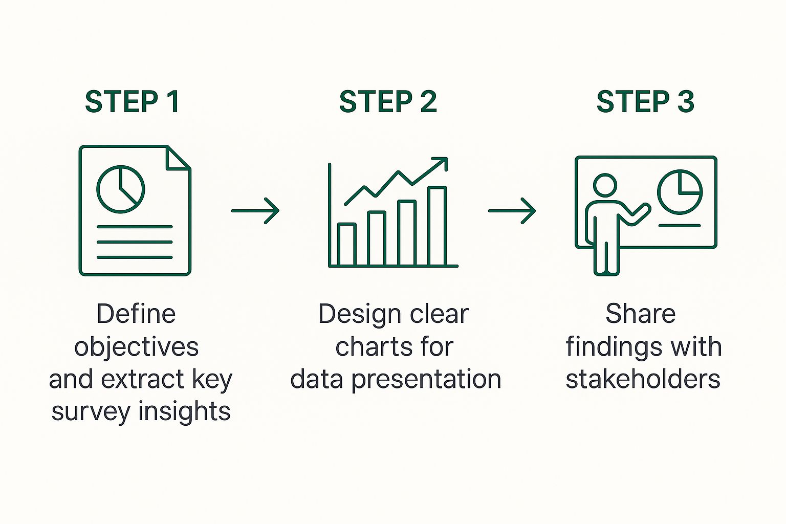
The main idea here is that analysis isn't just a single event. It's a journey that starts with a question and ends with clear, actionable communication.
Managing the Unexpected
Even the best-laid plans can hit a snag. Maybe you ended up with a smaller sample size than you hoped for, or perhaps the results are just... inconclusive. When that happens, honesty is your best policy. Be upfront about any limitations in your process. For example, if you had a low response rate from a certain demographic, mention it and explain how that might skew the results.
Pointing out these potential issues doesn't weaken your analysis. In fact, it does the opposite. It shows you've been thorough and builds trust with your stakeholders because they know you've considered all the angles. A clean setup in a tool like Microsoft Excel becomes your command center for navigating these challenges. When your data is well-organized, it's much easier to spot anomalies and adjust your approach on the fly.
This kind of roadmap helps you work smarter and deliver insights that people can genuinely rely on. And if you want to speed things up even more, let a tool like AIForExcel do the heavy lifting. You can ask questions in plain English and get insights back in seconds, turning hours of tedious work into a few quick minutes. Discover how AIForExcel can transform your workflow.