When most people think of Excel, they picture basic spreadsheets and simple formulas. But hidden just beneath the surface is a powerful suite of tools that can turn your familiar workbook into a full-fledged business intelligence powerhouse. This is what we mean by Excel Business Intelligence, or Excel BI. It’s not about buying new software; it’s about unlocking the advanced capabilities already built into the program you use every day.
What Is Excel Business Intelligence

Think of all your company's data—sales figures, inventory logs, marketing results, customer feedback—as thousands of loose Lego bricks scattered in different boxes. On its own, it's a messy pile. Excel BI gives you the tools to automatically gather those bricks, clean them up, and build them into a coherent model that tells a clear story about your business.
This is where features like Power Query and Power Pivot come into play. They do the heavy lifting of data collection and preparation, letting you skip the tedious manual work and jump straight to finding meaningful insights.
Beyond Standard Spreadsheets
Using Excel for BI is a massive leap from the old way of doing things. It moves you away from the fragile, error-prone world of manually copying and pasting data between sheets. Instead, you build automated, refreshable workflows that save time and ensure your data is always accurate and up-to-date.
This shift is part of a much bigger industry trend. The demand for accessible data tools is exploding, with the global Business Intelligence software market expected to skyrocket from $41.74 billion in 2024 to an estimated $151.26 billion by 2034. Companies want systems that automate analysis and help them see what's coming next. You can dig deeper into these numbers with Precedence Research's detailed BI software market analysis.
Excel sits right at the heart of this movement, acting as a surprisingly powerful and approachable BI platform for millions.
The Core Idea: Excel BI is about using the advanced analytics tools already built into modern Excel to gather, clean, model, and visualize data. This lets you make smarter, data-driven decisions without investing in complex, standalone software.
Ultimately, by embracing Excel for business intelligence, you can:
- Connect to Multiple Data Sources: Pull information directly from databases, websites, text files, and other sources without manual effort.
- Automate Data Cleaning: Set up repeatable steps to transform messy, inconsistent data into a pristine, analysis-ready format.
- Analyze Large Datasets: Effortlessly work with millions of rows of data—far beyond the standard worksheet limit of just over one million rows.
- Create Interactive Dashboards: Build dynamic reports with charts, slicers, and timelines that let anyone explore the data and uncover their own insights.
Your Core Excel BI Toolkit Explained
To really get the most out of Excel business intelligence, you have to understand the engine that drives it. It’s not just one feature, but a powerful trio of tools that work together: Power Query, Power Pivot, and the Data Model. Think of them as a specialist team, where each member has a vital role in turning messy, raw data into something you can actually use to make smart decisions.
Let's walk through each component, starting with how you get your data and finishing with how you make sense of it all.
Power Query: Your Automated Data Janitor
First up is Power Query, which you'll find under the "Get & Transform Data" tab in modern Excel. Its job is simple but absolutely critical: it fetches, cleans, and reshapes your data before you even begin your analysis.
Imagine getting monthly sales reports as clunky CSV files. They’re usually a mess—full of extra columns you don't need, inconsistent names, and frustrating formatting errors. Cleaning this up by hand every single month is a mind-numbing task, not to mention a recipe for mistakes.
This is where Power Query shines. It acts like your automated data janitor. You show it just once how to clean up the mess—things like removing columns, filtering out bad data, or unpivoting tables—and it records every step. The next time a new file lands on your desk, you just hit "Refresh," and Power Query does all that work for you in seconds.
This isn't just a minor time-saver; the efficiency gains are massive.
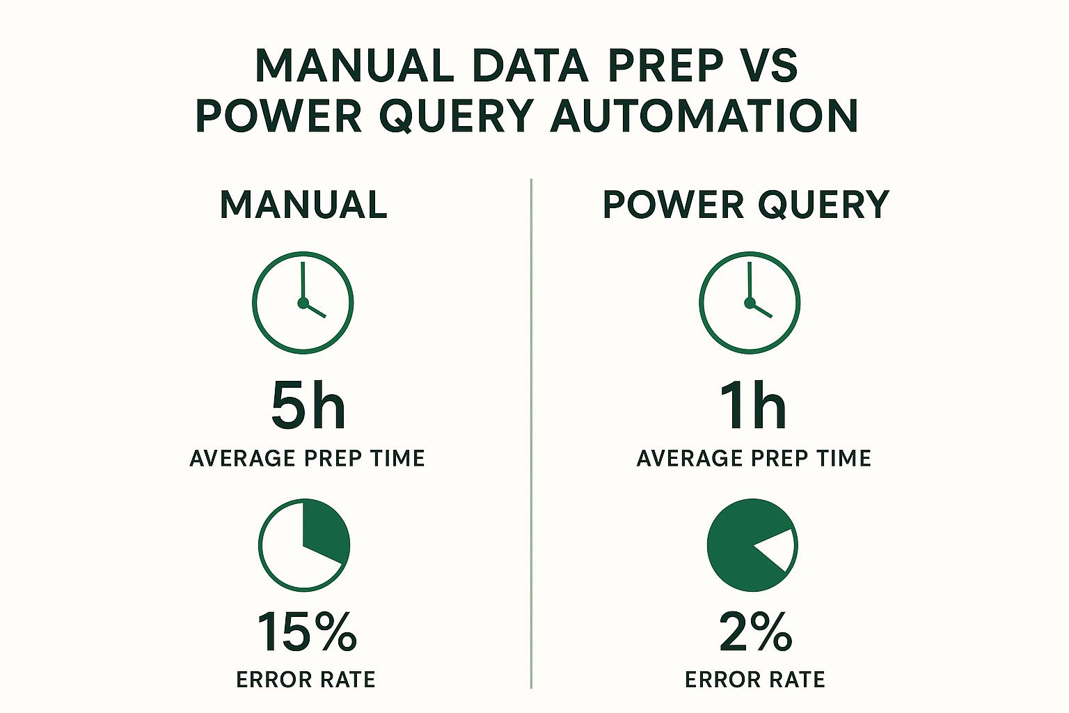
As you can see, automating your data prep with Power Query can slash the time you spend on it by up to 80%. More importantly, it dramatically cuts down on the risk of costly human errors.
Power Pivot: The Supercharged Brain
Once Power Query has delivered your squeaky-clean data, Power Pivot steps in to do the heavy lifting. This is the analytical brain of the whole operation. If you've ever been frustrated by Excel's one-million-row limit or watched your workbook grind to a halt because of complex formulas, Power Pivot is your new best friend.
It's a high-performance data modeling engine built right into Excel that lets you:
- Handle massive datasets: You can analyze millions (even hundreds of millions) of rows from different sources without crashing Excel.
- Create advanced calculations: It uses a formula language called Data Analysis Expressions (DAX), which is way more powerful than standard Excel formulas for building custom business metrics.
- Build a Data Model: This is the key. You can create relationships between different tables to unlock much deeper insights.
DAX is the special language of Power Pivot. While regular Excel formulas work on a grid of cells, DAX works on entire tables and columns inside a data model. This allows you to build powerful calculations like year-over-year growth or 30-day moving averages that are incredibly difficult (or impossible) to create otherwise.
The Data Model: The Central Nervous System
The Data Model is the final piece of the puzzle—it's where everything comes together. You can think of it as the central nervous system of your Excel BI project. It holds all the clean tables from Power Query and, crucially, the relationships you define between them.
For example, say you have a table of sales transactions and another with product details. In old-school Excel, you'd probably use a ton of VLOOKUPs to pull product information into the sales table. This approach is slow and creates enormous, bloated files.
With a Data Model, you just create a simple relationship between the 'Product ID' columns in both tables. This virtual link tells Power Pivot how sales and products are connected. Now, you can build a single PivotTable that analyzes sales figures by product category, even though that data lives in two completely separate tables. It’s a much smarter way to work.
If you're just getting started, you can learn more about how to analyze data in Excel with our full guide.
Excel BI Features vs Traditional Excel Methods
To really see the difference, it helps to compare these BI tools to the traditional spreadsheet methods you might be used to. This table breaks down how Power Query and Power Pivot completely change the game.
| BI Task | Traditional Excel Method | Excel BI Solution (Power Query/Pivot) | Key Advantage |
|---|---|---|---|
| Data Cleaning | Manual copy/paste, Find & Replace, Text to Columns | Automated, repeatable steps in Power Query | Massive time savings and dramatically fewer errors. |
| Combining Data | VLOOKUP, INDEX/MATCH formulas | Creating relationships in the Data Model | Efficiency. Avoids huge files and slow calculations. |
| Handling Large Data | Splitting files, hitting the 1,048,576 row limit | Loading millions of rows into Power Pivot's Data Model | Scalability. Analyze datasets far beyond Excel's worksheet limits. |
| Complex Calculations | Complicated, nested "mega-formulas" or helper columns | Writing clear, powerful DAX measures in Power Pivot | Clarity and Power. Build sophisticated metrics that are easy to maintain. |
| Reporting | Creating multiple PivotTables from one giant flat file | Creating one PivotTable from the multi-table Data Model | Flexibility. Slice and dice data from all connected sources at once. |
As you can see, this isn't just a minor upgrade. It’s a fundamental shift in how Excel handles information, turning it from a simple spreadsheet program into a robust platform for serious data analysis.
Building Your First Excel BI Project

Theory is one thing, but you don't truly get Excel business intelligence until you roll up your sleeves and build something. This is where the concepts click into place. We’re going to walk through a complete, hands-on BI project from start to finish, using a common business scenario you can easily adapt for your own work.
Let’s put ourselves in the shoes of a sales manager. Every month, you get a new batch of sales files from different regions—maybe as messy CSVs or separate Excel workbooks. Your job is to somehow stitch all this data together, figure out what’s really happening, and create a report that lets you and your team see the big picture without losing the crucial details.
We'll tackle this project in four key stages, just like you would in a real-world BI workflow:
- Gather & Clean Data: First, we’ll use Power Query to automatically pull in and scrub data from all those separate sales files.
- Model the Data: Next, we'll load our clean data into Power Pivot and build a Data Model, connecting sales records to a separate table of product details.
- Calculate Key Metrics: This is where you’ll write your first DAX measure to calculate a vital metric like total revenue.
- Visualize the Insights: Finally, we’ll cap it all off by building an interactive dashboard with charts and slicers that bring our analysis to life.
Stage 1: Gather and Clean Data with Power Query
Our journey begins where most data analysis projects do: with the often-dreaded task of data preparation. In our scenario, we have three separate CSV files: Sales_East.csv, Sales_West.csv, and Sales_North.csv. Manually copying and pasting this information every month would be a nightmare of tedium and human error.
This is a job for Power Query, our automated data janitor.
The Power Query Mindset: Think of Power Query as a "record" button for your data cleaning process. You show it what to do just once—like removing an empty column or fixing a date format—and it memorizes every single step. Next month, when new files arrive, you just hit "Refresh," and Power Query flawlessly repeats the entire sequence in seconds.
Here’s how we'll do it:
- Connect to the Data: In Excel, go to the
Datatab >Get Data>From File>From Folder. We’ll point Power Query to the folder holding our three sales CSVs. - Combine and Transform: Power Query previews the files and gives us an option to combine them. We’ll click
Transform Datato open the Power Query Editor. This is our workshop. - Apply Cleaning Steps: Inside the editor, we perform all the necessary cleanup. Maybe we get rid of a useless "Notes" column, make sure the 'Sale Date' column is actually treated as a date, and confirm that 'Unit Price' and 'Quantity' are proper numbers. Every action you take is recorded in the "Applied Steps" pane on the right.
Once our combined data looks pristine, we click Close & Load To... and choose to add the data directly to the Data Model. This is a pro move: it keeps our main Excel grid uncluttered and sends the data straight to Power Pivot, the "brain" of our BI operation.
Stage 2: Build the Data Model in Power Pivot
With our clean sales data loaded, it’s time to give it some context. Our main table has a ProductID, but no product name or category. That valuable info lives in a separate table, which we’ll call Dim_Products.
We load this Dim_Products table into the Data Model just like we did before. Now, we have two tables sitting in Power Pivot, but they're strangers—they don’t know they're related. We need to introduce them.
- Go to the
Power Pivottab in your Excel ribbon and clickManage. This opens the Power Pivot window. - Switch over to
Diagram View. You'll see your tables represented as boxes. - Now for the magic: simply click and drag the
ProductIDcolumn from your sales table and drop it right on top of theProductIDcolumn in theDim_Productstable.
A line instantly appears, connecting the two. That’s it. You’ve just built a relational data model. This simple connection is incredibly powerful. It lets you slice your sales data by product category or supplier as if it were all in one giant table, but without the terrible performance that would cause.
Stage 3: Write Your First DAX Measure
Now for the fun part—creating our own custom calculations. A standard PivotTable can give you a simple sum or count, but what about a crucial metric like Total Revenue? For that, we need to write a DAX (Data Analysis Expressions) measure.
DAX formulas might look a little like Excel formulas, but they are infinitely more powerful because they operate over entire tables and columns within our Data Model.
Let's create a Total Revenue measure. In the Power Pivot window, make sure your sales table is selected. In the calculation area at the bottom, click an empty cell and type this into the formula bar:
Total Revenue := SUMX('Sales', 'Sales'[Units Sold] * 'Sales'[Unit Price])
Let's quickly break that down:
Total Revenue :=This is just us naming our new measure.SUMX(...)is what’s called an "iterator" function. It tells Excel to go through the 'Sales' table row by painful row.'Sales'[Units Sold] * 'Sales'[Unit Price]For each of those rows, it performs this simple multiplication.- Finally, the
SUMXfunction takes all the individual results from each row and adds them all up to give us the grand total revenue.
With one formula, you've created a reusable, powerful business metric that you can now drop into any report.
Stage 4: Visualize Insights with a Dashboard
The data is clean, the model is built, and our key metric is ready. It's time for the payoff: visualizing our findings in a way anyone can understand.
We head back to our blank Excel sheet and insert a PivotTable. The key here is to choose "Use this workbook's Data Model" as your source.
Suddenly, the PivotTable Fields list on the right is populated with all your tables, including the shiny new Total Revenue measure we just created.
- Create a Chart: Drag
Product Categoryfrom theDim_Productstable into theRowsarea. Then, dragTotal Revenueinto theValuesarea. Instantly, you have a table summarizing revenue by category. With a single click, you can turn this into a bar chart. - Add Slicers: Slicers are basically fancy, user-friendly buttons for filtering. From the
PivotTable Analyzetab, we can insert slicers forRegionandYear.
You now have a genuinely interactive dashboard. Click "West" in the region slicer, and the chart instantly updates to show revenue from only that region. This is the very heart of Excel business intelligence. If you want to dive deeper into more advanced dashboarding, you can learn how to create a dynamic dashboard in Excel from scratch with our detailed guide.
How Businesses Win with Excel BI
It's one thing to understand the nuts and bolts of Excel BI, but it’s another thing entirely to see it in action, driving real success for a business. The tools we’ve covered—Power Query, Power Pivot, and the Data Model—aren't just abstract features. They are powerful, practical solutions that companies of all sizes use every single day to solve expensive problems, find hidden opportunities, and simply make better decisions.
So, let's shift from the theory to the stories. These examples show how different teams put Excel's BI tools to work to get tangible, measurable results. Each scenario starts with a common business headache and shows how a smart Excel BI workflow provided the perfect solution.
Optimizing Retail Inventory and Slashing Costs
Picture a small but growing e-commerce business. They’re stuck in a classic inventory trap: either they have way too much of a slow-moving product tying up cash, or they sell out of a bestseller, leaving sales on the table and customers frustrated. Their sales and inventory data are siloed in different, messy systems, making any attempt at forecasting feel like a shot in the dark.
To tackle this, their operations manager used Excel business intelligence to build a dynamic inventory dashboard.
- Automated Data Gathering: First, they used Power Query to automatically pull sales data directly from their Shopify store and connect to the CSV exports from their warehouse management system. This alone saved hours of manual copy-pasting each week.
- Building a Unified Model: Next, in Power Pivot, they created a relationship between the sales and inventory tables using the product
SKU(Stock Keeping Unit). This crucial step linked every single sale to a specific item's inventory level. - Creating Insightful Metrics: They then wrote a few simple DAX formulas to calculate key metrics like "sell-through rate" (the percentage of inventory sold each month) and "days of supply" (how much longer the current stock will last at the current sales pace).
- Visualizing the Results: The final dashboard had a simple table showing the stock level, sell-through rate, and days of supply for every product. Using conditional formatting, items at risk of selling out were highlighted in red, while overstocked products were flagged in yellow.
The outcome was immediate. The manager could see at a glance which products to reorder and which to put on sale. In the first quarter alone, they cut stockouts on their top 10 products by 75% and slashed carrying costs on slow-moving items by over 20%.
The Takeaway: By connecting separate data sources into one automated model, the retailer turned inventory management from a reactive nightmare into a proactive, data-driven strategy.
Measuring True Marketing Campaign ROI
A mid-sized company's marketing team was really struggling to prove their worth. They were spending money across Google Ads, Facebook Ads, and LinkedIn, but all the performance data was locked away in separate platforms. Reporting was a painful, manual chore of downloading spreadsheets and trying to piece them together—a process that was not only slow but also full of errors.
The marketing analyst decided to make Power Query the central hub for all their marketing data.
- Connecting to All Sources: They used Power Query’s built-in connectors to pull data straight from Google Analytics. For Facebook and LinkedIn, they set up scheduled CSV exports that Power Query would automatically grab from a shared folder.
- Standardizing the Data: The biggest headache was that each platform used different names for the same thing (e.g., "cost" vs. "amount spent"). Power Query cleaned this all up, standardizing column names and formats to create one clean table of all ad spend.
- Calculating Unified ROI: This clean ad-spend table was then connected to their sales data within a Power Pivot Data Model. A simple DAX measure for
Return On Ad Spend (ROAS)gave them a single source of truth for campaign performance, no matter the channel.
This unified report finally allowed the team to compare apples to apples. In one chart, they could see how a Google search campaign stacked up against a Facebook video campaign. They quickly discovered that while Facebook brought in more clicks, Google Ads delivered a 3x higher ROAS for their audience. This insight prompted them to reallocate $50,000 of their quarterly budget, leading to a much stronger return.
Uncovering the Root Causes of Employee Turnover
An HR department was getting nervous about a recent spike in people quitting. Exit interviews gave them some clues, but they lacked hard data to identify the real reasons behind the turnover. They had years of data scattered across spreadsheets—performance review scores, employee tenure, department, exit interview notes—but no way to connect the dots.
Using Excel BI, an HR analyst built a model to find the hidden patterns. They started by using Power Query to merge all the disparate HR spreadsheets. Then, in Power Pivot, they built a model linking employee records to their performance history and exit data.
By building PivotTables from this new model, they uncovered a startling insight almost immediately. The highest turnover wasn't among poor performers, but among high-achieving employees in one specific department right after their two-year work anniversary. When they cross-referenced this with the exit interview data, the reason became clear: a lack of defined career paths. Armed with this data, HR collaborated with that department's leadership to roll out a new career development program, tackling the problem at its core.
Integrating AI for Smarter Excel Analytics

So far, we've seen how the core tools of Excel Business Intelligence—Power Query and Power Pivot—give you incredible command over your data. But the next wave is already here, and it's bringing Artificial Intelligence right into your spreadsheets. This isn’t some far-off concept requiring a data science degree; it's about practical AI features that work alongside you, almost like a smart assistant for your analytics.
Think of AI in Excel as a superpower for your existing skills, not a replacement for them. It automates the tedious parts of data discovery, freeing you up to think about what the numbers actually mean and what you should do next. This approach makes AI a down-to-earth, usable tool for everyday business challenges.
This move toward accessible AI is a huge factor in the market's growth. The global Business Intelligence market is on track to jump from USD 5.9 billion in 2023 to an estimated USD 26.5 billion by 2033. Much of this is driven by cloud platforms and big companies getting on board, and for many of them, Excel is the familiar entry point that connects classic spreadsheet work with powerful new AI tools.
AI-Powered Features You Can Use Today
Microsoft has already woven several smart features directly into Excel. They’re designed to speed up your work and help you spot insights that are easy to miss. These tools are your on-ramp to AI-driven analysis.
A fantastic example is the Analyze Data button sitting right on the Home tab. All you do is select your data range and click it. Instantly, Excel’s AI engine gets to work, suggesting charts, PivotTables, and key statistical takeaways. It's like having an experienced analyst looking over your shoulder, pointing out interesting patterns and trends before you even start digging.
Here are a few other game-changing AI features:
- Forecasting Sheets: This tool uses powerful algorithms (like Exponential Triple Smoothing, or ETS) to project future trends from your historical data. It even gives you confidence intervals to show how reliable the predictions might be.
- Flash Fill: It might seem like magic, but Flash Fill is a simple form of AI. It recognizes the pattern in how you're splitting or combining text and automates the rest of the column for you. No more complex formulas for simple text cleanup!
- Natural Language Queries: With the Analyze Data feature, you can often just type a question about your data in plain English—like "total sales by region"—and get a direct answer.
AI as an Analyst's Assistant: Imagine you just cleaned a massive sales report with Power Query. Instead of spending the next hour building charts just to find a starting point, you click 'Analyze Data.' It immediately flags that sales for a certain product always spike in the third quarter. Just like that, you have a solid lead for a deeper investigation.
Bridging the Gap to Advanced Machine Learning
Excel also acts as the perfect stepping stone to more advanced platforms like Microsoft's Azure Machine Learning. The best part? You don't have to be an expert in those complex systems to get value from them.
The workflow is surprisingly simple. You lean on your Excel business intelligence skills, using Power Query to get your data cleaned up and perfectly structured. This well-prepared data is exactly what machine learning models need. From there, it can be fed into an Azure ML model to generate powerful predictions, like which customers are likely to churn or what next month's sales will be.
Finally, those predictions are sent right back into Excel. You can then use the familiar environment of spreadsheets and charts to analyze and visualize the results. Excel becomes the friendly face for very sophisticated predictive analytics, keeping you in the driver's seat. You use your business knowledge to interpret what the AI found and make the final call. This approach makes complex insights genuinely useful for anyone. For a closer look at how this all connects, check out our guide on the essentials of AI for Excel.
Common Questions About Excel BI
As you start dipping your toes into the world of Excel business intelligence, a few questions are bound to come up. It's totally normal. After all, moving from the familiar grid of a spreadsheet to a more robust, model-based way of working is a pretty big leap.
This section tackles the most common queries head-on. My goal is to give you clear, straightforward answers to help you understand exactly where these powerful tools fit and how you can get started.
Is Excel BI a Replacement for Power BI or Tableau?
This is easily the question I hear most often, and the answer isn't a simple yes or no. The best way to think about it is that Excel BI is an incredible and widely accessible first step into business intelligence. For a huge number of people, especially those in small to mid-sized companies, it's often all they need.
Power BI and Tableau are dedicated BI platforms. They're built for more complex visualizations, heavy-duty enterprise collaboration and security, and connecting to a massive variety of live data sources. It’s no surprise that Gartner has named Microsoft (driven largely by Power BI) a Leader in its Magic Quadrant for Analytics and Business Intelligence Platforms for over 15 consecutive years. It shows just how powerful it is in a large corporate setting.
Key Insight: Stop thinking of it as an "either/or" battle. The two often work together beautifully. It’s very common for analysts to do all the messy data cleaning and modeling in Excel with Power Query and Power Pivot, and then connect that clean, perfect data model to Power BI or Tableau to create the final dashboards for others to see.
What Version of Excel Do I Need for These Features?
To get your hands on the core Excel business intelligence tools, you'll need a fairly modern version of Excel for Windows. The main engines—Power Query (which is now called "Get & Transform Data") and Power Pivot—are built right into most current releases.
You'll be good to go with any of these versions:
- Microsoft 365: This is your best bet. The subscription model means you get all the latest features and updates as soon as they're released.
- Excel 2019 & Excel 2021: These one-time purchase versions also have the essential BI tools included.
- Excel 2016: Most flavors of Excel 2016 will have these features built in, too.
One critical point: Excel for Mac has lagged behind in this area. While you’ll find some of the "Get & Transform" data features, Power Pivot is still not available. If you want the full-blown Excel BI experience, you really need to be on a Windows machine.
How Hard Is It to Learn DAX Compared to Excel Formulas?
If you've ever found yourself deep in a spreadsheet, wrestling with a monster formula—think nested IF statements or a complex INDEX/MATCH—then you already have the logical mindset needed to learn DAX (Data Analysis Expressions). The real challenge isn't the code itself, but a shift in thinking.
Traditional Excel formulas live in a world of cells. You think in terms of "take what's in A1 and multiply it by what's in B1." DAX doesn't care about individual cells; it thinks in terms of whole columns and tables inside a Data Model. The biggest hurdle for most people is grasping evaluation context—basically, how a formula calculates its result based on the filters applied by your PivotTable or slicers.
But once that concept clicks into place, DAX lets you perform calculations that are laughably difficult or outright impossible with regular formulas. Think about trying to calculate year-over-year growth for just one product line with standard functions. It would be a messy, brittle formula. With DAX, that becomes a single, clean, and reusable measure.
Can Excel Really Handle Big Data with These Tools?
When people hear "big data," they often picture massive, complex systems. But Power Pivot was built from the ground up to completely shatter Excel's old data limits. A standard worksheet gives up at 1,048,576 rows. Power Pivot just laughs at that number.
It pulls this off by using a high-performance database engine (the very same one that drives Power BI) to do two brilliant things:
- Columnar Compression: It intelligently compresses the data as you load it into the Data Model. This allows you to cram millions—sometimes even tens of millions—of rows into a regular Excel file that stays surprisingly small.
- In-Memory Analytics: Instead of chugging along on the worksheet, all calculations happen in your computer's RAM, which is exponentially faster.
So, while Excel BI isn't going to replace a dedicated data warehouse holding petabytes of information, it is more than powerful enough to handle the data volumes that most businesses actually work with day-to-day. It can easily manage tables with several million rows without even breaking a sweat.
Ready to stop wrestling with formulas and start having conversations with your data? AIForExcel integrates a powerful AI assistant directly into your spreadsheet, letting you ask questions in plain English and get instant insights. Join over 4,800 professionals who are making smarter, faster decisions. Discover how AIForExcel can transform your workflow today.